
James Stanley of DailyFX.com uses real market action to illustrate how to plan and execute range trades in the forex market.
The benefits of strong trends can be obvious. Strong trends are one of the many reasons that record numbers of traders are flocking to the FX market from other arenas such as stocks or equity options. When a currency pair like the Australian dollar (AUD) goes on a run, as it did through 2010 and in the first half of 2011, the benefits to traders can be huge. Not only can a massive number of pips be racked up, but in a positive carry trade, traders can also earn rollover just for holding the position.
See related: Are New Carry Trades Coming Soon?
But it is an unfortunate truth that markets will not trend forever. Sometimes this amounts to a little congestion in the middle of an uptrend (or downtrend); other times this may be extended congestion while the market struggles to find a defined direction.
This article will walk through a simple mechanism by which traders can identify and trade in ranges while focusing on what many traders to be the most important part of any approach: risk management.
Identifying Support and Resistance Using Price Action
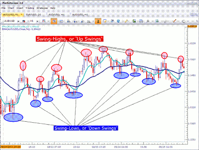
In Part 1, we looked at a way that traders can identify inflection points in the market based on where price had traded before. The benefits behind this can be huge.
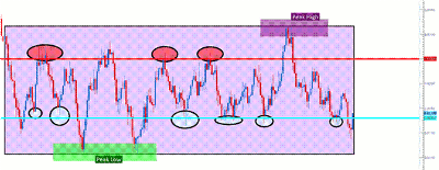
While past prices will never predict what will happen next on the chart with 100% accuracy, they can help us define our approach, and our stance in the market. The following picture will show an assortment of swing highs and lows identified on an hourly chart:
Click to Enlarge
Notice on this hourly chart that there are quite a few swings back and forth. This exemplifies the fact that markets will often oscillate while trying to find an intrinsic value.
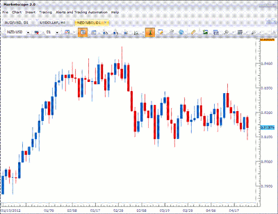
When beginning to line up a range set-up, the number of swings that might be available on the hourly chart may be too abundant. The longer time-frame charts, however, can offer quite a bit of information contained in each candle so that we can get more of a “bird’s eye view” on the market. So for this portion of analysis, the daily chart may work better.
Below is a current example on the NZD/USD daily chart:
Click to Enlarge
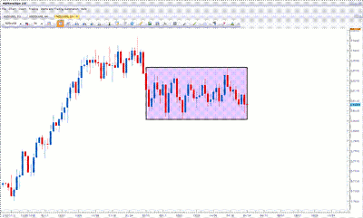
Right off the bat, we can notice that price, of late, has been caught within a range. The purple box below will show the period that I am referring to:
Click to Enlarge
Notice that since March 5 (approximately seven weeks before the publishing of this article), all prices in this currency pair have stayed within the box, with a low price of .8057 and a high of .8321 (a total of 260 pips from top to bottom).
|pagebreak|After we’ve established the range and the absolute high and low point of the prices during that period, we can move on to the next step of further defining support and resistance within the box. This can be done on a shorter-time-frame chart such as the four-hour. This will allow us to take a closer look inside the range to plot possible buy and sell points.
After moving down to the four-hour chart, we can look for groupings of swing lows around specific prices. This can often develop around psychological whole numbers such as .8100 or .8300 (any number ending in 000 can be looked at as a “round” number, or even 100-pip increments).
The chart below will show the four-hour set-up of the same chart we were seeing above, but with swing lows identified.
Click to Enlarge
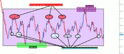
As you can see above, there are multiple inflections within the box we had previously identified that will allow us to further identify support and resistance. While this chart has a lot of information on it that is key to setting up a trade, we can simplify this quite a bit more (see chart below):
Click to Enlarge
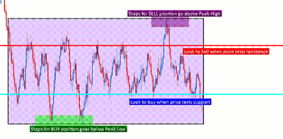
Notice that the previous collections of swing highs or lows are now identified on the chart, and are going to serve a very functional purpose in setting my game plan for the currency pair.
We can illustrate that game plan directly on the chart with what has already been given to us by the market. Since we have seen multiple iterations of price bouncing up at the price zone of .8130 for support, and multiple iterations for price driving lower after hitting the .8250 resistance zone (with no prices breaking above our peak high of .8321, or our peak low of .8057), we can then line out the prices with which we want to buy, sell, and manage our risk. The chart below will further illustrate:
Click to Enlarge
Risk Management Decides Our Entries
Now that we’ve identified the prices at which we want to buy, the prices with which we want to sell, and maybe even more importantly than that, where we want to place our stops, we can now begin to decide when we want to enter the trade.
Traders are best served by seeking risk-to-reward ratios of at least 1-to-1, and preferably higher. What this means is that anytime I open a trade, I want to ensure that my potential profit is at least as large as my potential loss (if the trade moves to my stop).
See related: Make Sure Risk/Reward Is on Your Side
And now that we know exactly where our stops should be placed, we can accurately calculate how much potential risk we are taking on.
Let’s walk through a real world example. Let’s assume that we enter a long (buy) position at .8220, which is slightly below the blue line in the above chart.
Remember, we want to place our stop just below the peak low that was seen previously at .8057. We can do the quick math (.8220 - .8057) to find that we are risking 63 pips on the trade.
For us to enter, we have to feel confident in being able to gain at least 63 pips. We can even plot this on our chart (see below):
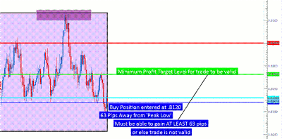
Click to Enlarge
If I feel confident in being able to gain 63 pips in the above trade set-up (as I would, considering that recent prices have been in this neighborhood, and the most recent swing high was within this price range), then I will place the trade.
If I do not feel confident in being able to gain at least 100% of my risk amount (63 pips in this case), I do not place the trade.
By allowing my potential risk/reward set-up to determine which trades I am taking and which I am not taking, I am enabling myself to focus only on high-probability set-ups.
If price breaks lower and takes out my stop, I can feel comfort in the fact that I may have saved myself a considerable amount of money because I closed the losing position before it continued to move against me and drain my account.
If this happens, the range that I was looking to take part in is invalidated, and this speaks directly to the reason that we had first identified support and resistance on the longer-term daily chart: looking to encompass the peak highs and peak lows.
By James Stanley of DailyFX.com


