Forex trader, Nick Simpson of Forex-FX-4X.com, outlines the details of an analysis approach that could provide a greater risk to reward ratio.
This discretionary price action article will run through a simple top down analysis scenario. The charts below show a theoretical trade setup using the daily chart to gain a bias and the lower timeframe to trigger a signal entry.
The idea behind this kind of granular trading analysis is that the stop loss can often be placed tighter than when trading the daily charts alone, thus providing a greater theoretical risk to reward ratio. The reality may be that of a lower hit rate, but demo trading, along with extensive back testing, may reveal that this provides a better “expectancy” reading over time.
Essentially, anyone interested in this kind off approach should do their own due diligence, with back and forward testing through a paper trading approach—and no capital at risk. With no further ado we will now run through a basic top down - multiple timeframe - price action analysis approach.
Top Down Analysis Example
The figure 1 chart shows price has reached a 61.8% Fibonacci retracement level on the daily chart and is just above a price pivot area. At this stage there is no significant price action bias.
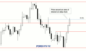
Click
to Enlarge
Things become a little bit more interesting on the figure 2 chart. Price is showing an element of indecision and has made a lower close after a significant upside run. The 61.8% retracement has held on the daily closing basis and a bearish outside candle has formed. The failure to close below the price pivot level is a slight concern for the bears but a slight bearish bias is forming from a price action analysis perspective.
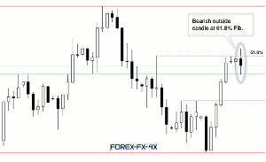
Click
to Enlarge
In Figure 3, the chart is based upon the hourly as we probe the lower timeframe looking for additional clues as to where price may go next. The hourly chart has given a one-hour bearish engulfing candle, which looks to have formed after a significant data release, or a major shift in intra-day sentiment. The resulting downside move has closed below our price pivot area (the previous cause of concern) and the daily and hourly chart bearish bias looks to be aligned when conducting our technical analysis using multiple timeframes.
The daily chart has been inserted into the hourly chart for reference. When viewing this chart, we note the required stop loss size is roughly half that of the daily candle—if utilizing this top down analysis and hourly entry approach and entering at market near the price pivot area.
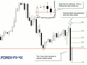
Click
to Enlarge
As the entry was based upon the daily chart we then use the daily for a theoretical exit reference. The significant cluster of highs shown in figure 4 is a logical potential trouble area, for any downside move, as resistance often becomes support.
Price then moves down to the exit area and an exit may be taken if the trailing stop has not been hit (depending on the strategy deployed).
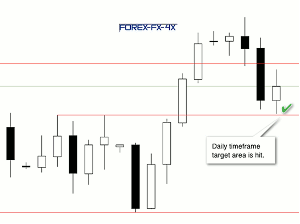
Click
to Enlarge
Things will not always go as smoothly as this but the basic tenet remains that the lower timeframe can provide additional information—thus allowing the trader to focus on the pertinent price action developments.
By Nick Simpson of Forex-FX-4X.com