Should you fear the rising yield curve? asks Rocky White, senior quantitative analyst with Schaeffer Investment Research, an industry leading provider of market timing and options investing and trading advice.
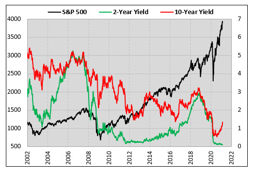
The 10-year Treasury yield fell below 1% in the early stages of the Covid-19 pandemic. As you've probably heard, its back above that level now and rising fast.
Shorter term rates continue to stay low though, causing a steepening of the yield curve. This week, I am taking a quantified look at what this has meant for stocks in the past.
Yield Spread Crosses 100 Basis Points
The chart below shows weekly data points of the spread between the 10-year and 2-year US Treasuries along with the S&P 500 Index (SPX).
Earlier this month, the spread went above 100 basis points for the first time since May of 2017. I decided to look at how stocks performed in the past when the spread crossed above triple-digits.
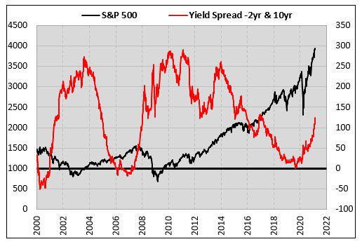
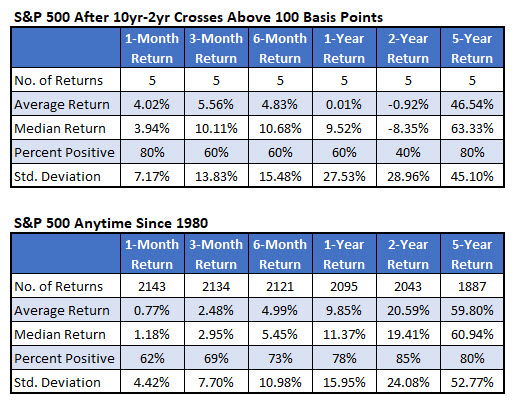
The table below shows the dates that the 10-year-2-year Treasury spread moved above 100 basis point for the first time in at least a year, which has happened five other times since 1980. It’s unnerving that the two times we’ve seen this since 2000, the S&P 500 was down almost 10% and 40% over the next year.
The first instance was in 2001 as stocks continued to suffer after the tech-bust. The second occurrence was in late 2007 in the early stages of the financial crisis. In the three signals before 2000, stocks performed fine over the next year.
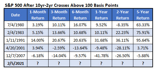
Here, I summarize the returns in the table above. The second table below shows typical S&P 500 returns since 1980 for comparison. The returns look great out to three months but the longer-term returns lag typical market returns.
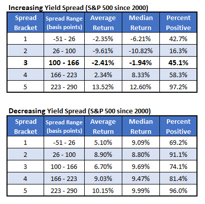
Yield Spread Levels
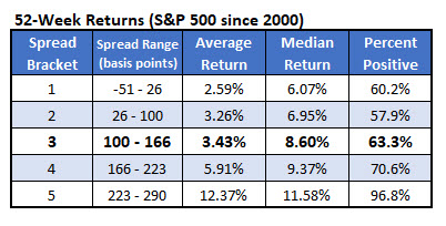
Let’s see if it’s better for stocks for the yield spread to be narrow or wide. To do this, I went back to 2000 and found the 52-week returns based on what the yield spread was.
I broke down the returns into five different brackets so that each one had the same number of returns. That’s the reason for the irregular minimum and maximum yield spreads in the ranges.
Based on the table below, a wider yield spread has resulted in better stock returns. This makes sense, knowing a negative spread has famously led to recessions a decent number of times. Investors should welcome the yield spread moving higher.
Finally, I looked at the same brackets above, but I broke down the returns by whether the spread was increasing, like now, or decreasing in the range.
With the spread increasing, our current situation is the middle row of the top table. The good news is that it is through the 100 level and out of that second bracket where the worst stock returns come from.
Unfortunately, in the current situation, the S&P 500 has averaged a 2.4% loss over the next with less than half of the returns positive. Generally, since 2000, stocks have done better when the yield spread was falling compared to when it was rising.