Stock markets sold off recently after an inverted yield curve sparked recession fears, writes Rocky White.
Yields in the two-year note/10-year note spread briefly inverted last week, sparking recession fears and inciting a market sell-off (it would behoove you to know that other iterations of the yield curve had inverted several months ago, but for our purposes we define a yield curve inversion as only considering the two-year/10-year spread). The S&P 500 Index (SPX) fell almost 3% Wednesday, Aug. 14, on the news.
The inverted yield curve seems to be the most notorious recession indicator there is. The chart below, in part, explains its bad reputation. The orange line is the spread between the 10-year yield and the two-year yield on U.S. Treasuries. The yield curve is inverted when that spread falls below zero, indicating that the two-year yield is higher than the 10-year yield. The last two major market tops were preceded by an inversion of the yield curve. Furthermore, the last five recessions (some say the last seven) have been preceded by a yield-curve inversion.
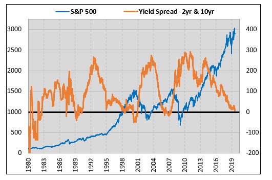
Recessions are defined after the fact, and don't always align perfectly with stock market downturns. As such, I'll be looking specifically at how stocks have performed after prior inversions.
How Stocks Perform After a Yield Curve Inversion
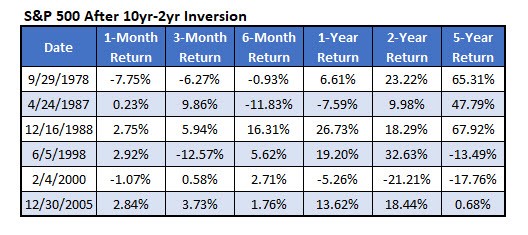
We have Treasury yield data going back to 1976. Below are the dates, using weekly closes, of the times that the yield curve inverted for the first time in a year over this time frame. Using this definition, we haven't had a recent signal, as the yield curve un-inverted by the end of last week. Still, you can expect it any time.
The numbers don't look as scary as what you'd think, based on the mania surrounding the inversion. Three of the last four years saw the S&P 500 gain double-digits over the next year. In five of the past six occurrences, the index was positive two years later. For investors who had sold out immediately after the yield-curve inversion, they were early, and missed out on gains over the next couple years.
The most concerning thing I see in this table is that stocks have lost double-digits over the next five years after two of the last three signals. And the most recent signal showed a market that was flat over the next five years, which is a demoralizing return over that long of a time frame.
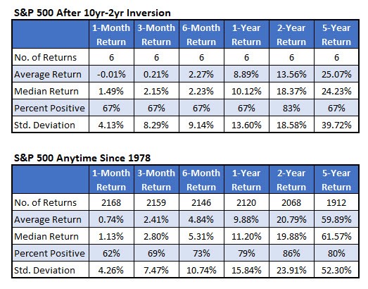
This next table summarizes the returns in the table above, and then I have typical returns for the S&P 500 for comparison. It reveals a tendency toward weaker-than-usual returns. The average returns are lower after an inversion across all the time frames, especially over the longer term.
When to Sell?
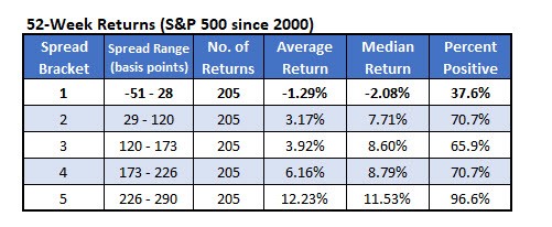
Here's a different way of quantifying stock returns based on the yield curve. Going back to 2000, I made ranges of the yield spreads so that there were five brackets with an equal number of returns. Then, for each bracket, I found the one-year return of the S&P 500 Index.
With a spread of near zero, that puts us in the heart of that first bracket. There's a clear relationship between the spread and the return on the S&P 500. The lower the spread, the worse the return going forward. Where we're at right now with the spread, the S&P 500 historically has lost an average of 1.29% over the next year, with not even 40% of the returns positive.
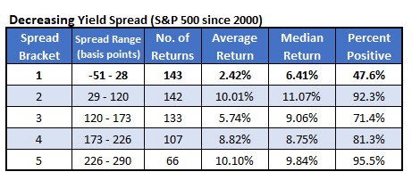
With the yield spread decreasing, however, the returns aren't quite as dire, though they're still not great. The table below shows the data above except it only includes the returns when the spread was decreasing, as it is now. In these instances, the S&P 500 gained an average of 2.42% over the next year, with a median return of 6.41%, which is not that awful. Not even half of the returns were positive, though.
It gets scary when the yield spread turns higher and starts increasing. This table shows the S&P 500 one-year return based on the yield spread, but it only shows times when it's increasing. Once the spread turns higher, selling seems to be the wisest strategy. When the spread is increasing from its current levels, stocks average about a 9% loss over the next year, with just 15% of the returns positive. When the spread gets a bit higher — from 29 to 120 basis points — the average return for the index has been even worse, averaging a loss of more than 12%.
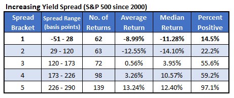
On the bright side, the initial inversion of the yield curve often happens with significant gains still to be had over the next year or two of trading. The data above does, however, show major headwinds when the spread is low or negative, and especially when it turns higher from extremely low levels.


