Is the 32-year bull market for bonds near its end? It depends on who you ask, but technician Greg Harmon of Dragonfly Capital looks at the charts for clues.
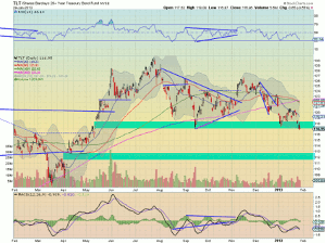
I have heard that a lot lately. And Treasury bonds are looking weak. The daily chart of the Treasury Bond ETF (TLT) is showing a break of a support area from 117.50 to 118.50 with Tuesday’s closing price. Price levels not seen since May 2012. And all of the simple moving averages (SMA) are pointing lower. In fact there was a death cross on Friday. Ominous, right?
Click to Enlarge
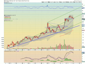
The next gap area lower forms between 111.70 and 112.70. $5 is some good coin. But the monthly chart may temper your enthusiasm to bet on the demise of bonds. The bullish Andrew’s pitchfork that has been in control since the ETF started shows that all that has happened is the median line attracting price and then a slight overshoot. This happened back in May 2012, as well before it launched higher, and boy does that 10+ year uptrend look strong. But there are some cracks in the story. The relative strength index (RSI) is making a new lower low from the last touch at the median line and continuing down, with a moving average convergence divergence histogram (MACD) that is negative this time and growing.
Click to Enlarge
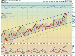
The MACD signal line is also pointing lower. This view shows that it will be tough to gain traction until it falls below 108. And looking at the actual Treasury bond prices shows that the long-term rising channel from 1994 is in control. Yes, it is pulling back from the top of the channel and the RSI and MACD support a further move lower.
Click to Enlarge
But the 135 level, 7 points lower will need to fail to provide support before there is a chance at the bottom of the channel, much less a bearish movement long term. So go ahead and get a little short. But it is not time yet to bet the farm on a collapse.
By Greg Harmon of Dragonfly Capital