
Greg Harmon, of Dragonfly Capital, defines Renko Charts, which were created by the Japanese, and he highlights how they can be used to smooth volatility in the market.
Renko Charts were created by the Japanese to smooth some volatility in the market. I like to think of them as a cross between Point and Figure charts and daily candlestick charts. Investopedia describes Renko charts like this:
“A type of chart, developed by the Japanese, that is only concerned with price movement; time and volume are not included. It is thought to be named for the Japanese word for bricks, ‘renga.’ A renko chart is constructed by placing a brick in the next column once the price surpasses the top or bottom of the previous brick by a predefined amount. White bricks are used when the direction of the trend is up, while black bricks are used when the trend is down. This type of chart is very effective for traders to identify key support/resistance levels. Transaction signals are generated when the direction of the trend changes and the bricks alternate colors.”
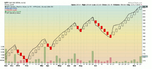
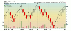
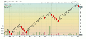
The only difference I see is that most charting packages use red instead of black for the downside and the Average True Range (ATR) for the box size. But it is a simple way to look at a trend. Take a look at the Renko charts for the three major Index ETFs: (SPY), (IWM), and (QQQ), compared to the actual price action as the line chart.
Click to Enlarge
There are few things to notice about these charts. First, a Renko block does not print everyday. This is not surprising as they are intended to smooth out some noise. So the actual day to day volatility is muted in the line charts. Next, speaking of those line charts, the Renko chart tracks it pretty well. There is a little lag occasionally at a turn but not anything like you can experience with a Point and Figure chart.
Click to Enlarge
Third, both the SPY and IWM are in an uptrend while the QQQ broke the uptrend last Wednesday. Finally, and most importantly, Renko charts give you a stop loss mechanism. In an uptrend, the bottom of the current block is your stop level, and in a downtrend, the top of the block.
Click to Enlarge
For an intermediate-term investor/trader, especially in ETFs, using Renko charts can slim your daily review down to under ten minutes.
By Greg Harmon of Dragonfly Capital


