
MoneyShow's Tom Aspray demonstrates how you can use a popular indicator to identify changes in a trend's momentum, which can help you identify opportunities and better manage your positions.
With half the year almost over, there are many different opinions about how the stock market might finish the year. One thing that both retail and professional investors and traders can agree on is that the choppy market has made it difficult to make money.
Many of the top hedge funds saw double-digit losses in the first quarter and the preliminary data on the 2nd quarter does not look much better. Of course, many were heavily invested in what is referred to as momentum stocks and suffered as a result.
One of the many fine technical tools that Welles Wilder developed can be quite useful in non-trending markets. This is the Average Directional Index (ADX), which can be used by itself or along with the Minus Directional Indicator (-DI) and Plus Directional Indicator (+DI).
They are all included in one of the classic technical analysis books, New Concepts in Technical Trading Systems, by Welles Wilder. Though I do not feature it in my daily columns, I have used the ADX since the mid-1980's. I have found it to be quite useful as part of the stock selection process as well as in managing stops.
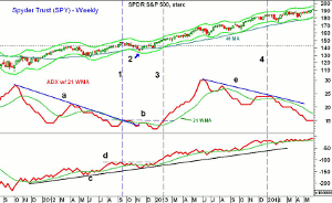
This weekly chart of the Spyder Trust (SPY) includes the 14-period ADX along with a 21-week WMA. Below this, I have also included my standard OBV along with its WMA. Many analysts use an ADX reading of either under 20 or under 25 to identify non-trending markets.
Click to Enlarge
I have found that chart analysis and a 21-period WMA can be even more effective especially when used on weekly and monthly data. I look for the break of a long-term downtrend in the ADX then can go back a year or more to signal a change from non-trending to trending. This trend line break is then confirmed by the rising 21-period WMA.
One needs to remember that the direction of the ADX line is not correlated with the direction of prices. A rising ADX that is above its WMA indicates the market is trending but other tools are needed to determine what direction the market is trending. The ADX just gives you a reading on the strength of the trend.
Prior to breaking its downtrend, the ADX will often drop to 15 or lower. In September 2012 (line 1), the downtrend was first broken after the ADX reached a low of 13 as SPY surpassed the spring highs (dashed line). The ADX rallied to 15 before the LCD sell signal in key stocks like Apple, Inc. (AAPL) took the entire market lower.
By the middle of November 2012, the SPY was close to its weekly starc- band (point 2) and the ADX was still below its WMA. With the fiscal cliff scare, December 2012 was a choppy market as the most significant bullish factor noted at the time was the new high in the NYSE Advance/Decline line on December 12.
In January 2013, the ADX moved above its WMA and had surpassed its prior peak, line b, by the end of the month. This indicated that the market had entered a trending phase. For the next few months, the ADX line stayed well above its sharply rising WMA, which was a sign of a strongly trending market.
The weekly OBV broke through its resistance (line d) ahead of the ADX line and was leading prices higher. In August 2013, the ADX line formed lower highs and then started a new downtrend by forming lower lows. A longer-term downtrend was established as the ADX peaked at 24 in late 2013 and early 2014 (line 3).
This action made it unlikely that stocks were going to be trending in the 1st quarter as a more choppy market was expected. The drop in the ADX line below its WMA was further confirmation that this was a non-trending market. The series of higher highs in the OBV indicated that the major trend of the S&P 500 was still positive even though it was not a trending market
NEXT PAGE: An Example of the ADX in Action
|pagebreak|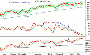
Click to Enlarge
I have found that the daily ADX analysis is primarily useful to short-term traders and can also be used on an intra-day basis. A daily chart of the SPY will illustrate this point. From July through October 18, the ADX line was quite choppy though it did surge for a few weeks into November as the SPY had a nice rally.
The downtrend from November, line a, was finally broken as stocks were topping in the latter part of January, signaling that the market was trending lower. The ADX peaked in early February when the Arms index confirmed we had seen a panic low.
The ADX line has been in a well-established downtrend since early February but the downtrend, line b, was broken two weeks ago. Therefore, we may now see a move into the trending mode. The long-term uptrend in the daily OBV, line c, was tested in early February. The OBV diverged from prices through much of March but the downtrend (line d) was broken in late April, signaling the recent rally.
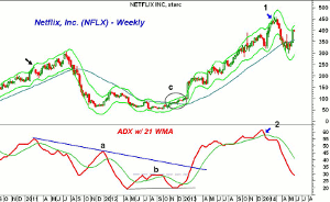
Let's look at some examples of the ADX formations that are consistent with a change from non-trending to trending. Netflix, Inc. (NFLX) has had quite a few wide swings over the past three years.
Click to Enlarge
Often, the ADX line will form significant peaks in the 55-60 area as NFLX did in February 2011 as it was testing the weekly starc+ band (see arrow). After a sharp four-week correction, NFLX again turned higher eventually peaking in July as the OBV (not shown) did not confirm the new highs.
The ADX line had been below its WMA and forming lower highs for almost four months before the stock made its high. The peak in the ADX was not a reason to sell but it was a reason to use tighter stops than when NFLX was trending strongly.
The ADX formed a double bottom formation between April and November 2012. The ADX line moved above its WMA in early January of 2013 as prices were trading in a tight range between $84 and $94 (circle c).
The ADX surpassed its prior high and resistance (line b) as NFLX surged to the upside. The downtrend in the ADX (line a) was not broken until early March when the stock was trading in the $180 area.
In early February of 2014, NFLX tested its weekly starc+ band for several weeks (point 1) but the ADX line had already dropped below its WMA (point 2). The lower weekly close in March started what turned out to be a 30% drop. Even though the stock has rebounded recently, the weekly ADX is currently not trending.
NEXT PAGE: Another Example of the ADX in Action
|pagebreak|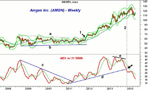
Click to Enlarge
Amgen Inc. (AMGN) has been one of the hottest stocks of the past three years. The weekly chart shows that it established a trading range (lines a and b) from late 2008 until mid-December of 2011 when it staged an upside breakout (point 1).
The ADX line shows a clear downtrend from the 2008 high that connects with the high in 2009. In late 2010 and early 2011, the ADX dropped down to 9 before it moved back above its WMA. The downtrend was broken in May as the ADX line began a new uptrend.
The ADX dropped below its WMA in October but turned higher before the end of the year as AMGN was testing its flat 40-week MA. The uptrend in the ADX (line d) was clearly established in early January as AMGN was trading around $65.
By November of 2012, the ADX was peaking at 49 and the weekly starc+ band was being tested. The stock again dropped down to its rising 40-week MA as the ADX dropped well below its WMA. The stock and the ADX soon reversed to the upside as the ADX line hit a high of 48 in May of 2013.
The stock continued higher but in November, with the stock near $120, the ADX line formed lower highs, line e, and soon completed its top. The uptrend in the ADX (line d) was broken at the end of 2013, line 2. AMGN finally peaked in March at $128.96 as the stock had gained another $15 per share after the uptrend in the ADX line was broken. The ADX line is still falling sharply.
Click to Enlarge
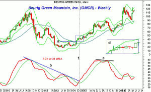
Another widely followed and often widely shorted stock has been Keurig Green Mountain (GMCR). The ADX line formed the classic pattern, line b, between September of 2011 and July 2012. The ADX dropped to a low of 17 in November 2012.
GMCR surpassed its weekly swing high, line a, at the end of November, and four weeks later, the ADX broke its downtrend (line b). GMCR was testing its starc+ band, but as I have discussed previously, when a starc band is tested the stock can either move away from the band or move sideways before the trend resumes.
Even though some might have thought at the time that the big move had been missed, the insert (box d) shows that GMCR actually traded in a tight range for many weeks as it continued to find support in the $38.73-$38.83 area before it resumed its sharp uptrend. This allowed for a good risk/reward entry in a trending market and the stock doubled in the next six months.
By August of 2013, the ADX line failed to make new highs with prices, line c, as GMCR again moved back to its starc+ band. When one sees a three-month divergence like this, it is often a good time to take some profits or to start using much tighter stops. GMCR proceeded to drop over 30% in 11 weeks.
The ADX line is trying to bottom out above 25 and a move back above its WMA and the recent high would signal that it is trending once more.
NEXT PAGE: Using the ADX to Manage Stops
|pagebreak|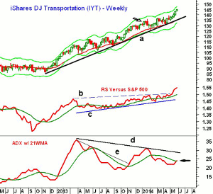
Click to Enlarge
One of the major averages that has been making new highs this year is the Dow Jones Transportation Average as the iShares Transportation Average (IYT) is up 10% YTD, which is more than double the performance of the Sypder Trust (SPY). In the following examples, I will look at some of the 2014 recommendations using relative performance analysis along with the ADX.
The weekly chart shows a solid uptrend in IYT going back to the late 2012 lows, line a. On January 13, it was recommended because of its daily relative performance had just surged to the upside and the OBV was positive.
The weekly RS line had broken out of its trading range last fall. The RS line shows a solid uptrend, line c, and has recently been very strong as it moved well above the resistance at line b.
The ADX line broke through the twin peak downtrend, line e, in November as the ADX line was well above its WMA. The ADX line turned lower in late January as IYT tested its 20-week EMA. The ADX line dropped below its WMA in mid-February but now looks ready to close back above it this week.
Click to Enlarge
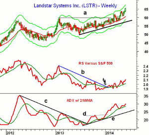
Of course, if a sector has positive relative performance and is trending, then the stocks in this sector should be focused on for stock picking. Landstar Systems (LSTR) was recommended at the same time as IYT as the weekly relative performance had just broken its downtrend, line b (see arrow).
LSTR broke through major resistance, line a, in March and has since accelerated to the upside. It tested the rising 20-week EMA several times prior to the recent surge. The relative performance continues to make higher highs after recently dropping back to test its rising WMA.
The weekly ADX line broke its downtrend, line c, last August and its WMA gradually turned higher. The move above the October high (line d) in early January was a sign that the stock was starting to trend higher. The ADX is still in a clear uptrend, line e, and is close to making new rally highs this week. So far this year, LSTR is up 13.6%.
The ADX is included in most Web-based charting systems, and I think you would find it useful in your stock selection, as well as your stop placement. When a stock has a good rally, the question is always do you use a stop under the last major low or one that is just under a minor swing low?
We all have had the experience of using the tighter stop only to be just barely stopped out and then have the stock surge much higher. On the other hand, sometimes when you are using a wide stop to keep you in the trade, you wind up giving back too much of your hard-earned profits.
Using the ADX can help increase the odds in your favor because if the weekly ADX is still rising strongly, a wider stop could be used until there are signs that the ADX is topping out. If the ADX line has topped out, then you should be looking to take profits on strength and use a tighter stop to protect those profits.
This, of course, will not always keep you out of trouble but I think you will find it a very useful technical tool. Before you look to the ADX, use relative performance analysis to find market-leading stocks and on-balance volume to determine, which ones are being accumulated.


