
With many often warning of a sharp double digit correction, MoneyShow's Tom Aspray reveals the signs that traders and investors should look for in order to get advance warning of a correction.
The rough stock market performance in January 2015 increased the bearish sentiment, and while some are warning of a severe 15% or more correction, others think we are already headed for a bear market. The very weak close on Friday, January 30 did not help as many bulls were holding their breath before the following Sunday's opening in the futures. The fear was alleviated somewhat by the strong stock market performance in early February.
So what can you do to be prepared in advance for a sharp double digit correction? These are often panic attacks where investors and traders become skeptical that earnings will justify the current stock price levels. That does fit with the current fundamental outlook as many are nervous about what long-term impact the strong dollar and lower crude oil prices will have on earnings.
Some technical analysts will warn of a correction because of low volume or divergences in some of the well known momentum studies like the RSI, MACD, or the stochastics. Others who have been negative on the market as it has continued to move higher will issue warnings based on their own unique or proprietary technical methods.
The standard definition of a correction is a decline of less than 20%, while a decline of over 20% is used by many to signal that we are in a bear market. I have never liked that definition as the financial media often uses it to scare the average investor out of stocks just before the correction is over. Most true bear markets last significantly longer than corrections and take prices much lower.
Since the 1980s, my favorite indicator for identifying a market correction in advance is the NYSE Advance/Decline line. Since ETFs were introduced, I have used the signals from the NYSE A/D line to trade widely followed ETFs like the Spyder Trust (SPY) as well as inverse ETFs like the ProShares UltraShort S&P 500 (SDS).
In early 2009, the advance decline data also became available on the S&P 500, Nasdaq 100, Dow Industrials, and Russell 2000. I follow these A/D lines also since they can give you valuable insight on what market segments are leading or lagging the markets. For example, the Russell 2000 A/D topped out in July 2014 warning of the weakness in the small-cap stocks.
Without more historical data on these A/D lines, I rely on the many years of experience I have in successfully using the NYSE A/D line to gauge the market's overall trend . Over the years, some have questioned the use of the NYSE since it contains a large number of interest rate sensitive issues. This has always been part of its makeup, but that has not kept it from being accurate in the past.
In this week's trading lesson, I will focus on several very sharp market corrections that have occurred over the past thirty years. This, I hope, will allow you to identify future corrections in advance. I believe it will also illustrate that the warning signs of a correction take time to develop so that you will be less apt to react emotionally to a sudden correction or bear market headline.
NEXT PAGE: What Do You Remember About August 1987?
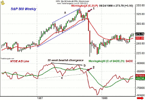
|pagebreak|One of the sharpest and most often discussed market corrections occurred in the fall of 1987. Some view this as a bear market since the S&P 500 dropped 33.5% in just 99 days, but the long-term charts now make a strong case that this was just a correction in the bull market that began in 1982.
Click to Enlarge
The weekly chart of the S&P 500 and the weekly NYSE Advance/Decline line reveals that the A/D line peaked on March 20, 1987. The S&P 500 peaked four weeks later and then corrected 9% over the next month. The S&P 500 dropped below its rising 20-week EMA several times but did not close below it.
Eight weeks after it peaked, the A/D line moved back above its WMA, and by June 19, the S&P had also exceeded the April highs. The rally continued for the next two months as the S&P 500 made a new high the week of August 28 before closing the week lower. This new high was 11.2% above the April high.
The A/D line had formed a much lower high as indicated by line b. This negative divergence is evident by comparing the slopes of lines a and b. The divergence took 20 weeks to form, and as I have mentioned previously, the length of the divergence can provide valuable clues as to how severe the correction may be.
In September 1987, the A/D line dropped below its WMA one week after the S&P made its high. The S&P reached its 20-week EMA before it bounced for two weeks, point 1, before it, again, turned lower. This was typical of a failing rally as they often just last two bars when they are going against the trend. The A/D line was very weak on the rally as it stayed well below its declining WMA, point 2.
The A/D line violated its support (line c) the week before the market really crashed as it lost 30% in the following two weeks. This is probably the most extreme example of why serious students of the market need to develop a regular schedule of market analysis, especially when they are seeing significant divergences in the A/D line.
Click to Enlarge
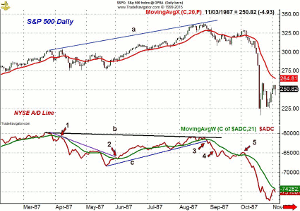
Now let's look at the daily chart for the same time frame to see how its signals can be combined with the weekly analysis. The daily A/D line peaked at the end of March and formed a short-term negative divergence at the April 7 high, point 1, as the A/D line was barely able to move above its WMA. This short-term bearish divergence resistance was not overcome until early June (point 2) when the A/D line began a new uptrend.
The A/D line was clearly in a short-term uptrend by the end of June, but was still well below the March highs. The short-term uptrend in the A/D line, along with its WMA, were both broken in late August as the A/D line had stalled below the March highs, line b.
In the nine days after the high on August 25, the S&P 500 lost 8.6%, and more importantly, the A/D line dropped below the July low (point 4), which was a sign of weakness.
From a low of 308.56 the S&P rallied back to 328.94 on October 2. The A/D line just barely made it above its WMA on this rally (point 5) and still showed a clear pattern of lower highs and lower lows. This was a classic example of a failing rally.
On Tuesday, October 6, the S&P 500 closed at 319.22 and the A/D line dropped below its WMA. Just two days later, the A/D line had dropped below its previous low, which was a definitely a sign of weakness. This was two days before Black Monday collapse.
NEXT PAGE: How About September 1990?
|pagebreak|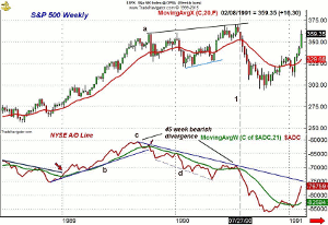
Click to Enlarge
The next correction I would like to examine is the 19.9% decline than occurred in 1990, which lasted 85 days. The weekly A/D line was positive at the start of 1989 as it moved above its downtrend and its WMA (see arrow).
The weekly A/D made a series of higher highs before it peaked on September 1, 1989. Just four weeks later, it made a lower high (see arrow) while the S&P 500 was clearly higher.
Drawing a line through these lower highs, line c, allows one to monitor what I call the bearish divergence resistance. As I have noted frequently in my daily columns, a break through these resistance levels can generate new buy signals.
The following week, the A/D line dropped below both its uptrend, line b, and its WMA. For the next eight months, the A/D line stayed below its declining WMA. It did rally back to its WMA in January 1990 but soon resumed its downtrend. By February of 1990, the S&P 500 had already dropped 11%.
By early May, the S&P 500 was in a short-term uptrend (blue line), and by early June, the A/D line was finally able to move back above its WMA but did not break its downtrend. As the S&P was forming higher lows between February and April, the A/D line was forming lower lows, line d. This warned that the rally was weak as fewer stocks were pushing prices higher.
The weekly A/D just reached its downtrend, line c, from the prior year's highs on July 13. This completed a more pronounced forty-five week negative divergence, and the following week, the A/D line dropped back below its WMA, line 1. In the twelve weeks after the S&P 500 made its high, it declined 20.3%.
Click to Enlarge
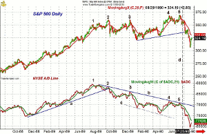
As is sometimes the case, the daily A/D line peaked on August 8, 1989 (point 1), almost a month ahead of the weekly A/D line. It formed a lower high in early September (point 2) and then tested its uptrend, line a. The A/D line was significantly lower on October 10 (point 3) even though the S&P 500 was 3% higher than it was in August. The support in the A/D line that went back to December 1988, line a, was convincingly broken in October. This confirmed the divergence at point 2.
The S&P 500 made a marginal new high in January 1990 (point 3) as the daily A/D line just reached (point 3) its bearish divergence resistance at line b. The daily A/D line had dropped sharply by the end of January, confirming a new downtrend. The A/D line made further new lows in April, before it rose back above its WMA in early May.
In early June, the S&P 500 hit a high of 368.78-which was well above the January high of 360.59-but the A/D line had failed to move above the bearish divergence resistance at line b.
In July, the S&P 500 made another new high, but the A/D line failed to surpass its June high. Eight days after the S&P high, the A/D line dropped below the June lows, line d, which confirmed that the correction was underway.
NEXT PAGE: And July 1998?
|pagebreak|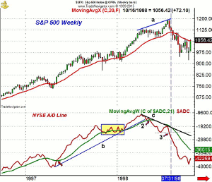
Click to Enlarge
The stock market was hit hard in July of 1998 as the Russian ruble came under pressure and a well known hedge fund, Long Term Capital Management, was blowing up. The stock market ended up dropping 19.3% in just 44 days.
The weekly chart shows that the A/D line moved back above its WMA on May 9, 1997 (point 1) as the S&P 500 closed at a new high for the year at 824.78. The S&P and the A/D continued higher until the A/D line peaked in October 1997.
Over the next four weeks, the S&P 500 dropped 13%. The A/D line then developed a trading range (see rectangle) that lasted until February 1998 when it broke out of its range and moved to new highs.
The stock market continued to make new highs with the A/D line until early April. The A/D line peaked the week of April 3, 1998. Six weeks later-as the S&P 500 was moving sideways-the A/D line dropped below the support (line b) and its WMA (point 2). The flat price action with a falling A/D line was negative and indicated that prices would eventually follow the A/D line lower.
By Friday, July 24, the S&P 500 had rallied 5.2% above the April high, but the A/D line just moved back to its declining WMA, which completed the fifteen-week bearish divergence, line c. Just two weeks after the July highs, the A/D line dropped below the June low, point 3, which reaffirmed the downtrend in the A/D line.
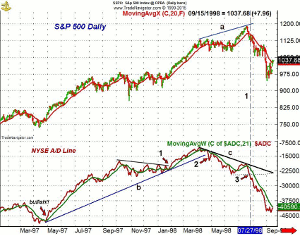
Click to Enlarge
On the daily chart, the bullish signal at the April 1997 lows is very evident and it was confirmed a week later by the weekly A/D line moving above its WMA. The A/D line continued higher until it peaked on October 7, 1997 along with the weekly A/D line.
After a four month period of consolidation, the daily A/D line completed its continuation pattern in February 1998, which provided an excellent short-term buy signal, point 1. The A/D line stayed in a strong uptrend for the next two months, peaking on April 3, 1998.
Just two weeks later, when the S&P 500 made a new high, the A/D line did not. This allowed one to draw the bearish divergence resistance, line c. The sharp drop on April 24 took the A/D line below its support at line b, which was a sign of weakness (point 2). Those several days of very negative A/D numbers suggested a change was likely occurring.
Over the next six weeks, the S&P 500 stayed in a trading range but the A/D line formed a series of lower lows. At the end of June 1998, the A/D line moved slightly above its WMA. The S&P 500 had rallied 10.7% in just over four weeks, but the A/D line just rebounded to its bearish divergence resistance at line c. On July 27, the A/D line dropped below the previous lows, point 3, confirming a resumption of its decline.
The analysis of these three sharp double digit corrections distinctly illustrates that they all have some common features. The divergences in the weekly A/D lines clearly can give you plenty of advance warning that the market is getting weaker as it moves higher.
This was supported by the analysis of the daily A/D line, which allowed one to more closely pinpoint the turning points. This allowed traders to consider the short side of the market while investors were able to reduce their commitment to the stock market or to hedge their portfolios.
Spotting the 8-10% correction is often more difficult, but I will share some examples in the next trading lesson. I will also review how the monthly, weekly, and daily A/D lines can alert you in advance to the start of the next bear market.


