
MoneyShow’s Tom Aspray thinks that his unique method of relative performance analysis is the ultimate stock picker's tool and his in-depth analysis of some recent top performing stocks will teach you the secrets of successful stock picking.
The market decline from the late February 2015 highs to the March lows has reiterated the importance of picking ETFs and stocks that are acting stronger than the S&P 500. For example, the Select Sector Utilities (XLU) peaked at $48.73 in late January and had a recent low at $43.01. This was a decline of 11.7%, and as of March 17, the XLU is down 6.33% in 2015.
Contrast this performance with the Select Sector Health Care (XLV), which I discussed recently in Sector Sidesteps Correction. On a YTD basis, it is up 7.34%, which means there is a difference in performance of 13.67% between these two ETFs. During the same time period, the Spyder Trust (SPY) is up just 1.48%.
One of the stocks that I found based on the strong relative performance of the healthcare sector was Actavis, Inc. (ACT). Its weekly RS line pulled back to its EMA in early January before turning higher. As per my article, the average entry price was $265.69. Half of the position was sold at $298.30 or better and the stock closed on March 17 at $305. Often times you will get twice the return from a market leading stock than you will in the underlying sector ETF.
Since I started explaining my relative performance several years ago, it has become quite popular again, even though it has its roots in the 1930s. My approach, I believe, is unique and is one that anyone can apply if they are willing to do the work.
Therefore, I thought a detailed analysis of some of the top performing stocks or ETFs over the past three years might illustrate how market leaders often go through three distinct phases.
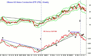
One of the top performing ETFs in 2012 was the iShares Home Construction ETF (ITB) as it was up 79.36% versus a 15.99% gain in the Spyder Trust (SPY). As most traders are aware, the weekly analysis is more reliable than the daily analysis and I will concentrate on it in this article.
Click to Enlarge
For those who are not familiar with my relative performance analysis, the red line on the bottom of the chart (the RS line) is the ratio of the instrument (ITB) to the S&P 500 or the SPY. In addition, I run a 21 period WMA of the RS line.
The price of ITB had been in a general downtrend from April 2010 until early 2012. The RS line also shows a similar downtrend, line a. The first phase is when a ETF or stock starts to turn from a laggard to a leader. I look for several specific conditions to be met before this change is confirmed.
The first step is for the RSI to move above its WMA, which, for ITB, occurred on October 21, 2011. This is often an early sign that it is entering Phase 1. This was three weeks after the low. The home construction stocks rose sharply that week on heavy volume (Volume is Bullish for Homebuilders).
The second step is that I want to see the RS line either start a clear new uptrend or to break a long-term downtrend. This is needed to signal it has entered Phase 2. The downtrend in the RS line for ITB was broken on November 25 (line 1). ITB opened the following Monday at $10.76 which was not far above the October 21 close at $10.60.
By April of 2012, the RS line was in a clear uptrend, line b. This is the 2nd and most profitable phase as the stock or ETF is clearly now a market leader. The RS line held above its WMA until February 2013 when it dropped below it for one week. The uptrend stayed intact for the next two months as it was not broken until April of 2013. This is what I call this an “early warning signal.”
On this correction, the RS line also declined below its prior low so a new downtrend could be forming. The relative performance failed to make a new high with prices in May, thereby forming a negative divergence, line c. The high at $26.21 came the week of May 24. The break of support in the RS line four weeks later (line 2) was a sign that it was no longer a market leader as it had started a new downtrend. ITB had now become a market laggard (Phase 3).
NEXT PAGE: Any Other Market Leaders?
|pagebreak|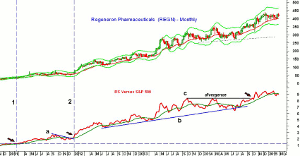
Click to Enlarge
The turning points in the ITB were pretty clearly defined, but that is not always the case. Regeneron Pharmaceuticals (REGN) was another leader in 2012 as it was up 208.62%. The long-term chart shows that it became a market leader initially in February 2011, line 1, as the RS line had moved above resistance that went back several years.
The relative performance underwent a short-term correction from September though December, as noted by line a. Prices and the RS line often show very similar corrective patterns. The RS line completed this correction on December 30, 2011, line 2.
The RS line stayed above its WMA until June 15, 2012 as it dropped below it for six weeks before turning positive again on July 27. After a brief test of the WMA in November, the RS line held above its WMA through the end of 2012. In early 2013, REGN had a shallow correction in prices that was over by April and the RS line also moved back above its WMA.
For REGN, 2013 was also not a bad year as the stock was up 60.89%. Throughout 2013 the RS line formed higher highs and higher lows, but the RS line did drop below its WMA several times.
In early 2014, the RS line did not make a new high with prices, line c, and dropped below support, line b, for two weeks in July. This potential new downtrend was reversed in September 2014 as the RS line moved above the bearish resistance at line c, and made new highs. Therefore, a new downtrend in the RS was avoided. Currently, the RS line is still in an uptrend but is below its WMA.
Click to Enlarge
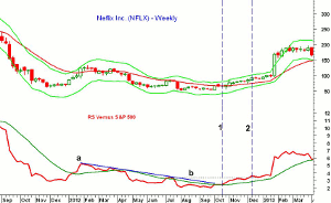
Without a doubt, Netflix, Inc. (NFLX) was one of the top stocks in 2013 as it was up 297.63%. The Spyder Trust (SPY) that year was up 32.31%. The stock had hit a high in July 2011 of $304.50 before dropping to a low of $52.81 in April 2012. The RS line formed a ten-month downtrend between January 2012 and October that was finally overcome the week of October 19. The RS line had moved above its WMA a few weeks earlier (Phase 1).
The next important level in the RS line to watch was the July high, line b. This resistance was overcome December 14 as NFLX closed at $93.30. At this point, NFLX had made the transition from Phase 1 to Phase 2 as the WMA of the RS line was also now rising.
Click to Enlarge
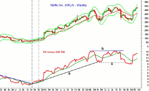
The stock exploded to the upside the week of January 25, 2013 as it had a weekly range of $96.59 to $172.68, closing at $169.56 in reaction to their powerful earnings. The RS line dropped below its WMA for one week in April but the WMA was rising sharply at the time. A drop in the RS line below a sharply rising WMA is less of a concern.
The drop below the WMA was more severe in January 2014. The RS line did make a new high with prices in March before triggering a low close doji sell signal. On the following decline, the WMA was broken three weeks after the high. By end of April, the uptrend was also violated.
Though NFLX made higher highs in both June and September, the RS line had lost its momentum and formed lower highs. The support in the RS, line c, was broken in November, but NFLX staged another strong earnings rally this January and is again back to its highs. The RS line is well above its WMA but has not yet made new highs. Therefore, the broad range could be either a massive top or a continuation pattern.
NEXT PAGE: Were There Any Surprises?
|pagebreak|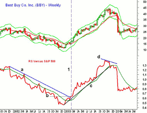
Click to Enlarge
Another surprising top performer in 2013 was Best Buy Co. Inc. (BBY) as it was up 248.32% according to Morningstar. This is in spite of what seemed to be a very negative fundamental outlook as they had announced plans in March 2012 to close fifty stores. This was followed on August 21 by a reported 91% drop in second quarter profits. The chart shows that the relative performance was in a well established downtrend in 2012, line a.
The stock was also in a steady downtrend for most of 2012, losing over 46% for the year. On January 18, 2013, the RS line moved above its WMA, which made the resistance at line b, the key level to watch. This key level and the downtrend (line a) were overcome in the latter part of February (line 1). This signaled that BBY was now a market leader. It closed that week at $17.02.
The RS line stayed well above its strongly rising WMA until the fall as it peaked on October 18, 2013. As it turned out, BBY made a new high three weeks later, but the RS did not confirm prices as it formed a negative divergence, line d.
Just three weeks later, the RS line moved back to its flat WMA (see circle) before again turning lower (line 2). This was a bearish setup as BBY closed at $40.51. Just five weeks later, it closed at $24.43.
Click to Enlarge
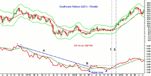
Southwest Airlines (LUV) was one of the top performers in 2014 as it was up 125.80% versus just 13.46% for the SPY. As is often the case for stocks that become long-term market leaders, it emerged as a stock to own much earlier. This chart covers the decline from the November 2011 high as the RS formed a slight negative divergence at the high, which was the start of its downtrend.
This downtrend, line a, was tested in early 2012, before the RS line dropped again, making its final low in April 2012. On the next rally, the downtrend in the RS was broken just after its WMA was overcome. The key resistance for the relative performance, line b, was established on this rally.
This is typical of the transitory period between when a stock changes from one that it is lagging the market into one that is leading it higher (Phase 1). After peaking in the summer, the RS line again dropped below its WMA but did make higher lows. The RS line moved back above its WMA (line 1) as LUV was trading in a very tight range.
Five weeks later, on December 12, the RS line moved above the key resistance (line 2) confirming that it was now a market leader (Phase 2) as the RS had formed higher lows and higher highs.
Click to Enlarge
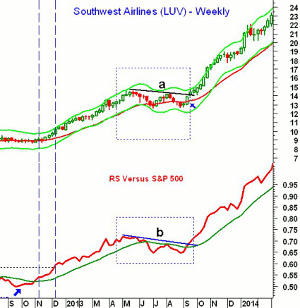
The RS line stayed above its WMA until June 21 as it rose from $10.19 to $13.48. The chart shows that both prices and the RS formed continuation patterns (see rectangles). The weekly flag formation took 17 weeks to be completed as the downtrend, line a, was broken on September 20. A week earlier, a high close doji buy signal had been generated.
The corresponding resistance in the RS, line b, was broken at the same time. The RS line quickly started to rise very sharply. In a very strong- and long-term, uptrend, corrections like this in the RS line and prices are quite normal. From high to low, LUV dropped 13.6% but did hold above the previous swing low at $12.44 as the correction low was $12.58.
NEXT PAGE: The Uptrend Confirmation
|pagebreak|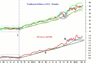
Click to Enlarge
The confirmation that the uptrend in prices and the RS line had resumed came on September 20 as LUV closed at $14.41, line 1. Since then, the RS line has stayed well above its rising WMA. It even held above it during the 20% correction that occurred in September-October 2014 (see circle). The rising 20-week EMA also held on a closing basis during this correction.
With LUV now trading above the $45 level and very close to making a new weekly closing high, the RS line has not yet made a new high yet. The RS line is in a strong uptrend, line a. Though it is possible that a negative divergence will form, it is too early to suggest that LUV is losing its leadership role. The RS line now has key support, at line b, and a break of this level could signal Phase 3.
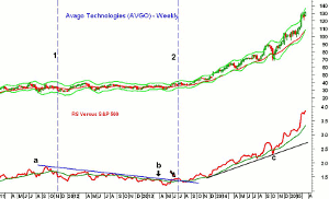
Click to Enlarge
Another market leader in 2014 was Avago Technologies (AVGO) as it was up 92.55% after rising 69.85% in 2013. It also provides a slightly different example of how a stock goes through the different phases of RS analysis.
AVGO was a market leader in 2010 as it rose over 55% but the RS analysis signaled that it had turned into a laggard in November 2011 (line 1) when the RS line started a new downtrend. The downtrend, line a, stayed intact until May of 2013.
The turnaround was quite rapid after the stock had been through a long period of consolidation, not a major correction, in 2012. The RS line moved above its WMA on May 24, 2013 and three weeks later moved above its downtrend. By July 5, the RS line also moved above the early 2013 high (see arrow), confirming that is was a market leader.
From the close on July 5 at $37.38, the stock is now trading above $131 as the RS line continues to make significant new highs. It is also well above its uptrend, line b, and its WMA, so it is still a market leader.
In order to catch one of these major turnarounds, you might keep a list of companies that have been weak for a year or two. Monitor these issues every other week to see if you see any changes in their price behavior. When they do start to move higher, then run the relative performance analysis and determine if you can observe a clear downtrend.
A strong move above the WMA will often be an early sign that you are ending Phase 3 and starting Phase 1. Once the weekly RS starts a new uptrend, then you are now in Phase 2. Once you are transitioning from Phase 1 to Phase 2, you will need to pay closer attention to the price and start to determine your entry strategy. One of my other favorite technical tools—the on-balance-volume—should help you in this process.
Often times, you can be patient as the stock will generally not take off immediately. If you look at the chart of AVGO you will see after it turned into a market leader it corrected for several weeks back to its 20-week EMA. The daily analysis will give you more false signals, but will also sometimes get you in earlier. The monthly RS analysis will give you the confidence to buy during the weekly corrections.
Once you are in a market leader, you need to be clear as to whether you want to stay with the major trend or attempt to trade the swings. In either case, you need to monitor the RS analysis weekly to see if there are any significant changes.


