

Technician Corey Rosenbloom of AfraidToTrade.com studies the monthly, weekly, and daily charts to outline what he calls, ‘the purity of the price trend in motion’ for this powerhouse stock that has been trending since its mid-2012 breakout.
You may not be aware that Disney (DIS) is one of the strongest trending stocks in the Dow Jones and S&P 500 right now and has been since its breakout in mid-2012.
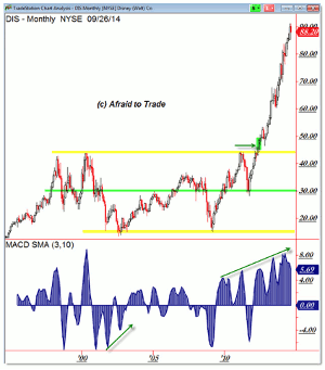
Let’s start with the Monthly Chart (where the magic is) and study this stock from there:
Click to
Enlarge
I wanted to focus this post on the purity of the price trend in motion for Disney DIS shares.
Note the typical sideways long-term consolidation from the 2000 peak to the 2002/2003 low into the peak near 2007 and the retest of the bottom of 2009.
Many stocks show a similar pattern (top in 2000, bottom near 2002, top again in 2007, bottom again in 2009) and other stocks also share breakouts to new all-time highs in the 2012/2013 period, but there’s something special—if not magical—about Disney shares.
The strength and persistence of the strong uptrend that took place in mid-2012 carried price almost straight up into the current $90 per share level (doubling from the $45 per share resistance).
This isn’t a pattern we see often and it’s certainly not a pattern we see for the typical Dow or leading S&P 500 stock (or a company as well-known as Disney).
Nevertheless, the stock speaks to the strength of uptrends and the preference for pro-trending strategies such as buying retracements or breakouts (instead of trying to call that illusory top or bottom…which is possible but extremely difficult).
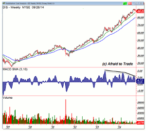
The weekly chart further confirms the trend strength over the last few years:
Click to
Enlarge
Remember the $45.00 level as the multi-year resistance high and then note the breakout—then pullback to this level—then second breakout during 2012.
This breakout set the stage for the persistent (strong) uptrend that actually began with the 2011 price low but continued with the bullish money flow after the breakout to new highs.
In a strong trending stock, we often reference the rising 20- or 50-week EMAs (which is the case now in the S&P 500).
A pullback to this level can offer a favorable risk/reward entry into a swing trading (or longer) position (placing and trailing the stop under the 20- or 50-week EMA depending on your risk tolerance).
We do note divergences in a lengthy trend, which tempers the bullishness and we’re currently seeing another pullback (retracement) to the rising 20-week EMA, it would appear.
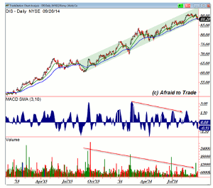
The Daily Chart also shows persistent strength and shorter-term entry signals (bullish swing trades) into a strong trending stock:
Click to
Enlarge
The chart above details the breakout and pullback ahead of the 2013 sustained rally (green uptrend).
Yes, we’re still seeing negative volume and momentum divergences, yet the trend remains strong and there is no sell signal until price firmly breaks under the rising parallel trendline channel or a weekly EMA level.
Watch the current pullback cautiously to see if support holds, or else fails, and otherwise be sure to study the charts as a reference for the concept of “Strong Getting Stronger” in terms of simple strategies to join a trend rather than fight against it.
By Corey Rosenbloom, CMT, Trader and Blogger, AfraidToTrade.com


