
Forget all the complex indicators and start by relying on simple trend lines, which allow us to identify and execute low-risk, high-probability trades. Consider these real market examples.
We're going to take a look at a very simple trading technique that even seems too simple to help us make decisions. Very often, beginning traders believe that trading has to be complicated to be effective. If trading is really easy, why isn't everyone making money doing it, right?
Well, if you need trading to be complicated or complex, stop reading now and definitely don't come to one of my classes!
Before we start looking at this trend line technique, I must re-emphasize the often-quoted fact that properly identified supply and demand levels are the most effective way to trade, giving us the lowest-risk, highest-reward trading opportunities.
Occasionally, we may miss these optimum reversal trades and must follow the trend by using one of our trend-following techniques.
Using trend lines to define our trend is an easy way to figure out which direction the chart is taking us, and which type of trade we should be looking for—long or short.
The way we discuss trend lines in class is that it shows where the traders in charge of this trend are doing business, buying the dips in uptrends and selling the rallies in downtrends.
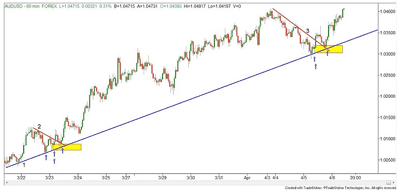
In the following AUD/USD chart, the upward-sloping blue trend line labeled "1" is showing where the bullish traders are aggressively buying the dips in the uptrend. As a reminder, we like to say that it takes two points to draw a line, and the third is our trading confirmation.
Click to Enlarge
The downward-sloping red lines on this chart indicate where the bears were in charge…at least for those few candles! Notice that where these opposing trend lines intersect resemble triangles.
Obviously, price can't stay inside these triangles forever, so the action is to trade in the direction of the broken trend line. Another reminder is that trend lines act as angled support/resistance lines.
As I'm sure you recall, what was a support line can become a resistance line, and vice versa. Notice how the broken red trend lines were acting as resistance, but then became support? Nice little odds enhancer, isn't it?
Notice the yellow-shaded demand zones. The reason I choose to indicate these swing lows is because those two lows showed the enthusiastic bulls who came in and bought, breaking the downward-sloping red trend lines from the double blue arrows. The two retests in these demand zones gave a couple of very easy, high-probability entries to join the overall upward trend.
So, if the triangles work on the long side, do they work on the short side as well? Of course!
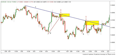
In the following EUR/USD chart, the downward-sloping trend line labeled "1" is showing where the bears are in control, while the shorter, red lines are showing where the short-term bulls are in charge.
Click to Enlarge
The double arrows are showing the origination of the downward moves that had enough power to break the upward-sloping trend lines. Drawing in the yellow supply zones give you an easy indication of where you could consider entering a short trade to join the bears in their continued down move.
Hopefully, watching the triangles of these opposing trend lines will help you join trends already in progress.
By Rick Wright, instructor, Online Trading Academy


