Most charting software includes dozens of different indicators that can be displayed on the charts, but Michael Fowlkes of Market Intelligence Center outlines the most important ones to know.
Attend The TradersEXPO New York 2018 - Engage with Top Trading Experts
In order to become a successful investor, we need to be able to develop two distinct sets of skills. They are commonly known as fundamental and technical analysis. They are very different skill sets, yet they are equally as important to learn if you truly want to understand what is going on with your stocks.
Fundamental analysis is essentially digging into a company's financials. Fundamental analysts study everything that could potentially affect a company's value. This can include both macro and micro economic factors as well as things like the company's strategic planning, supply chain and even employee relations. Technical analysts study stock charts, operating under the premise that trends tend to occur over and over again.
For someone starting to learn technical analysis, it can be a daunting experience. There are so many terms and phrases that it can get a bit overwhelming. We are going to look at a few easy-to-learn concepts that you can use as a starting point along your journey into technical analysis.
For our discussion, all of our charts were obtained from stockcharts.com. You can visit this site to re-create any of the charts, and use the following tools to evaluate your personal holdings as you learn how to incorporate technical trading in your investing arsenal.
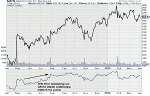
1. The Accumulation/ Distribution Line
What the accumulation/distribution line (A/D line) seeks to determine is whether money is either flowing into out of a security. When the A/D line is sloping upward, it can be assumed that new money is coming into a security. The opposite is true when the slope is headed lower.
You will notice that in most cases this indicator runs pretty close to the movement of the stock, but it does tend to move slightly sooner than the underlying security and can be used to tell if a near-term rally or sell-off is expected. Take a look at the following chart on Amazon (AMZN). You will see where Amazon was trading in a sideways pattern between June and August, but the A/D line was sloping upwards. Starting in August, the stock started to trade higher. You can see the same thing happening in reverse at the end of September.
AMZN A/D Chart
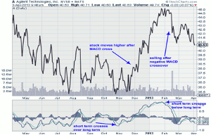
2. MACD
The MACD, which stands for moving-average convergence/divergence line, is probably the most widely used technical indicator. It signals not only the trend, but also the momentum of a stock. The idea behind the MACD line is to compare the short-term and long-term momentum of a stock in order to estimate its future direction. Basically it is the comparison of two moving averages, which you can set for any time period you like, but typically the 12-day and 26-day moving average of the stock are used.
The idea behind MACD is that when the short-term line crosses the long term line, it is a signal of future stock activity. When the short-term line is running under the long-term line, and then crosses above it, the stock will typically trade higher. Likewise, we can predict a selloff when the short-term line crosses under the long-term line. You can see both of these instances in action in the following chart on Agilent (A).
A MACD Chart
NEXT PAGE: 3 Chart Patterns to Watch
|pagebreak|
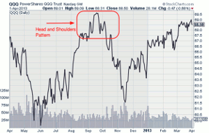
3. Head and Shoulders Pattern
The head-and-shoulders pattern is not an indicator like our first two examples, but instead a chart pattern that technical analysts look for. Simply put, a head-and-shoulders pattern appears when a stock rises to a peak to form the first "shoulder" and then falls. Then it rises above the previous peak to form the "head" and then falls below the first shoulder before rising again to the level of the first shoulder and falling, hence creating the second shoulder.
Technical analysts believe that a head-and-shoulders pattern is one of the most reliable trend-reversal patterns. If you see such a pattern start to develop on one of your holdings, then be aware that future selling could be coming. As you can see in the following graph, shortly after Nasdaq 100 ETF (QQQ) showed its head-and-shoulders pattern, there was a steep sell off in the security.
QQQ Head-and-Shoulders Chart
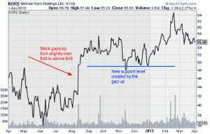
4. Gaps
Gaps occur when a stock opens much higher or lower than the previous day closing price. Typically, this occurs due to some news that is released when the market isn't open, such as earnings, which result in a sizable move during after-hours trading, and the stock picks up at this point when the normal trading day gets under way. Gaps are important because they create new support or resistance lines for the security.
A perfect example of this happening can be seen in the chart on Michael Kors (KORS) below. In August, there was a major opening gap in the stock, which then served as the new support level moving forward. Gaps are important because a lot of traders set up sell orders using support and resistance points as their stop loss or limit. If you use stop loss or exit orders, and there is a gap in one of your stocks be aware that your exit orders will need to be revised.
KORS Gap Chart
5. Double Tops or Bottoms
Another chart pattern that forecasts a changing trend is a double top or bottom. Spotting this chart pattern is a fairly simple process. In terms of a double top, a stock on two occasions tests a specific price level, and in both cases the stock hits resistance. On the other side of the coin, a double bottom occurs when a stock falls to a certain price level and finds support on both occasions. A double top indicates future selling, while a double bottom indicates that the stock is getting ready to trade higher.
AN Double Top Chart
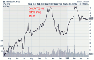
You can see a classic example of a double top formation in the Autonation (AN) chart below. This chart illustrates how the stock climbed to $48.50 in October before selling off. Then the stock gained strength and once again climbed all the way back to $48.50 in February. Once the stock was unable to break through the previous high, it formed a double top and another sell-off took place. Technical analysts would have spotted this double top and either exited any long positions once it was made, or shorted the stock and profited from the downside.
By Michael Fowlkes of Market Intelligence Center