
Options instructor Russ Allen of Online Trading Academy adds three more lines to the same option payoff graph for an option trade that he first introduced last week to now map out the profit or loss at different dates in the future.
My last article was the first in a series on the option payoff graph or risk graph. Today we continue with that.
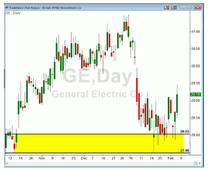
Our example was a neutral-to-bullish option trade on General Electric (GE) stock. We actually began this example in an article on types of options expiration dates a few weeks ago and, so far, GE is still hanging in there.
Here is what the GE chart looked like on February 4:
Click to Enlarge
We expected GE to reverse out of the demand zone created last October in the range from $27.48 to $28.03. A week ago, we could have sold the GE February puts at the $27 strike price for $.39 per share or $39 per contract.
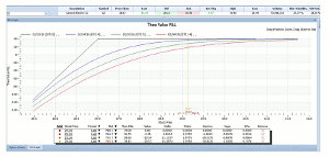
In last week’s article, we showed the option payoff graph for that option trade. Here we update that to show it as of now, with some additions:
Click to Enlarge
Last week we only showed the one gray line, which represents the profit or loss on this trade at the displayed stock prices if we held that position until the puts expired.
Last Thursday we added three more lines (the blue, green, and red ones) which show the profit or loss at different dates in the future. The red one is as of Thursday, February 4, at which time there were 14 days to expiration. The green line is as of Wednesday, February 10, when there will be nine days to go. And, the blue line is as of Sunday, February 14, when there will be just four days to go.
The straight gray lines, as stated above, represent the profit at any stock price on the expiration date. At that time, the option will have a value exactly equal to its intrinsic value, the amount by which the stock has fallen below the $27 strike price, if any. If the stock is not below $27 at that time, the position will be worthless. That is what we want since we have sold the option short. We would then not have to pay anything to extract ourselves from the option trade and we would keep the $39 we received for selling the put. That is why the gray line is horizontal at a height of $39 at all stock prices at or above $27. It slopes downward to the left at stock prices below $27, which reflects the fact that if the stock is lower than $27, the puts will have value and we would have to pay that value. That reduces our profit. To read the entire article click here…
By Russ Allen, Instructor, Online Trading Academy


