These unique and popular tools can be a helpful way for longer-term investors and traders to identify high-probability trades.
By the Staff at Investopedia.com
Originally designed for long-term investing but now used by traders as well, point and figure (P&F) charts have been described as one of the simplest systems for better determining solid entry and exit points in stock trading.
The system monitors supply and demand of each issue while keeping a keen eye on developing trends. While point and figure charting has never been on the top of the list of popular techniques used by technical analysts, there is a growing interest in P&F from all corners of the charting community. Here we take a close look at P&F charts and how to read and construct them.
Constructing P&F Charts
Conventional technical charts tend to be the open-close/high-low chart. In the creation of P&F charts, the emphasis is only on the closing price of an issue. The developers of P&F charting were interested in trend development, and thus were concerned not with the noise created daily by minor moves up or down, but with the larger picture and how that plays out in the areas of supply and demand.
The key to P&F charts is the establishment of the unit of price, which is the unit measurement of a price movement that is plotted on the graph. On P&F charts, there is no time axis, only a price axis. Rising stock prices are shown with X's and falling prices are shown with O's. These points appear on the chart only if the price moved at least one unit of price in either direction.
So say the closing prices of a stock moved up one price unit three times. This would appear as a column of three X's. If the price movement reverses direction, the chart shows a new column of O's, wherein an O is plotted for each unit of price movement. X's and O's never appear in the same column. The chartist, however, must establish how many price units make up a box, which is how much the price must move in the opposite direction for the chart to begin a new column.
Let's say, for example, the stock you were tracking was trading at $25, you were using a $1 unit measurement, and a reversal box of three units. Now, if the stock had been trading upward to $25, the stock would have to close at $22 before the chart would reverse to a column of O's. Because each unit of price movement must be plotted, each unit of price movement down from the $25 level must, in this new column of O's, be represented by one O.
The next reversal would have the stock trading up at least $3, or three points, before a new column of X's came back into view on our P&F chart. Assume then that the issue continues to fall to $20 before reversing itself; the X's would reappear once the price hits $23. Remember, you choose the unit size. It could be $0.50, $1, or even $2 if the stock price is high enough. Graphically, the first two columns of our example would look like this:
| $25.00 | X |
| $24.00 | XO |
| $23.00 | XO |
| $22.00 | XO |
| $21.00 | X |
NEXT: How to Read P&F Charts, Plus Real Chart Examples
|pagebreak|Reading P&F Charts
Now that we have had a look at how to construct a P&F chart, the next question is how to read it. It is clearly understood by P&F experts that the law of supply and demand determines the price of the stock. If the issue is rising in price and we have an uptrend in place with at least three X's, we believe that demand has overcome supply. The reverse, when that chart gives us three O's, indicates supply has overcome demand. P&F charts show us the establishment of trends, trend reversals, and the supply and demand of charted issues.
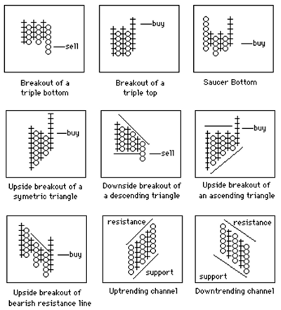
Here are some examples:
Figure 1: Examples of trends illustrated by point and figure charts
The following will give you a solid base to further study two important principles of P&F charting: support and resistance levels. You should remember that both support and resistance are shown in horizontal lines and trend lines are represented with 45-degree angles.
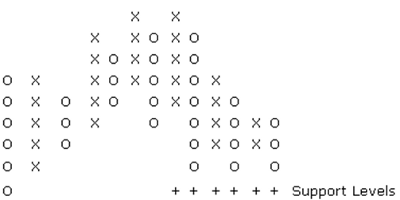
Support Levels
A support level is a level at which investors and traders alike believe prices will start to move higher after hitting the support mark. Have a look at the three O's in the example above to see what this means. A horizontal row of O's is what you are looking for when zeroing in on a trend reversal and an uptrend to begin.
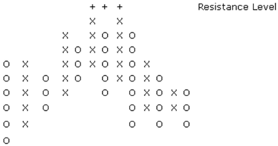
Resistance Levels
A horizontal row of X's marks the resistance levels you need to be looking for in the P&F charting study. Studies of trend lines have shown that a break through resistance levels generally occurs with great gusto; that is, with big volume and a rapidly increasing stock price.
Bottom Line
Trends take a long time to reverse, so traders should remember that P&F charting is designed for long-term investors and has no value whatsoever for the short-term trader. By using point and figure charting to identify overall price trends, technical investors can take positions that have a strong probability of profiting. This is just a basic overview of P&F charts.
The best book ever written on the subject is Point and Figure Charting, written by Thomas Dorsey. This book is a must for all those who want a thorough understanding of this popular charting method. Since the introduction of P&F charts, they have been deeply integrated in other technical analysis and trading strategies.
By the Staff at Investopedia.com


