

The man dubbed by Barron's as the "technician's technician" Martin Pring of Pring.com shares why he thinks that a commodity bull market is about to start again.
In June, I discussed "Are commodity prices about to explode?" The question mark was there because a lot of ingredients were in place for a major rally, but I also pointed out that we really needed confirmation from some of the key averages.
Now I am going to remove the question mark, because two months later, a substantial number of indicators are crying "commodity bull market." Take a pinch of salt with the explode part of the headline because there are no known techniques for consistently forecasting the character of a forthcoming price move. I am not ruling it out, merely forecasting that in one way or another prices are likely to be substantially higher by year-end.
Commodity indexes are a disparate bunch, and some have already experienced tentative breakouts while others look set to. What's really interesting is that traders in other markets, which often anticipate commodity rallies, have already started to discount inflationary times ahead. In effect, they are telling commodities that it's time to get moving.
Click to Enlarge
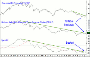
Chart 1 for instance, features the stock market in the form of a ratio between the Goldman Sachs Natural Resource ETF (IGE) and the Spyder Consumer Staples (XLP).
When it's rising, this stock market relationship is forecasting commodity inflation. That's because traders are more enthusiastic about bidding up the price of the inflation-sensitive IGE than its defensive and deflationary counterpart the XLP. You can see from the chart how the ratio's movements correspond quite closely to those for the Dow Jones UBS Commodity ETN (DJP).
What is clear though, is that the ratio violated a two-year down trendline last week. That suggests it's going higher. In effect, it's the stock market's way of forecasting higher commodity inflation. Moreover, this price action also signals a change in sector leadership in favor of earnings-driven areas such as energy, miners, and basic industry over deflationary beneficiaries such as homebuilders, financials, and utilities. The bottom window features, the Special K, a summed cyclical rate-of-change indicator. It is designed to identify primary trend reversals, and does so on a fairly consistent and accurate basis when it crosses trendlines of nine months or greater duration. As you can see, it broke above its bear market trendline last week and strongly supports the breakout of the DJP above its 2013 down trendline.
NEXT PAGE: Other Signs of a Commodity Bull
|pagebreak|The other asset class to signal a more inflationary environment is bonds. For instance, the recent rise in yields and drop in prices has been widely attributed to liquidation ahead of the Federal Reserve unwinding its bond purchase program.
However, that could be a smoke screen for the fact that bonds have actually been anticipating a bout of commodity price inflation. Remember, they hate inflation as it eats into the purchasing power of credit market instruments. That point is debatable, but what is not, is recent price action of a powerful bond relationship that is closely tied in to commodity price movements.
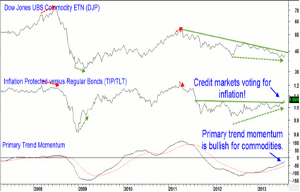
TIP/TLT Ratio
Click to Enlarge
You might think that studying the price action of inflation protected bonds would be a guide to inflationary expectations and a safe haven for capital when yields rise. However, the Barclays Tips Bond ETF (TIP), has lost around 10% of its value since April, so that's not the answer. What is helpful is to compare the performance of the inflation-sensitive TIP to a regular bond ETF, such as Barclays 20-year Trust (TLT).
This relationship is shown in chart 2. A rising ratio tells us that bond investors have a preference for inflation-protected bonds. In theory, this should mean that they are fearful of inflation. That's also the case in practice, because the ratio moves up and down with commodity prices. At important turning points, bond investors appear to be more savvy than their commodity counterparts as this relationship leads the DJP. Previous instances have been flagged with the dashed arrows.
DJP/TLT Ratio
Click to Enlarge
Recently, there has been another such discrepancy as the DJP briefly touched a new bear market low in July but the ratio did not. Now the TIP/TLT relationship has broken out from a base and this action is re-enforced by intermediate and long-term momentum. All of this supports the case for a much better TIP relative performance, as bond investors seek inflation protection. Where the ratio goes commodity prices are likely to follow.
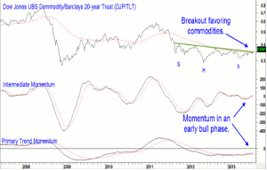
The ultimate inflation/deflation relationship is that between commodities and bonds. An example is featured in chart 3, with the ratio between the DJP and the TLT. See how it has just broken out from a large base and is being supported by rising momentum. This is bullish for both the intermediate (6-weeks-9-months) and primary (9-months-2-years) trend.
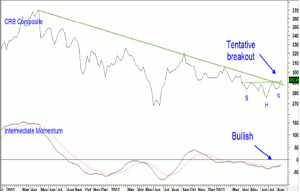
CRB Index
Click to Enlarge
Finally, chart 4 features the popular Thompson Reuters CRB Composite. Last week, it tentatively broke above a two-year (primary trend) down trendline and completed a small inverse head-and-shoulders base. Since the intermediate momentum is bullish, and by no means overstretched, I am expecting to see a more decisive move to the upside.
Explosive? Possibly, but I think the technical picture is certainly telling us it's time for the start of another commodity bull market. My advice? Buy industrial commodities and commodity-sensitive stock market sectors and avoid bonds and interest-sensitive equities. Aggressive investors who are aware of the risks might alternatively buy the DJP and short the TLT or go long the IGE and short the XLP.
By Martin Pring, President, Pring.com