
We're mid-way through the third quarter of 2009, and the major averages have reached more significant resistance, so it seems appropriate to take a look at the major sectors. Since our last sector analysis on May 15th, the S&P 500 has risen from 882.50 to 1010.50, and many of the major sectors have done even better.

Figure 1 - Click to Enlarge
In March and May, the primary reason for my positive view was the clear bullish divergences that appeared on the weekly charts of the major averages as well as the charts of the market internals. The weekly S&P 500 chart is a good example as the RSI made a low of 16 in early October (point 1), but was much higher in early March (point 2) despite the S&P being substantially lower. The two-year downtrend in the RSI (line a) was broken the week ending March 27th, which confirmed the positive divergence. The RSI has continued to make new highs, which is positive. The price chart shows that the 38.2% resistance level has been reached, with the 50% level at 1120. Good support in the 920-950 area should hold on any correction. From the weekly analysis, there are no signs yet of an intermediate top.
Table 1 - Click to Enlarge
The sectors I liked best from the May report were the Materials and Consumer Discretionary, as I had already identified the Information Technology sector as a favorite the prior month. I was unfortunately not convinced that the Financials sector had bottomed, and therefore missed the dramatic rally. Only the Materials and Information Technology sectors are showing nice gains for 2009 and they remain two of my favorite areas. I had been closely monitoring the triple bottom in the RS chart of the Consumer Discretionary sector, and its completion was noted in the daily report on March 27th. The completion of the major reverse head-and-shoulders bottom formation in the Industrials makes it—and the Financials sector—ones to watch. The remaining sectors are neutral to negative, but we will examine them further also.
Figure 2 - Click to Enlarge
The RSI for the Materials sector also formed a five-month positive divergence at the March lows (line b), though the long-term downtrend in the RSI (line a) was not overcome until the latter part of April. The Materials are up 70% from the March lows and a respectable 32% for the year. The 38.2% resistance was overcome last week, with the 50% level just below 200. In May, we suggested that a pullback to the 130-140 area would be a good buying opportunity. The setback in early July just reached the 143 area before the Materials accelerated to the upside. Even though the sector is overbought, the weekly trend is still positive, and any pullbacks in the weekly RSI to the 50-55 area and the rising WMA should be a buying opportunity.
Figure 3 - Click to Enlarge
The Information Technology sector is up 59% from the March lows and is the best performer for the year, up 36%. It has gotten plenty of attention over the past few months, having reached the major 50% retracement level for the sector and for the NASDAQ. There is a band of strong resistance at 340-350, along with the 61.8% resistance, which could take several attempts to overcome. The RS chart shows that the Technology sector moved above its WMA in early 2009, then broke out above resistance at the end of February, which was featured in our March 4th daily report. This sector should continue to be a leader until there are signs that the WMA is starting to flatten out, but it currently is rising sharply.
NEXT: Industrials, Financials, and More |pagebreak|
Figure 4 - Click to Enlarge
The Industrials sector made significant new lows in March, which helped me to incorrectly conclude in May that the rebound in the RS was just an oversold bounce. Clearly, I was wrong as the sector is up 68% from the March lows and 6% for the year. The sector did test the strong resistance above 200 in early June, but then pulled back to the 180 area in early July, forming the right shoulder of a reverse head-and-shoulders bottom formation. The sector closed above the neckline at the end of July and was strong again the first week in August. The upside targets from the head-and-shoulders formation are in the 280 area, which also corresponds to very strong chart resistance. This is a sector made up of quite a few different industries, which are likely to be some of the best performers as the market rally continues. Over the past month, some of the strongest industries in this sector have been machinery, conglomerates, and home construction.
Figure 5 - Click to Enlarge
In December 2008, I first started discussing and watching the triple lows in the RS for the Consumer Discretionary sector. As noted earlier, the formation was completed at the end of March 2009, while the downtrend in the RS (line d) was broken at point 1. This sector is up 68% from the March lows and 23% so far this year. It was also a good sign that the RS formed a positive divergence at the March lows (line e) as prices were making lower lows (line c). The uptrend in the RS is still intact and the sector has just moved through its longer-term downtrend (line a). Now that the 38.2% resistance has been overcome, the 50% level stands at 220, with the 61.8% resistance at 245.
Figure 6 - Click to Enlarge
Clearly, the Financials sector has been one of the star performers, as it is up 146% from the March lows, though only up 14% for the year. Technically, the weekly trend is still positive, as the RSI formed a positive divergence at the low (line c) that was completed by the RSI moving though its downtrend (line b). The RSI just tested the rising WMA during the June pullback, but has since made sharply higher highs. The sector is still well below the 38.2% retracement resistance at 245 with even stronger resistance in the 300 area. Therefore, this sector still has room to move on the upside.
Figure 7 - Click to Enlarge
Two of the defensive sectors that held up better during the bear market, Consumer Staples and Health Care, have underperformed the S&P 500 recently, and the RS analysis indicates that this can continue. The Consumer Staples sector is up 26% since the March lows, but just 1% for the year, which does not compare well with 52% and 15%, respectively, for the S&P 500. The sector has reached the 50% retracement resistance, but closed lower the first week in August. The RS peaked at the March lows and has since formed lower highs (line a). It is below its declining WMA and is now testing the longer-term uptrend (line b). A break below it would suggest that the sector will continue to lag behind the general market.
NEXT: Telecom, Utilities, and Helpful Multi-Sector Map |pagebreak|
Figure 8 - Click to Enlarge
The Telecommunications sector has been the weakest this year, as it is up only 19% since the March lows, much weaker than the S&P 500, which is up 52%. However, if you had to be in a sector last fall, this was the sector to be in, as the downtrend in the RS was broken in October (point 1). The uptrend (line c) stayed intact until early April (point 2), when the RS dropped below its WMA. It has plunged since and shows no signs yet of stabilizing. The price chart still shows a broad trading range (lines a and b) and the 90 area could be tested.
It may be surprising to many that the Utilities sector is up 29% since the March lows, even though the sector is down 1% for the year. The weekly chart shows a downward-sloping trading channel, which is negative (lines d and e). The multi-year uptrend in the RS (line f) has just been broken (point 3), which indicates that the sector will continue to be weaker than the S&P 500.
The performance figures in Table 1 clearly reinforce the importance of being in the right sector at the right time, as the best performer for 2009 so far is up 36% and the worst performer is down 1%. Over the next few months, I will focus in on some of the sectors that we discussed in hopes of finding new opportunities, as we did with our in-depth look at the Technology sector last April.
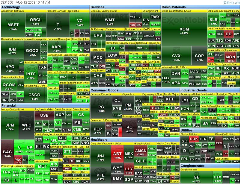
There are many good sources for information on sectors, and one I've recently discovered is www.finviz.com, which has a wide range of market and sector data available. I found the sector maps, such as the one below, to be quite interesting, as it is color-coded based on one-day performance. However, you can change the maps to show performance over different time periods or rank by other fundamental factors. They also have detailed coverage of world markets and individual stocks. You can also find this table at http://www.finviz.com/publish/081209/sp500_large1044.png.
Figure 9 - Click to Enlarge


