
While giving a Market Maps live pre-market session late last week, I began my look at the currency markets with a 20-minute chart of the Australian dollar against the US dollar. The live sessions always begin at 6:30 am CST and run just over an hour. Besides allowing people to literally watch me prepare my charts for the day's trading before the markets open, these sessions are filled with my own trading tips and techniques. When I see areas that I think trades could develop, I point those areas out and describe what would have to happen for me to enter a trade at or near that area. If I spot a quality trade entry while marking up my charts during the live session, I enter the trade and mark my charts accordingly while everyone watches. This allows people to see how I plan my trades using limit entry orders, how I use market structure to protect my stop loss orders, and why I choose the profit areas I do when entering a trade.
I was recently interviewed by the CME Group and one of their more interesting questions was: "How many currency pairs do you suggest a new or inexperienced trader watch and can you tell us which pairs you would recommend?" I tell traders who I mentor that watching too many currency pairs can be very distracting. More is not always more! I tell my less experienced students to begin with three currency pairs: The euro FX, the Canadian dollar, and the Australian dollar (all against the US dollar). The EUR/USD is the most liquid trading pair in the world and it does a good job as a proxy for general US dollar movement. Both the Canadian and Australian dollars give a trader great trending action and great range trading opportunities. Although most markets are currently filled with nice big swinging trends, this tends to come and go, and it is a good idea for all traders to know how to trade both trends and ranges so they can take advantage of any market condition.
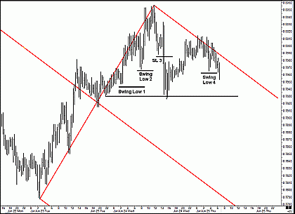
Let's look at a trade I took during one of last week's live Market Maps sessions:
Click to Enlarge
This is a 20-minute chart of the Australian dollar against the US dollar. Price had been in a very strong uptrend for some time, but then it began to show signs of the trend slowing. If you look at the upside movement on the left side of the chart, you'll see that price broke back below two prior swing lows from the left-hand run up in price. Then, price began making lower highs and lower lows. This chart image was taken just after I began the live session, when I began pointing out market structure on the Australian dollar as I charted it. When I noticed that price had just taken out another prior swing low (marked "Swing Low 4"), I added the red, down-sloping Median Line and its parallels. You should immediately note that price tested the red, down-sloping upper Median Line parallel a number of times several hours earlier (but of course, I was sound asleep!). As price continues making new lows for the move, it is pulling away from this red, down-sloping parallel. The current price action does not make me feel that I'll likely see a re-test of this red upper parallel soon.
But I like the market structure too well to simply shrug my shoulders, quit, and move on to the next currency pair. Instead, let me show you what I do.
| More tomorrow in Part 2. | Read Part 2 | Read Part 3 | Read Part 4 | Read Part 5 |
Timothy Morge
timmorge@gmail.com
www.medianline.com
www.marketgeometry.com


