
Greg Harmon of Dragonfly Capital discusses how the volatility index can tell a lot about market sentiment and points out that the way it currently looks might be indicating that the era of low volatility is ending.
Traders and Investors have many ways to measure sentiment. There are surveys like the AAII and others, the CNN Fear/Greed Index, Put/Call ratios, and any number of others. With the explosion in social media you can now also measure message volumes to get a sense either quantitatively or qualitatively.
These all have there limitations. Surveys and messages run the risk of mixed time frames and investors not doing what they say they are doing. The quantitative measures may be better but who knows why someone bought a put or a call with today’s complex strategies.
One of my favorites though is the Volatility Index. It is not perfect either. In fact, it seems kind of random in its design. Near month S&P 500 Put and Call activity is consolidated to create an average implied volatility for the S&P 500. As an exact measure of sentiment, it is not very useful, but how and when it changes can give some interesting clues to sentiment.
Click to Enlarge
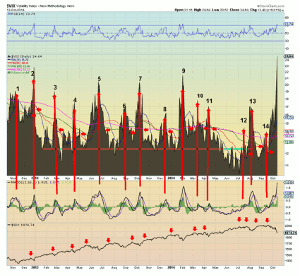
The daily chart of the Volatility Index (($VIX), ($VXX)) above has a lot to say about sentiment. I have written a lot in the past about the signals it has given over the past two years (labeled 1-14) of an impending new high in the S&P 500. But there is more there to see. Focus on the right hand side and Monday’s spike. This is the highest the VIX has measured since June 2012. Every one of those 14 peaks (and the June 2012 high) marked a low in the S&P 500. Will it happen again? Maybe.
This time became different from the last 14 when it went over 22, the high mark of the last two years. The era of low volatility may be ending. It could keep going higher, but the technical picture suggests if it does it will be short lived. The indicator that supports this is the RSI. At the top of the chart, the RSI does not like to remain over 70, in overbought territory. The combination of the spike and elevated RSI is what may let you sleep at night for the next few days. There may be more pain, but, from history, it should be short lived. If it is not short lived then things have changed.
Click to Enlarge
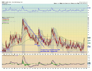
Adding weight to the case is the weekly VIX chart. Going back to 2007, every time the RSI on the weekly chart has touched that 70 overbought level, the VIX has pulled back fast, except for one. That was in the volatility around the financial crisis. Has the economy or market changed enough to look like 2007-2008 again? Watch not just the VIX but the RSI on the VIX. It will tell you what the aggregate view is on the market.
By Greg Harmon of Dragonfly Capital