Ratio chart analysis can be a reliable way to determine whether bulls or bears hold the advantage in the markets and predict upcoming moves, says Marty Chenard of StockTiming.com.
Indexes measure the market, but some indexes are price weighted, some are market-value-weighted or market-share-weighted, and some are float weighted. Understanding the details of each isn't that important, but what you need to know is that in these types of indexes, a few stocks can have an over-exaggerated impact on the movement of the overall index number. There are different ways of measuring what is happening in the markets and indexes are not always the clearest, which can be noted if we take a look back a few years, from a historical perspective.
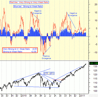
Index values don't answer a very important question: "What percentage of all the stocks are in an uptrend versus the percentage in a downtrend?" This is illustrated in the chart below as an example.
It is an important question, because the answer tells you who is in control of the market at that moment: Either the bulls or the bears.
Finding the answer is not a simple task, because you have to run an analysis of the strength of every stock on every index and do it every night. What we do is first run a program to count the number of stocks in an uptrend. We then we re-run the program to count the number of stocks in a downtrend. (We do this for every stock that has a value over two dollars.)
Next, we measure the number of very strong and very weak stocks. With that, we have a good view of what the bulls and bears are doing and if there is a power shift starting to occur. With the four computations, we can create bull/bear ratios for the broad market stocks and the leadership stocks in the market.
The answer relative to who is in control (bulls or bears) can then be easily determined by dividing the strong and weak numbers to produce a ratio. If the number is positive, then there are more stocks trending up than there are trending down. If the number is negative, then there are more stocks trending down and the bears have the advantage.
So, let's look at this ratio chart and analysis from 2010-2011 as an example. There are two ratios expressed in the top graph of the chart below.
The red line shows you the ratio of leadership stocks during that time period and the blue bars show you the ratio of the broad market stocks.
There are two things to note in this study. First, when both ratios are in positive territory, the bulls are in charge and the stock market rallies.
When both ratios are negative and the very strong ratio (red line) is lower than the broad market ratio (blue bars), then there are more bears than bulls and the market pulls back.
It is important to also note that the level and direction of leadership stocks will pull the market up or down. The higher the red leadership line is above the blue broad market ratio, the greater the positive pull is on the broad market. The opposite is also true.
At the time of this writing, the very strong (leadership) ratio has been positive and higher than the broad market ratio. There was one exception, on January 18, 2011, where the leadership ratio was slightly lower than the broad market ratio, but both were still at a strong positive level and that lasted only for that one day.
Also at the time of this writing, both ratios where positive and the bulls were in charge.
By Marty Chenard of StockTiming.com


