Ned Schmidt on SafeHaven.com takes a technical look at the charts to determine if commodities are speaking to us and, if so, what they are saying about US inflation.
Markets often do talk to us, if only we would listen. Our ears serve as only part of listening. An open mind is also required. Regrettably, minds receptive to new thoughts and questions have been somewhat outmoded in the investment world for many years.
Why else do so many seem to ignore what commodities are saying?
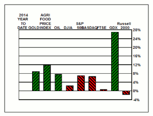
As we ponder the chart above, we again note that market trends continue in place. Thus far, in 2014, with almost 60% of it now past, commodities are performing better than the financial markets. As you can see in the chart, the GDX, an ETF of producing Gold mining stocks, has soared far above the crowd's favorites. The difference between the return on the GDX and the Russell 2000 suggests that some investors missed the train, the plane, and the ferry as 2014 opened.
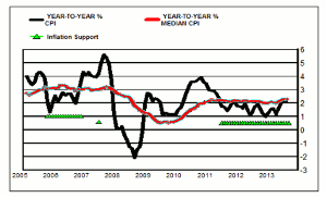
Commodities may be saying that complacency on prices might be inappropriate. In the chart above is plotted the year-to-year percentage change for the US consumer price index, black line, and a like measure for the median US CPI as prepared by the Cleveland Federal Reserve Bank.
The year-to-year percentage change on the median CPI being positive and above the percentage change in the headline CPI has preceded a rising trend for US inflation. In the early example shown in the chart, the year-to-year percentage change for the headline CPI rose fairly dramatically after those two conditions existed. A similar situation existed, as of Monday. Is a dramatic rise in US inflation-as measured by the CPI-about to occur again?
Perhaps the chart below may provide some insight into the answer to that question.
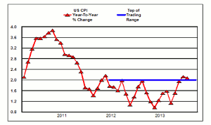
In it is plotted the year-to-year percentage change for the US headline CPI. Readily apparent is a formation that is not an unusual occurrence and often quite reliable. In first part of graph inflation rose to a high, almost doubling, and then crashed. It then went on to move into a lateral pattern that persisted for about two years. The top of that trading pattern is highlighted by the blue line.
The normal expectation when price moves up out of such a lateral pattern is a further advance for prices. As can be observed in the chart, the last two monthly reports for the US CPI place the year-to-year percentage change above the top of the lateral pattern. Is US inflation about to break out to the upside? For other examples of this formation phenomenon take a look at a two-year chart for AEM and GOLD.
The markets and the data do seem to be sending a message on prices, one unfavorable to US financial assets. When the US consumer price index was considered, we found two situations that suggest higher inflation in the US is a real possibility. Arguing with the market's message is rarely fruitful, as is following the consensus view.
By Ned Schmidt, Contributor, SafeHaven.com


