
Using recent chart examples, see how to clearly identify price structure as it unfolds on multiple time frames, which then allows the trader to choose a strategy and spot confirmation or early warning signs.
Do you know how to quantify price structure? It’s not a difficult concept at all, yet many traders miss the benefit of taking a moment to assess objective price structure in the context of a developing trend.
Doing so allows you to assess objectively the next likely swing, and thus the most probable trading strategy to take. Let’s take a brief moment to review the basics of identifying price structure on multiple time frames.
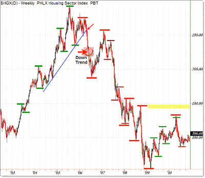
Let’s start with a long-term weekly chart of the Philadelphia Housing Index:
Click to Enlarge
We’ve heard it 100 times, but let’s refresh basic definitions of trends:
An uptrend is defined as a series of higher swing highs and higher swing lows.
A downtrend is similarly defined as a series of lower swing highs and lower swing lows.
To reverse a structural uptrend, price structure must make both a lower low and a lower high.
The point at which price makes both a lower low, then a lower high, then breaks under the newly established swing low is known as the “trend reversal price” and is the most objective point at which to call (or label) an official trend reversal.
Looking above at the housing index chart, we have a weekly structural uptrend from 2003 into 2006, as marked with a sequence of higher highs and lows.
However, price forms a lower high in early 2006 and then turns down to break under a long-term rising uptrend as shown. A break in a trend line strangely enough does not officially reverse a trend in terms of price structure.
Shortly after, price continues its power swing to the downside and officially breaks and closes under the two recently formed swing highs during June 2006 at the 230 index level.
I circled this spot as the trend reversal price, henceforth, the weekly trend was officially labeled as being down.
From there, the weekly structure continued to record lower swing highs and lower swing lows as the downtrend continued.
The structure finally changed in mid-2009 when we began to note minor new swing highs and swing lows, thus reversing the intermediate trend to the upside in late 2009.
From the May 2010 peak, a power swing to the downside recently took out the previously established swing low from late 2009 as a warning sign of potential future trend reversal back to the downside, but that’s beyond the scope of this educational post.
Take a look at how I labeled each successive swing in terms of higher highs and higher lows, both on the primary (larger) trend landscape and in the smaller or intermediate landscape (particularly during 2007).
NEXT: Using This Logic on Smaller Time Frames
|pagebreak|You can identify long-term structural trends on the weekly chart, but if you’re a shorter-term trader than that, you can use the same logic on smaller time frame charts, including all intraday landscapes.
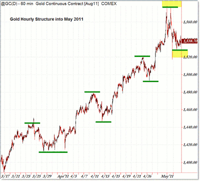
Let’s see a recent hourly structural trend progression in gold:
Click to Enlarge
Moving right to the point, we see the hourly (intraday) structure forming a sequence of higher swing highs and higher swing lows from March to May 2011.
Even on the hourly chart, you can see smaller swings that build up the larger hourly swings in gold. These create trading opportunities for traders on the lower frames, with the simplest strategies being buying (putting on new positions) during pullbacks in lower time frame structure in the context of higher time frame structure.
Alternately, traders can play breakout strategies on intraday breakthroughs of a prior higher time frame swing high. Notice the continuity (burst) that tends to occur when price, in a structural uptrend, breaks to a new chart high (For example, April 6 above $1,440; April 15 above $1,480; and April 27 above $1,520).
NEXT: A Valuable Lesson from the LinkedIn IPO
|pagebreak|Structure can also be helpful even on the smallest time frames to guide decision making (and trades) as structure develops.
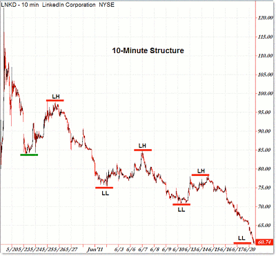
The IPO for LinkedIn (LNKD) received a great deal of attention (bullishly), but if traders took a moment to look at developing structure in the days after the initial hype, they would have seen a deterioration in structure and a reversal to an official intraday downtrend.
Here’s the IPO and structural trend reversal on the ten-minute time frame:
Click to Enlarge
The hype was intense on the IPO date and shortly after, but as we moved into June, intraday structure officially reversed to the downside, allowing for short sales on each retracement up or for breakdown trades on each breakthrough of a prior swing low (such as $756 on June 9 and $70 on June 16).
You can even see minor swings (which you can label easier on the five-minute and one-minute chart) that comprise these larger swings on the ten-minute chart.
Intraday traders can do well by assessing structure as it develops.
It merely takes a moment to quantify objective price (trend) structure, and it’s often best to do so quickly on a clean chart of price only—no indicators are necessary.
Once you assess the current (developing) structure, you can plan your trading strategies more effectively, keeping in mind price levels that would serve as an early warning for potential trend reversal, and of course the official price that would confirm a trend reversal.
By Corey Rosenbloom, trader and blogger, AfraidToTrade.com


