
All markets are driven by supply and demand, and by using certain “odds enhancers” to confirm price action, traders and investors are better able to define major trends and turning points in the markets.
The key to low-risk, consistent profits in trading and investing is knowing where the next turn and move in a market is going to be before it happens. Those who can do this with a very high degree of accuracy own a skill set that allows them to attain low-risk profits in any market and any time frame.
So, how can we predict where the next big move in a market is going to begin?
The answer is not that difficult if you use simple logic. Every turn in a market happens because of a supply and demand imbalance at a specific price level. The greater the imbalance, the stronger the turn in price.
So, to find the next big turn in price and market move, we must figure out where the greatest supply and demand imbalances are in the market. If you agree with this, then there is one question left: What does the picture of a supply and demand imbalance look like on a price chart?
You see, this is where most people stumble. They don’t go down the simple logic path we just went through. Instead, they buy a trading book that teaches them conventional technical analysis, which is a very flawed school of thought.
Or, they dive into the world of conventional fundamental analysis, which has you buying when the news is good (at a high price) and selling when the news is bad (at a low price), which is a recipe for disaster for you, but a gift for those on the other side of your trades and investments.
Let’s get back to a proven path to profits, which is the simple logic behind how you make money buying and selling anything that is buying low (at demand or wholesale) and selling high (at supply or retail).
To find these low-risk turning points at price levels where supply and demand are out of balance, we must know precisely what the picture of an imbalance looks like on a chart. I have written about this many times before in prior articles, but after writing about this for years, I still receive one common question: "I understand why you chose the supply or demand level in your chart, but why did you ignore the others?"
Knowing the difference between a real demand or supply level and one that is not is the most important part of the trading puzzle. At Online Trading Academy, we have a simple, yet very specific set of criteria that helps us identify a quality demand or supply level versus one that is not. We call this set of criteria "odds enhancers."
I typically go over two of them on a regular basis in the articles I write. In our Professional Trader class, we go over four "odds enhancers," and in the Extended Learning Track (XLT) class, we go over the remaining four, which completes the list. These odds enhancers have one purpose: To train your eye to identify a key demand or supply level (market turning point) and tell the difference between a key level and one that is not a level at all.
NEXT: Learn from a Real Recent Trade Example
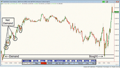
|pagebreak|Let’s take a look at an XLT trade from last week that illustrates what I am talking about. The chart below is a five minute chart of the S&P 500.
In the early morning, price began to decline. When I looked to the left, I saw what would appear to many people to be many demand levels on top of each other (circled areas on chart). Many people would look at those circled areas and call them demand (support) levels and likely buy when price revisited them on the decline.
This depends on your definition of demand (support). To us, those are not demand levels; they don’t meet the criteria for a quality demand level based on our odds enhancers. Therefore, I would not even call them demand.
However, the level at the bottom had enough odds enhancers to qualify it as strong demand. (Which odds enhancers and why are beyond the scope of this article, and when I go too deep into odds enhancers in articles, XLT members send angry e-mails because they feel I may be giving away their edge, and so I certainly understand and respect that.)
Click to Enlarge
If you can clearly see the difference between the demand level at which I bought versus the other areas I have circled, you’re doing very well and have an edge needed to succeed in this ever-competitive game of trading.
If you don’t, be careful putting your hard-earned money at risk in the markets. Below are some odds enhancers to consider that helped qualify the demand level in the chart for your review and benefit.
Some Odds Enhancers:
- How did price leave the level?
- Time at the level
- Levels on top of level
- Retracements
Remember, every turn and every strong move in a market happens and originates at a price level where demand and supply are out of balance. We must start with that premise and then clearly understand what that picture looks like on a price chart.
Knowing how to identify a quality turning point (demand or supply level) is just as important as knowing what is not quality. This is where many people get confused. They can spot the good ones but don’t know which to ignore, and that’s a problem solved by these odds enhancers. They are a simple, deeper dive into the real supply and demand equation at a given price level.
By Sam Seiden, instructor, Online Trading Academy


