
One of the questions that he is often asked is which is the best market or stock to trade, says Greg Capra of Pristine Capital Holdings, Inc., and his answer is always that there is no best market or stock to trade.
Markets and stocks are all good or bad to trade at certain times. If you find charts of whatever it is that puts the odds on your side—it's a good market or stock. A better question would be what puts the odds on your side? Let's see a few charts.
Click to Enlarge
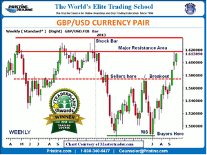
The above weekly chart displays the British pound versus the US dollar. This is traded in the forex market, and many believe that is the best market to trade. Forex does offer the advantage of trading 24 hours a day, which allows individuals to trade at a time that's best for them. Technically speaking, the chart of a currency pair is no different than that of a stock chart. Meaning the analysis is the same, what is the trend, where is support, where is resistance, is there a "void" of either and is there a definable pattern to trade where the risk-to-reward is on your side?
In the above chart, prices broke out above a resistance area and entered into what we call a tradable void. That's a relatively large area for swing traders and day traders to take advantage of with the bias (buy-side or long one) that prices were going to reach or move into the major resistance area above. With this currency pair now reaching that area, traders can wait for a reversal to occur in this timeframe to change their bias. Or move down to a lower time frame like the daily and wait until an area of major support (MS) is broken to change the bias.
The foundation concept is that prices—regardless of whether it's a currency pair stock or commodity—move between reference points we call support (where buyers/demand is) and resistance (where sellers/supply is). In this case, when prices reach the area of major resistance (MS) after a multiple bar advance, the odds are high that prices are going to retrace from the area that they have multiple times in the past.
Click to Enlarge
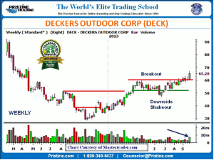
Deckers Outdoor Corp. (DECK) declined throughout 2012, but made its low at the end of that year and started a slow grind higher. It eventually was able to overcome its major resistance (MR) and has been basing for a number of months.
A telltale sign of institutional buying is when prices break down below a consolidation and then immediately reverse right back up again. And we can see that's happened over the summer in the shares of DECK. Since then, it continued the sideways price action—until last week when DECK broke out above that multi-month consolidation on increased volume. All good signs for prices moving up.
Since DECK has consolidated over several months and built this new base to move higher from, it's essential that prices stay above that new support area established. If it doesn't, the current pattern pointing to higher prices would be negated. Considering the extent of the decline through 2012, DECK may continue to be a slow but steady advance higher. Ideally, DECK will move higher from last week's breakout bar this week and not come close to that breakout bar's low on any retracement. The daily time frame will provide more detailed price action.
Click to Enlarge
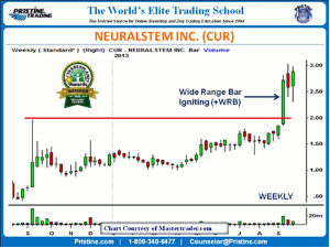
Here's a low price stock Neuralstem (CUR) that moved sideways for a year and finally broke out a few weeks ago on heavy volume. The last couple weeks have been spent consolidating that big gain and the last week's bottoming tail reversal suggests CUR may be ready to start another move higher. Notice that last week's low is under the prior week's low, but after breaking it, CUR was able to rally all the way back toward the high of the range. This tells us that there are buyers waiting to get shares on pullbacks.
If CUR can push above its recent highs, it could be the start of a further advance higher. Those who wanted shares on a pullback would be faced with the possibility of that not happening and have to pay up for them. Of course, that is the essence of breakouts and continuation patterns.
NEXT PAGE: 4 More Setups
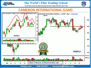
|pagebreak|Here's a setup that may appeal to those of you that are swing traders and day traders since we have two time frames in alignment. On the weekly chart to the right, we can see that Cameron international (CAM) moved sideways for most of this year and then broke down through the bottom of that consolidation in one big bar that was accompanied by heavy volume. Since then CAM has struggled to move back toward that breakdown area, which it recently did. Last week's range was inside the prior range that attempted to move higher. The prior week's high has now become an area of resistance. Based on the earlier decisive breakdown through support and recent retracement toward that breakdown area, a break below last week's low would signal a move lower.
Click to Enlarge
The daily chart on the right is an x-ray view of the last three to four weeks of trading seen on the weekly timeframe. As you can see, the daily chart has formed what's called a head and shoulders top (H&S). This pattern shows distribution and in alignment with the bigger picture of the weekly timeframe. A move below Friday's low, which just happen to be a green candle-short-term buying-also would be a break under last week's low, and in alignment with that signal of lower prices.
Click to Enlarge
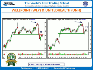
Here are two stocks in the same sector that have similar patterns, but one is clearly weaker than the other. Before getting to that, notice the high point in both stocks. Both of them formed new high failures (blue arrows). The one on the left gapped higher above the small consolidation and then retraced back down into that range. The one on the right started the day within its small range, traveled above it, and then retraced all the way back down inside of it.
This type of price action at a high turning point is common. We call these shock bars at Pristine because the pattern prior to that bar does suggest higher prices. In other words, a bar forms that is so unexpected based on the prior chart pattern that it's a shock to traders long the stock. This creates a tremendous amount of uncertainty about what's happening technically and to those that were likely following the positive news. Once the selling begins, it tends to feed on itself driving prices lower to where MS is.
Comparing Wellpoint (WLP) to Unitedhealth (UNH), we see that WLP decisively broke through its major support (MS) area, whereas UNH only marginally violated its major support area. In other words, UNH showed a marginal amount of relative strength to WLP. Both of these stocks are weak, but were able to hold their current price an area during last week's trading. Considering the small topping tails (TT) that formed last week, a move below Friday's low could start the next drop in prices.
Click to Enlarge
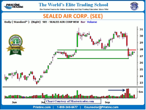
In the above chart of Sealed Air Corp. (SEE), we see a retest of the prior high that resulted in a sharp drop below support on extremely heavy volume. Historically, this type of price action results in a further drop in prices, but of course the question is, is now the time? Last week, prices held at the next support area and inched up toward the area where prices broke the prior support. Ideally, I'd like to see a little bit more of an attempt on SEE to move into that resistance area and then fail. That's a pattern I'd like to see since it clearly shows sellers aggressively taking control buyers again. However, it doesn't mean that's what will happen. Have to keep an eye on it and see how it shapes up. Stay tuned.
There are many more charts and setups out there we could review, of course. But with these few you have some ideas for possible trade setups this coming week and how we at Pristine look at a chart regardless of whether it's a stock or a currency pair and while I didn't show you one, it would be no different for a commodity or the S&P 500 E-mini contract. That being said there are nuances to these various tradable instruments and that is why an in-depth education is needed.
By Greg Capra, President & CEO, Pristine Capital Holdings, Inc.


