
Proper use of multiple time frame analysis can help traders clearly identify the best time and price level for entering the market, says Rick Wright of Online Trading Academy.
So you've analyzed the charts and have decided that your currency pair is trading at the right location for a possible reversal-a clear level of supply or demand. The questions in the back of most traders' minds are, "Will this level hold? Or Am I too early?" This is where multiple time frame analysis can help a trader decide when to trade.
The way I look at the charts, my larger time frame tells me where to enter, and my smaller time frame tells me when to enter.
A very common problem with new traders is buying or selling too late, or waiting for too much confirmation. By the time the moving average has turned, for example, and the trader buys, the move has already started and the stop loss may be dozens of pips further out than it had to be!
The opposite side of buying or selling too late is trading too early. Very often, traders will try to pick bottoms or tops, yet the price continues and stops them out. A relatively simple way to fix both problems is by using multiple time frame analysis.
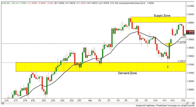
Click to Enlarge
On this four-hour EUR/USD chart, the blue arrow indicates the lowest-risk, highest-reward entry on the long side. However, many newer traders will be unwilling to take that long trade as the market has been trending down for the past several days.
The fear in this trader's mind is keeping him from buying because of the simple fact that the trend may continue down and hit his stop loss. Waiting to buy on a close above the upwardly trending moving average will get him in, but not until 1.3875.
The experienced trader is looking to the left on the chart and defining his demand zone (which was a supply zone previously) by the two dramatic upside moves from the 1.3761 level. This trader will get in, but approximately 100 pips cheaper!
Now the question remains: How can I get a better entry, yet still have confidence that I'm not too early?
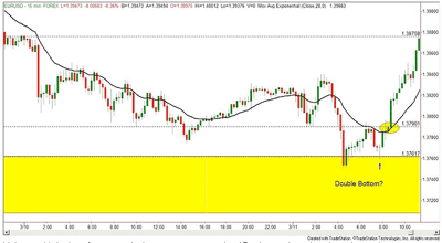
Click to Enlarge
Using multiple time frame analysis, we can see on the 15-minute chart that the price action came down into our demand zone twice within the four-hour candle. This even shows us a double-bottom pattern, a very common reversal pattern.
So now, waiting for the blue arrow, the trader has a higher degree of probability in their long trade.
Still not enough confidence? How about the doji candle with the longer tail, giving a potential bullish reversal? I hope that three reasons to go long at the blue arrow are enough for you! If not, then try throwing in a moving average on this smaller time frame. Waiting for the trend to start will give you more winning trades, albeit with larger stops and smaller winners. If you waited for the close above the moving average on this chart, you would still be getting in around the 1.3790 level-30 pips higher than the best entry, but about 85 pips better than if you only watched the four-hour chart!
In class, we call this "timing our entry." Buying in high-quality demand zones and selling in high-quality supply zones has been covered numerous times in previous newsletters. The only potential pitfall in this technique is getting in too early. However, with lots of screen time, you will begin to trust the levels you have identified. Using the smaller-time-frame chart to confirm your entry within your longer-time-frame supply and demand zones will lead to a higher percentage of winners and give you more confidence in trusting your levels.
One simple way to watch these charts is to set up two time frames for the currency pair(s) you will be trading.
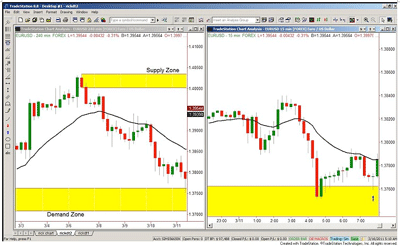
Click to Enlarge
If you are looking at only one chart and switching back and forth between your long-term and short-term time-frame charts, you will certainly miss a trade once in a while. So I do recommend having two charts of the same pair next to each other on your screen. Provided your trading computer has the necessary screen space, why not have these two charts for every pair you trade up at the same time?
Trading from a laptop would make this a bit difficult to see the price action, but if you have a larger monitor or three, this would be a very efficient technique.
Longer-term position traders will often use daily and one-hour charts; swing traders may use four-hour and 15-minute charts; and shorter-term traders may even be using one-hour and five-minute charts. Always keep in mind that larger-time-frame supply and demand zones are more important than smaller time frames, and this technique should help.
By Rick Wright, Instructor, Online Trading Academy


