
Moby Waller of BigTrends.com discusses intermarket relationships between the dollar and assets like stocks, bonds, and commodities and explains how to base trading decisions around these correlations.
Currencies are certainly an important part of the global financial machine. The purchasing power and export costs of an individual country or region are based on the relative value of their currency, and this makes a great impact on standard of living, GDP, and other factors.
I’ve long been a proponent of having a strong currency in whatever country you live in, and in our case in the US, it is the US dollar (USD). While some say that a weaker dollar allows manufacturers to produce cheaper exports (thus boosting our economy and job situation), in general, the benefits of a strong currency far outweigh the alternatives, in my view.
A strong currency allows consumers to have a higher standard of living on a relative basis than citizens of other countries. Imported products are relatively cheaper, and it also makes traveling overseas cheaper as well. And as an indication of the general fiscal state and from a psychological perspective, a strong currency is a good thing.
Also, don’t forget that strong currencies are where "flight-to-quality" money goes. Imagine if the dollar and US Treasuries completely lost their place as a world pre-eminent safety zone, because currently, the money that is parked there often goes right into the US stock markets when the times comes to re-allocate. That’s not likely to happen soon, however.
That aside, there really is no definitive long-term correlation between the dollar and other risk assets like stocks, gold, bonds, and oil—despite what some “experts” would like you to think. There have been shorter-term correlations throughout history, but they have varied both in strength and duration.
As an example, during strong dollar periods in the 1980s and 1990s, both our economy and stock markets were very strong. Bonds also rallied during those times (interest rates dropped). Meanwhile, during those periods, oil and gold were relatively weak. Some of those correlations have reversed or slowed since that time period.
See related: What Intermarket Analysis Means to You
Nonetheless, let’s take a look at the current scenario vis-a-vis the dollar and other assets. Recently, the dollar has shown some strength, mostly due to weakness and uncertainty about the euro, which is tracked by the CurrencyShares Euro Trust (FXE).
On an interesting side note, despite the recent euro weakness, it still is about $1.30/1 euro, and while when the euro was founded in the late 1990s it was anticipated (and traded in) that it would largely be in the range of $0.80 to $1.20—somewhat “pinned” around $1.00/1 euro
We’ll be using the PowerShares DB US Dollar Index Bullish Fund (UUP) (green) for the dollar, Spyder Trust (SPY) (red) for US stocks, the iShares Barclays 20+ Year Treasury Bond Fund (TLT) (blue) for US Treasuries, the United States Oil Fund (USO) (gray) for crude oil, and the SPDR Gold Trust (GLD) (yellow) for gold.
The first chart below is SPY vs. UUP performance since UUP basically topped in late 2008. This was also one of the key market bottoms, although it famously reached a lower panic low in March 2009. Note that the rebound in stocks we’ve seen since that time has been accompanied by a generally lower-trending dollar. This has provided a backdrop for higher stock prices, it appears, so keep an eye if the rising UUP breaks above its long-term trend line.
SPY vs. UUP Long-Term Chart
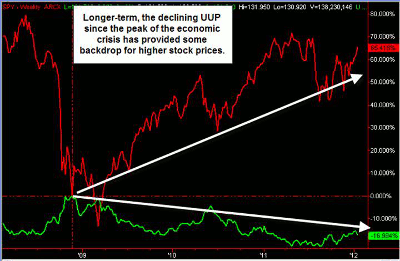
Click to Enlarge
SPY vs. UUP Short-Term Chart
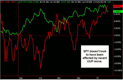
Click to Enlarge
The shorter-term UUP vs. SPY daily chart above shows the strength in the dollar since late August. Note that there really hasn’t been a correlation here with the Spyders. As we mentioned, these intermarket relationships between different assets aren’t set in stone rules.
See related: Intermarket Marvel Can’t Last…Can It?
|pagebreak|Below is the crude oil vs. dollar chart, and again, here we see that UUP has been rallying, but in general, there hasn’t been a strong correlation or affect from that move on USO prices. Some say that a rising dollar makes crude oil prices rise, but once again, this is not a permanent relationship.
USO vs. UUP Short-Term Chart
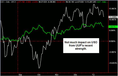
Click to Enlarge
We do see much more of a correlation when we look at the long-term Treasury bond ETF (TLT) and the dollar ETF (UUP) on the chart below. Both of these have rallied very closely in tandem during the time frame examined. This is somewhat logical since these are often "safety assets" where cash is parked on the sidelines. Also note that TLT has outperformed UUP along the way.
TLT vs. UUP Short-Term Chart
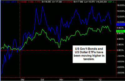
Click to Enlarge
Finally, we will examine popular gold ETF GLD versus the dollar ETF (UUP). Here, we do see what looks like an inverse correlation. The strength in UUP does look to be hindering the performance of GLD. This relationship does have some historical backing, as some believe that money shifts between hard money assets like gold into soft paper money assets like currency.
GLD vs. UUP Short-Term Chart
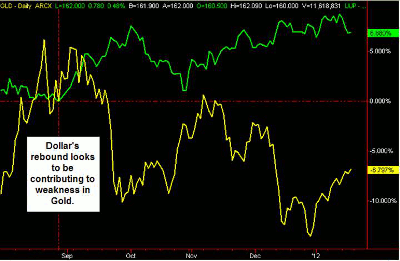
Click to Enlarge
Here’s the bottom line: the dollar in the form of UUP has been showing some strength recently, mostly at the expense of the euro ETF FXE. But long term, the dollar is still relatively weak and is approaching a long-term trend line that could possibly provide resistance. Certainly, news events out of Europe and Asia and economic developments here in the US will have a big impact on 2012 dollar performance.
Secondly, keep an eye on the correlations between the dollar and major assets like stocks, bonds, oil, and gold, but remember that none of these relationships are permanent in and of themselves.
Currently, we do see a short-term positive correlation between bonds and the dollar and a short-term inverse correlation between the dollar and gold. Longer term, there may be an inverse relationship between the dollar and stocks that bears watching, but that’s not certain.
By Moby Waller of BigTrends.com


