
Ryan Littlestone of ForexLive.com highlights a handy tool that forex traders can use to gauge the FX market.
If you’re wondering why EUR/USD is so stable and that moves are jumpy on not much at all, this magic doodad will go some way to explaining it. A heat map from Reuters is giving trading volume activity over a half hour window.
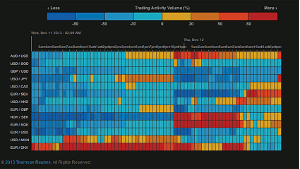
What’s hot and what’s not?
Click
to Enlarge
As you can see from the blue, volumes in majors like cable, EUR/USD, and USD/JPY are well down. The numbers are based on a one-month moving average. This is leading to the spikes and drops looking like big news but is coming on the back of lower volumes. The less there is in the market, the easier it is to move.
It’s just a snapshot from one system but you can pretty much use it to gauge the market. We’ll see how it looks leading up to the FOMC, but after next week, the market is going to die running into the holidays.
And before you ask, there’s no changing the currencies it shows, so you can forget asking about INR/BRL volumes or some such.
By Ryan Littlestone of ForexLive.com


