The loonie may continue its trajectory upwards unless the US Federal Reserve finally calls it quits on the easing game, says Howard Simons on Minyanville.com.
The Canadian dollar, often known affectionately as the loonie for the depiction of the waterfowl on its obverse side, has been in a strong uptrend since March, returning almost 5.6%, after being on the defensive since the US started twisting the yield curve in August 2011.
These strong trends in both directions are nothing new for the CAD. Its behavior used to be dominated by very persistent gaps in expected short-term interest rates between the US and Canada. When commodity investments and commodity-linked equities treated as a substitute for the underlying commodities came into vogue about ten years ago, the CAD started to reflect the cross-border flows produced by these investments.
The CAD's upturn in March began with that month's FOMC statement and the realization that the US would remain considerably looser than Canada for the foreseeable future. Canadian three- and six-month swap rates are more than 100 basis points higher than their US counterparts, and the realization that US rates would not be rising toward Canadian levels made it profitable to borrow the USD and lend in the CAD without fear of the interest rate carry disappearing.
Back to the Canadian Future
When the commodity indices peaked six years ago, both the CAD and the relative performance of Canadian equities started to take it on the chin, and by the time the US and the rest of the world started to drive their short-term interest rates to zero, the simple and clean relationship of the Canadian and US dollars started to come apart.
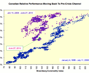
If we map the relative performance of the S&P/Toronto Stock Exchange 300 index vis-à-vis the S&P 500 Index (SPX) as a function of the Bloomberg (nee Dow Jones-UBS) commodity index split over the July 2008 period, we see how current values are coming back into the channel prevailing from January 1999 through July 2008. This means Canadian relative performance should start to track physical commodity prices once again.
Relative Performance by Sector
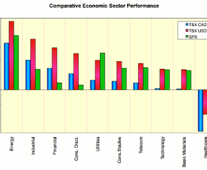
What has been the relative sector performance of the Canadian and US markets since March 20, 2014? Let's map the total returns for each sector. The Canadian sectors are displayed both in CAD and USD terms, while the US sectors are displayed in USD terms.
The US has outperformed in USD terms in two sectors only, utilities and healthcare, with the healthcare sector being distorted by Valeant Pharmaceuticals (VRX). The US utility sector has been distorted by investors treating the sector's equities as a yield play. The utility sector has outperformed the broad market handily since March, 10.26% to 5.33%, led by Pepco Holdings (POM), Entergy (ETR), and Integrys Energy (TEG).
I expect the CAD to keep chugging higher until someone at the Federal Reserve blows a whistle and declares the easing game to be over once and for all. If that is the case, an allocation to the Canadian market as a whole via an ETF such as the iShares MSCI Canada ETF (EWC) would give you a play on physical commodities, the Canadian dollar, and North American equities all at once...
Howard Simons, Contributor, Minyanville.com


