
It’s been great to trade gold and gold shares the past 2 years! Making double digit gains have been somewhat standard, recalls Omar Ayales, precious metals sector expert and editor of Gold Charts R Us.
Much of it has been hinged on the expectation of an inflationary boom given the money printing scheme central bankers embarked over 10 years ago.
It has been said that by increasing the money supply in any currency, the value of that currency is diminished simply because there’s more of it. Like adding water to a punch bowl.
And during the financial crisis in 2009 and its aftermath, it has become standard for central banks across the board to ‘print money,’ buy assets pretty much unhinged and keep interest rates low in an attempt to ‘grease the chains’ of the economy and spur inflation.
To this day, the money supply continues to expand. It fueled inflation expectations and animal spirits. It helped push gold to a new all-time high at $2,100 in August!
Interestingly, the real-life effect has been the opposite and inflation (not its expectation) still remains at bay.
The Federal Reserve is so concerned over this development that it has vowed to keep ZIRP (zero interest rate policies) for years to come.
The problem today is tightening deflationary pressures. The data shows that for most of the past 40 years, governments and central banks have worked tirelessly to keep inflation down, not up.
Dis-inflation in many ways has been engineered into the economic system. It was only until after the financial crisis in 2009 that dis-inflation reached a level that became inconvenient. 11 years later, Central Bankers are panicking.
And with good reason. Trillions of dollars of newly minted money have been forced into the economic machine looking to spur inflation
The cash injection and overall accommodative monetary policy has fueled bubbles in many assets such as real estate, stocks, gold and others.
But has there been real asset appreciation or just a re-distribution of wealth? A chart of the U.S. 30 year yield since the 1970s shows it best.
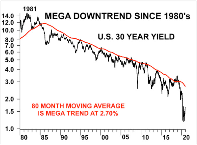
It not only shows its mega downtrend since the early 80s (mega bull market for bonds), it also exposes a savings glut that has been built up so far.
Consider the global bond market is about twice the size of the global equity market, if not bigger. This means, the majority of money out there is tucked away.
About half of it was added just over the past 10 years. Unfortunately, for the most part, that money is being used to finance government inefficiencies through deficit spending.
Proof is that sovereign debt to GDP ratios globally continue to swell, meaning all that liquidity added to the economy has not contributed meaningfully to productivity.
From the peak in interest rates in 1981, to this day, dis-inflationary policies have been engrained in the heart of the global monetary system. That process has been enhanced considerably by technological innovations and more recently the internet of things.
Not surprisingly, however, the expectation of inflation has been running wild, justified entirely by the money printing scheme the world has unleashed over the past 10 years. But when will inflation catch up to expectations? More importantly, what happens if it doesn’t?
The simple answer to the first question is deflationary pressures could become more evident and it could eventually push traders, investors and money managers to adjust their portfolios accordingly.
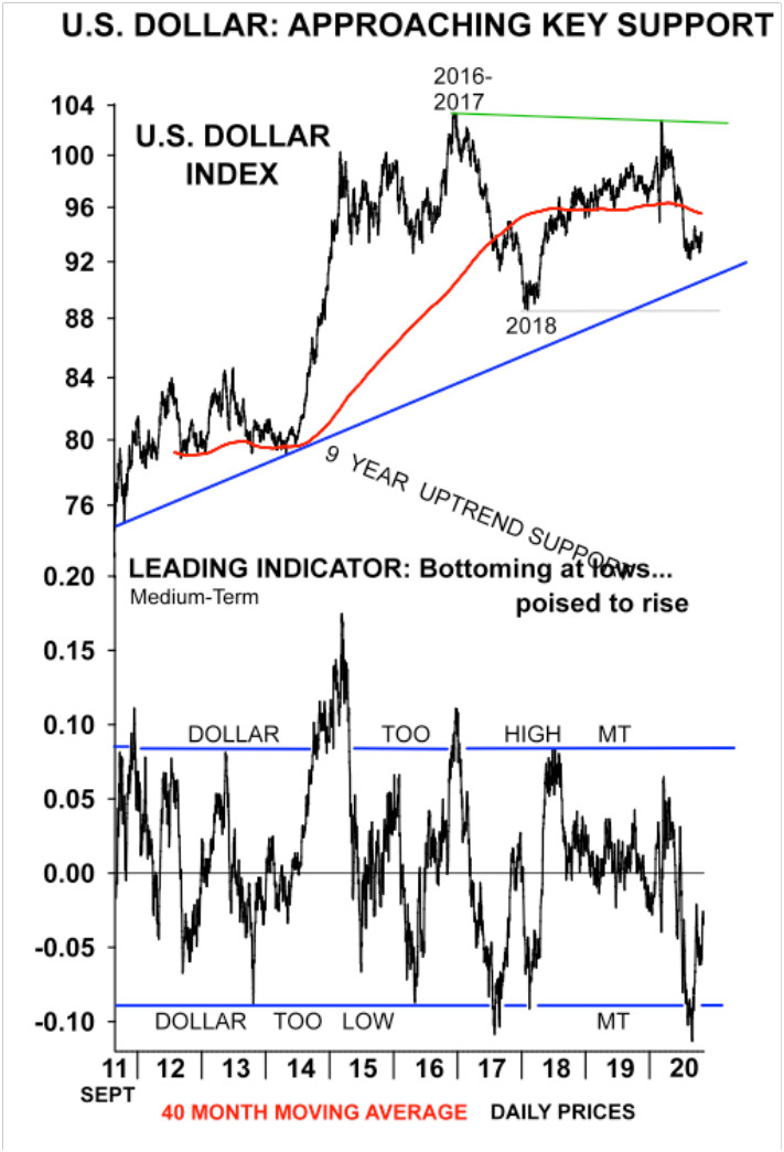
As for the second one, it could mean stronger days for the U.S. dollar, despite conventional wisdom. A stronger dollar would mean downside pressure in commodities and global currencies across the board.
Consider, the U.S. dollar has held strong on a longer-term basis, despite the constant attempts to debase it. A main reason why is that compared with its global counterparts the dollar remains among the strongest. It’s the world reserve currency, accounting for 80% of all global foreign reserves.
You could argue the U.S. dollar today is weaker compared to 20 years earlier, but it still remains stronger on a relative basis against other currencies.
Consider much of the upmove in gold over the past 2 years has been on rising inflationary expectations given the amount of liquidity being plugged into the market.
This is very similar to what happened from 2009 through 2011. Back then, however, inflation didn’t rise to the expectation, giving way to deflationary pressures, pushing commodities and global currencies into a bear market that lasted through 2015 and into 2016.
It’s been argued since that not enough was done. Will this time be different? Covid-19 seems to have pushed the economic reset button on a global scale.
This global reset has seen businesses and entire industries disappear, pushing unemployment to levels not seen in a long time. For most, 2020 will prove to be ground zero. But uncertainty is poised to ebb lower and productivity to inch higher as time goes on. A longer-term ratio between gold and copper shows it best.
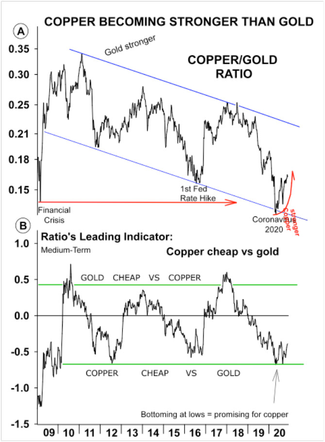
Remember, gold is sought as a store of value. It’s held as a hedge against inflation and uncertainty. When it’s favored over copper, it means money is being put aside.
When copper is favored, it means money is being put to work. Remember, copper is a barometer of the global economy given its broad use.
You’ll notice the chart above has favored gold over copper in recent years. But it also shows the relationship has reached an extreme and it could be poised to bounce back to favor copper. That is, just like it noticeably did during the financial crisis in 2009, as well as during gold’s peak in 2011, and during the first Fed rate hike in 2015.
The leading indicator below the chart is also showing momentum could be starting to shift to copper. This doesn’t necessarily mean copper rises and gold falls; it simply means copper could have an edge over gold in the medium term.
Under the hood this means resource metals driven by economic growth are poised to outperform precious metals. The chart could be telling us an economic lift-off from ground zero in 2020 is likely and inevitable, yet not necessarily imminent.
The chart sequences also suggests that we could enter into a period of dis-inflation as the economic recovery slowly unravels.
It tells us this process could take time and it doesn’t discard dollar strength short term. But it does tell us to be vigilant of the tectonic shifts that are headed our way, particularly if you’ve profited from the 2 year-long gold rally.
Use data and the technicals...the indicators, if properly read will expose when it’s a good time to buy, sell and take profits, or limit losses. Don’t miss on what could be one of the greatest opportunities in resources ever!


