
I don’t base my investment recommendations on charts. Nor do I consider myself an expert on technical analysis. But as the expression reminds us, some pictures are worth 1,000 words. And three charts form my basis for believing the stock market is heading for a major drop, advises Nilus Mattive, editor of Safe Money Report.
For my asset allocations, I mostly consider macro forces — big things like inflation rates, interest rates, the geopolitical climate, debt levels, and economic growth. And when it comes to stocks, I’m far more interested in using fundamental analysis and valuations.
But that doesn’t mean I don’t consider an asset’s price history. That’s a major piece of the puzzle, along with major levels of support and resistance or previous all-time highs.
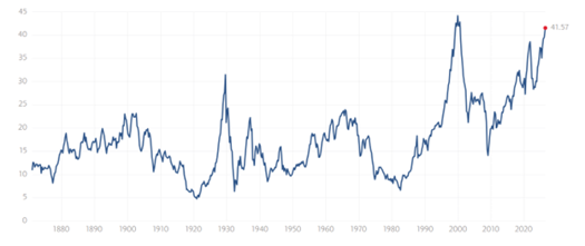
Source: Multpl
So, here is one of my charts showing the S&P 500 Index’s (^SPX) cyclically-adjusted price-to-earnings ratio (CAPE), based off work from Robert Shiller. As you can see, investors are paying just about the highest valuations EVER for US stocks right now. The only time the CAPE ratio has been just a bit higher was back at the top of the Dot-Com Bubble.
That was right around the time Shiller’s book “Irrational Exuberance” was nearing publication…a full four years after former Federal Reserve Chairman Alan Greenspan first used the same term to address fears that a bubble was forming.
As for the S&P 500 itself, it seems like the last place we had any type of serious consolidation was back around the 4,000 level. That also happens to be my downside target for the S&P 500. Not just because of the chart but because of history and fundamentals, too.
So, by all means, enjoy whatever gains you’re making right now. Just know this current euphoria won’t last forever.


