
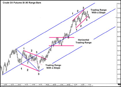
Going back to the crude oil chart, you can see that when price broke above the third drive to the top line in the first down-sloping range, it began a very nice trend higher.
Price did consolidate in a horizontal trading range for a while, but once again, it broke out to the upside and you can see that price ran from about $48 a barrel (where it broke out from the first trading range) all the way to $72.50 before finally breaking below a trading range formed by a three drives to the bottom line around $70 a barrel. That's a very nice run in crude, called by a very simple and easy-to-use trading tool. Is the top now in for crude oil? That's isn't the point, actually. The point is trying to capture the move from $48 a barrel to $72 a barrel.
Click to Enlarge
Let's look at a few other markets to see this simple technique at work. These charts are all from the same day’s trading in the stock index futures markets, and I used them to teach the basics of this simple method in the live morning sessions on Monday and Tuesday:
Click to Enlarge
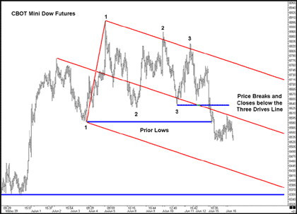
Here's a look at the CBOT mini Dow futures. You can clearly see the three drives to the top marked, as well as the three drives to the bottom. On this chart, I use a Median Line, or pitchfork, to show the probable path of price, but your eyes can easily see the lines that I could have drawn in to connect the three tops and three bottoms. And the break below the three drives to the bottom line is easy to see, and the results quite devastating.
Let's look at another market from that same day:
Click to Enlarge
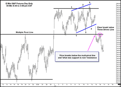
This is a chart of the e-mini S&P futures. Please note that these bars represent only the “day session” from 8:30 am to 3:00 pm and are 39- minute bars, one of my favorite stock and stock futures time frames because it reflects the cash market open and close.
You can see this range is up-sloping, yet it has three drives to the top and three drives to the bottom and when the three drives to the bottom line is broken, the resulting sell off is a swift one! If you look carefully at this chart and the prior chart, you may find that price did pull back to a logical place for you to enter a short position.
Let's look at another market from that same day:
Click to Enlarge
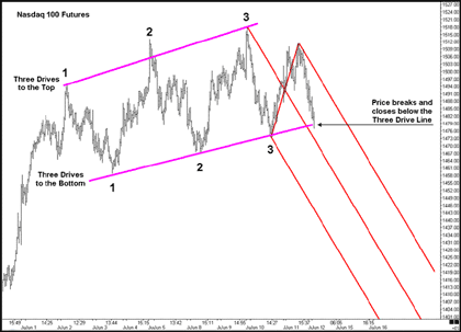
This is a chart of the Nasdaq 100 Futures from the same day. Note the same three drives to the top and three drives to the bottom that form the sloped trading range. And note that price is just now breaking below the three drives to the bottom line.
Take a moment to imagine what price might do now that it is breaking this important line.
Did you imagine something like this?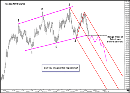
Click to Enlarge
This is what I drew on my chart as a “what if” exercise during the morning session. I thought price might form a trading range, then make its way over to the upper sliding parallel, where I might attempt a short position, and then head lower.
Remember, the Market is always right! We can imagine and think it is going to do something, but in the end, we are left trying to hang on to the tail of the market as it goes where it wants to go!
| More tomorrow in Part 3. | Read Part 1 | Read Part 3 | Read Part 4 | Read Part 5 |
Timothy Morge
timmorge@gmail.com
www.medianline.com
www.marketgeometry.com


