
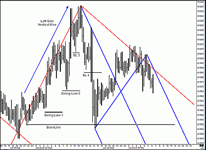
As I zoom in on the current action, I note that price took out three prior swing lows from the left side vertical move. While the difference between two prior swing lows and three prior swing lows may seem trivial, I always look for price to break below at least two prior swing lows before considering that a strong uptrend may be over. The opposite would be true in a strong downtrend, so the additional swing low gives me just a bit more comfort with my feeling that a top may be forming.
Click to Enlarge
I look at the action on the right side of this chart and notice that price left double tops about six or seven bars back and then began to accelerate to the down side. I decided to use these double tops as part of the three alternating pivots needed when drawing a Median Line, and then I pick out a suitable prior high and prior low and draw in a blue, down-sloping Median Line (and its parallels) which is smaller and lies inside the larger, red, down-sloping Median Line. This new Median Line has several hits or touches on its “tail,” the line connecting the “A” pivot and the midpoint of the line connecting pivots “B” and “C,” and this makes me feel more comfortable that this new Median Line is vibrating at the same frequency as price. My eyes also tell me that price is more likely to interact with this more narrow Median Line as I add it to my chart. Remember, I am charting live in front of several hundred people, so I also explain what I am thinking while I add each line.
After noting that I am interested in the area where price would interact with the blue, down-sloping upper Median Line parallel, I move on to the Canadian dollar and begin marking up that chart from scratch. After analyzing the Canadian dollar chart and pointing out several interesting market structures on it, I move on to the euro FX chart and begin marking it up. First, I note all the important market structure and begin drawing in Median Lines, Fib retracements, and simple trend lines. I like to think of the market structure on any chart as the skeleton and the lines I draw on the chart as the muscle and skin. If you don't understand the market structure on a given chart, you'll often end up drawing lines that are useless, because these lines need to take advantage of the underlying market structure, not fight it.
| More tomorrow in Part 3. | Read Part 1 | Read Part 3 | Read Part 4 | Read Part 5 |
Timothy Morge
timmorge@gmail.com
www.medianline.com
www.marketgeometry.com


