
The CBOE Volatility Index (VIX) has long been utilized in a variety of manners for judging both investor sentiment and market timing. It can clearly shows times of both "panic" and "complacency" by the crowd, which is often late to the party and/or marks a turning point.
Take a look at this longer-term VIX daily chart below:
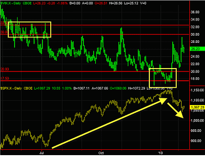
Click to Enlarge
First thing that jumps out to me on this chart is the basic range on the VIX has been 20 to 30 over this time frame, with an "outlier" range of 17.5 and 22.5. Previously, I have forecast that the VIX could reach as low as 15 in 2010, with 17.5 being a key level, but wasn't going to penetrate below 15 as an outlier, and I stick to that analysis.
There are several things one could see on this chart, one of them being that short-term spikes in the VIX were often good entry points during market run-up in 2009. But there also is something interesting with the outlier range. When the VIX consolidated in the 30/32.5 range in May/June 2009 (unable to breach above this area), it preceded a major upward leg in the S&P 500. The VIX made lower lows through July as well, indicating the bear trend (rise in VIX) was drying up.
Recently, we established a new bottom outlier range on the VIX, as we tested the 17.5/20 range repeatedly in December 2009/January 2010. This was in effect a contrarian sell signal for the markets, and we have subsequently sold off. Additionally, you can see that the VIX is making higher highs recently, indicating its strength (and actual volatility) has not abated.
Does this chart give me every answer as to where the market is headed? Of course not, it is a snapshot and component of putting together a big-picture view. But keep an eye peeled if we head back down into the 20/17.5 range (and even break down to 15), because that may well presage another sharp market correction.
By Moby Waller of BigTrends.com


