
Wouldn't it be nice if you knew where price would be four bars from now? Sound crazy? Sound impossible? Maybe it is. But consider this: Wouldn't it be great if you knew where all the police cars and cameras were that were monitoring speeding, so you could drive down the road at your own pace and then slow down when you got near the speed traps? Does that sound crazy too? Have you heard about radar detectors, laser radar detectors, and even GPS real-time systems that mark out the current speed detection traps near you? Some people have all of this and more on their smart phones already!
Wouldn't it be great if you knew when the person you were playing poker against was bluffing, or holding a poor hand but trying to bet up the price of staying in the game, just hoping you'll fold? Did you know that most people who play poker have personality traits that make them do something physical when they are nervous, holding that bad hand, trying to drive the price of the pot higher? Some talented poker players can easily spot the “tics” or “tells” of their opponents after playing a few hands against them.
What if you could see the tics or tells of a trending market as it is stretched ever higher, while there are fewer and fewer new buyers? This market will eventually turn—wouldn't it be great if you could spot a sign that the market was running low on directional energy and likely to turn soon?
I'm not talking about squiggly computer-generated lines that lag price by ten or 20 bars! By definition, they may confirm changes in behavior, but they won't give you changes in behavior in advance. I'm talking about real signs the market offers, to those who look for the signs, that will give you a tell that the current trending market may be running out of directional energy. Does it sound crazy? Does it sound like one of those “Get Rich” ads you read in the trading magazines that (hopefully) make you chuckle? Let's see if I can make a believer out of you!
Click to Enlarge
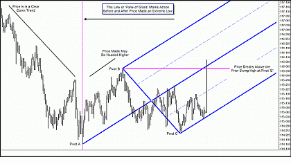
Here's a chart of the CBOT 30-year bond futures. You can clearly see price was in a nice downtrend and then began to consolidate. After some time, price climbs out of the consolidation, making a series of higher lows and higher highs. And then price shoots higher, breaking above major swing highs to the left in one bar—a clear sign that there has been a change in behavior.
Wouldn't you like to have been able to read the signs that this change in behavior was coming? Price gave you the signs you needed. It left tells that its downtrend was ending and a likely change in behavior was on the way. Looking at the chart now, can you identify those signs? Can you see the tells the market left?
Let's go on and see what the market offers us. We're looking at market structure and signs that there may be changes in behavior coming.
Click to Enlarge
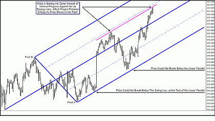
Price continues higher, breaking above the up-sloping Median Line before pulling back, but note that it does not test or break the lower parallel, nor does it break below the prior major swing low.
Then price heads back higher in a stair-step fashion. You'll note I added a pink line that has the same slope as the Median Line and connected it to the first major swing high, and this line catches the current high to the tick.
Median Lines and their parallels mathematically project the path of least resistance for price—and this means it is the most probable path of price, since all things in motion seek the path of least resistance.
You can see that price is currently making higher highs, but if you measure its progress against the sloped lines, its path of least resistance, it is just re-testing its prior high. I'll bet I've just totally confused many of you! When I show these charts in live seminars or live Webcasts, I tell people to turn their head to the right and look at how far price has moved upward against the sloped lines. But I believe most people don't turn their heads, and truthfully, most people listen to me talk about price making progress against the sloped lines, but really don't understand what I am talking about. So let me quote an old saying: “A picture is worth a thousand words!” Here goes!
Click to Enlarge
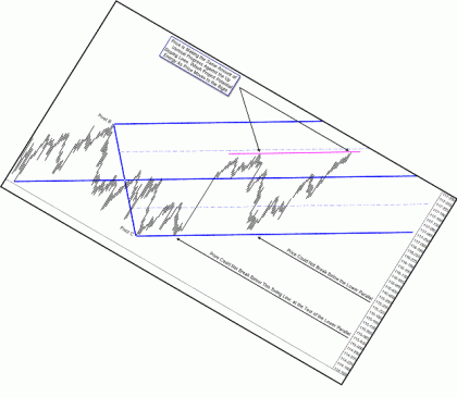
By rotating the chart so your eyes align the sloped Median Line with the natural horizontal plane, you can now see that as measured against the probable path of price, the Median Line and its parallels, price is not making new highs, but instead re-testing its prior highs.
There are no signs that this market is turning yet, no tells that this market may soon exhibit a change in behavior. But when you looked at the prior chart, price was clearly making new higher highs. When you look at the same chart aligned with the path of least resistance, price is merely re-testing prior highs.
Don't worry if you still don't understand what I mean. I believe humans are visual in nature, and I have plenty of pictures! Let's see where price goes now.
Continued tomorrow in Part 2…
By Tim Morge of MarketGeometry.com


