
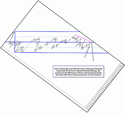
Once again, let's begin by looking at the below efficiency chart. By looking at the “tells” that price leaves behind, you can be ready before the change in behavior occurs. You would be surprised how much this simple visual trick can improve your trading!
Click to Enlarge
In the MarketGeometry.com mid-day mini mentoring sessions, I had been telling members to turn their head to the right for months as I talked about price “losing efficiency” just before a change in behavior occurs. And though I swore to myself I was going to keep this visual trick to myself until my new advanced seminar debuted in late-April, several weeks ago, in a moment of weakness, I just popped up a tilted chart, a chart clearly showing price losing its efficiency, and the chat session stopped dead in its tracks! All the members had heard me, over and over, talking about it. But when I showed a tilted chart, the light went on.
I also saw a distinct change in the profitability of some of the traders I mentor. One of them is now on a nice winning streak and she attributes the improvement in her trading to beginning to pay detailed attention to the efficiency of price. Her new mantra is, “Trade less, pay attention more, make more.” It was clear that I had been seeing price losing its efficiency and using it as a visual clue for years. I had been talking about it and trying to explain it to the traders I teach for years, but it took a simple visual tool to clearly explain the idea.
Once members and the traders I taught saw the tilted efficiency charts, the idea was clear. After I debuted the tilted efficiency chart, whenever I begin analyzing a chart bar by bar in the mid-day mini mentoring sessions, once price begins to lose its efficiency, people catch it and call it out before I can even mention it. It's a very powerful concept that can help you catch many major turns.
Now that I showed how powerful a tell the lack of efficiency can be, did you go back to the first chart I showed you and look carefully for the signs price left right in front of you that it was either going to consolidate and re-store its energy or exhibit a change in behavior?
Ok, I'll scroll back in price and time and see if we can spot some of the signs price left for us.
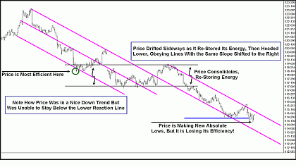
Click to Enlarge
Price went through several phases in this downtrend. It headed lower quickly, reaching its most efficient point as it tested the lower pink reaction line. But when it was unable to hold below the reaction line, it quickly climbed higher and tested the upper parallel, or the action line. Once again, price failed to break out of the action/reaction line set. Price gapped lower and then spent a great deal of time restoring its energy, trading in a consolidation pattern, or energy coil.
It stayed in this trading range so long that it drifted out of the action/reaction line set to the right, but note that price was unable to make it above a line with the same slope, equal in distance and projected forward in space and time. Price headed lower again, but once again, it began to lose efficiency.
Did you see any of these signs? Did you tilt your head?
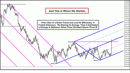
Click to Enlarge
And now you can see we are right where we started this charting exercise. Price lost efficiency, trading in a consolidation phase, and then a change in behavior occurred when price was able to trade well above pivot B, a major swing high.
Tilt your head, tilt your screen, but by all means, pay attention to the signs, or “tells,” that price is giving you! There is so much information contained in simple price charts if you just take the time to look for them.
It's a pleasure and an honor to be back writing for MoneyShow.com!
I wish you all good trading,
By Tim Morge of MarketGeometry.com


