Rate of change (ROC) stands alone as an important indicator used by many technicians interested in market momentum. It shows the speed at which a variable changes over a specific period of time and can give traders a sense of how two variables change in relation to each other and at what speed. Here we'll take a look at ROC and how it's used by active traders.
ROC 101
The speed at which a variable changes over a specific period of time, rate of change is often used when speaking about momentum, and it can generally be expressed as a ratio between a change in one variable relative to a corresponding change in another. Graphically, the rate of change is represented by the slope of a line, or horizontal median called the equilibrium. It is this median that tells us everything we need to know about rate of change.
The normal time frame for ROC measurement is ten days. The ratio to build the ROC indicator is as follows:
Rate of Change = 100 (Y/Yx)
"Y" represents the most recent closing price, and "Yx" represents the closing price a specific number of days ago. So, if the price of a stock closes higher today than it did ten days ago, the ROC value point will be above the equilibrium, thus indicating to chartists that prices are rising in that particular issue. Conversely, if the price in today's session closes lower than it did ten trading days ago, the value point will be below the equilibrium, indicating that prices are falling off. It is safe to say that if the ROC is rising, it gives a short-term bullish signal, and a bearish sign would have the ROC falling. Chartists pay great attention to the time period in the calculation of ROC. Long-term views of the market or a specific sector or stock will use perhaps a 26- to 52-week time period for Yx and a shorter view would use ten days to around six months.
The following examples are from older charts, but they are great examples of ways you can use ROC on current charts to predict future stock price.
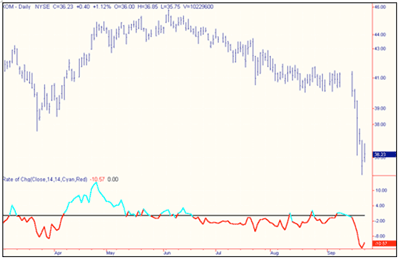
As you can see in this chart of Exxon Mobil (XOM), the events of September 11, 2001 saw the ROC fall off dramatically over the five trading sessions shown on this chart and rallying into the strong market of September 24, 2001. You can see that the red line turned up sharply that day as the price of XOM jumped over $2. You can see that for the most part, the preceding summer months had Exxon Mobil falling off slightly in price from a level of about $47 in early June to $41 on September 10, and the ROC indicator traded below the median line for almost the entire three-month period.
Another important point is the bullish move at the end of the first week in April, when the stock price jumped from $38 to between $44 and $45 by the end of the month.
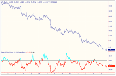
The second chart is that of Nortel Networks and shows the bearish trend from September 2000 through the next 12 months. There were a number of bullish signals over this same period of time that, for the most part, would have been acted upon by the short-term traders, but it is fairly safe to say that long-term investors would have stayed away from NT during this period of time. The fundamentals of the company, coupled with the bearish indicators saw the "smart money" head for the sidelines. As you can see by the chart, there was not a strong bullish sign since the brief tech breakout in April 2001, which lasted just long enough to tease investors into thinking that the bear market for tech issues was over.
Conclusion
New technicians and veterans should look very closely at ROC when looking for plus/minus moves in indexes and stock issues alike, and use a number of different time spans to reconfirm their findings. (For further reading, check out “Divergences, Momentum and Rate of Change” and “Simple Moving Averages and Volume Rate of Change”.)
By the Staff at Investopedia.com


