
Silver’s euphoric rise and violent fall took many by surprise, prompting this look at technical indicators that can be used to identify when a market really is becoming unstable and is likely to crash.
Many investors were initially taken sharply by surprise by the stellar run-up in silver prices, and then perhaps even more so by the dramatic collapse in prices after the period of euphoria and instability.
But how do you define “instability” and “euphoria” objectively?
Let’s learn a lesson from silver’s Sigma (standard deviation) bands and see what they had to say about the stable rise that morphed into a multi-day unstable rise ahead of the violent collapse.
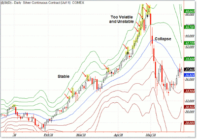
Click to Enlarge
What we’re seeing is the Sigma bands, or standard deviation bands, for silver futures in TradeStation (just like your typical Bollinger bands, only showing standard deviation (SD) levels one through four, both above and below the 20-day average).
Each line represents a distance of one standard deviation above the mean. Generally, price is contained within two SDs above or below the mean (average), which is the logic of Bollinger bands.
However, expanding the Sigma bands like this gives good insights when a market transitions objectively from tradable stability (inflecting between the two SD bands) to high-risk instability (spiking and remaining outside the second standard deviation and even moving up into the third and fourth deviation).
We can see silver behaved “normally,” or at least “stably,” from February to March as price bounced cleanly between the resistance of the second Sigma band and support of the first Sigma band.
The S&P 500 showed a similar pattern during this time, as I’ve shown in prior blog updates.
After the March pullback, silver continued this behavior into early April, which was where things started to go wrong.
I’ve highlighted each time price spiked beyond the second Sigma band (typical Bollinger band) and then returned lower immediately.
This behavior changed in mid-to-late-April as price spiked sharply outside the second Sigma band and remained outside this level consistently—never pulling back the next day.
You can see in late April where silver began resisting against the third Sigma band and then spiked finally into the fourth Sigma (that’s four standard deviations above the 20-day moving average, or mean) just ahead of its eventual crash into May.
The lesson is simple: Trends can turn parabolic and rise higher than most people expect. Eventually, as a market moves objectively from a stable/sustainable pattern into an unstable/unsustainable pattern, odds of a crash increase, if not become inevitable as the system/structure falls apart.
There were spike candles/reversal candles ahead of the initial crash, which began officially on May 2 (your initial “serious warning” sign) and continued back to the $32 level on May 12.
I know it was tempting both to call a top in silver each day during the parabolic move (those traders were right, but early) or by the opposite token, to declare that “silver will rally forever.”
For most traders, it’s best to play predominantly in stable markets and manage risk appropriately—not getting caught up while greedily riding a euphoric ticking time bomb, or calling the top in a euphoric market that can remain unstable for longer than they expect.
Watching price relative to Sigma (or Bollinger) bands helps assess the difference between:
- Stable markets that are likely to continue moving in the same direction (resulting in slow, but steady potential profits), and…
- Unstable markets which could reverse violently any day (resulting in large potential profits that can evaporate into losses in a single day or bad week). Think “flash crash” in stocks on May 6, 2010.
By Corey Rosenbloom, trader and blogger, AfraidToTrade.com


