
Long-term charts predicted the sharp recent downside price action in the commodities and equities markets, proving that even short-term traders shouldn’t ignore long-term chart patterns.
Commodities, along with equities, have fallen sharply since their respective May 2011 market peaks. Long-term charts told us it was going to happen, and it’s an important lesson on why watching longer-term charts is important for short-term traders.
See related: More Time Frames, More Confidence
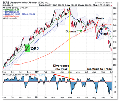
Let’s take a look at the breakdown in the CRB Commodity Index and note the critical confluence reference support level upon which the index sits currently.
Click to Enlarge
First, let’s start with the May peak of 370. I showed previously that there was a “three-push” price pattern accompanied by a corresponding negative momentum divergence, which was a major caution sign for the index.
Price then broke both the 20- and 50-day rising exponential moving averages (EMAs), resulting in a new price and momentum low (a “kick-off” early reversal signal).
Price stagnated between 330 and 350 for the next few months, though price structure took on a bearish pattern, which confirmed an official trend reversal on the break under 320 in August.
The August breakdown also triggered a close under the rising 200-day simple moving average (SMA), often a “line in the sand” between bull and bear markets (at least in simplest terms).
In late September, commodities in general collapsed towards the current 300 target after triggering a “bear flag,” or breakdown reversal set-up into 340 (the underside of the 200-day SMA reference level).
For reference, this is a good example of how a chart-based trend reversal develops and is confirmed by non-correlated indicators (“three-push” price pattern, negative momentum divergences, EMA breakdowns along with bearish crossovers, new momentum low “kick-off” signal, break under 200-day SMA, etc.).
(I’ll be discussing trend reversals in much more detail during my upcoming Traders Expo presentation How to Spot and Trade Trend Days (when to expect them, how to adapt your tactics/trades to them) at The Las Vegas Traders Expo in November.)
NEXT: See Important Signals on the Weekly Chart
|pagebreak|At present, the index trades at the same level as when the Federal Reserve initiated its “inflation-creation” program known as QE2, or quantitative easing.
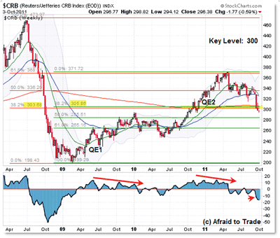
That’s important to know as we turn now to the weekly chart to see why the 300 level is a very important index reference level:
Click to Enlarge
While you can spot other lessons in the chart above (the interesting correlation between QE1 and QE2 on the CRB Index, negative divergences and reversals into January 2010 and May 2011), let’s focus our attention simply on the two Fibonacci retracement grids overlapping at the 300 level.
The red Fibonacci grid is the “bear market” retracement up, starting with the 2009 low and moving back to the 2008 peak.
The green Fibonacci grid is the “bull market” retracement down, starting with the 2011 high and moving back to the 2009 low.
You can also see that the 2011 high into 370 (and the negative daily divergences) developed into the 61.8% Fibonacci retracement of the bear market—very interesting.
What’s most important right now is the double confluence just above 300: the 38.2% “bull market” retracement at 306, and also, ironically, the 38.2% “bear market” retracement at 304.
To throw another classic indicator into the mix, the flat 200-week SMA resides at 306.50.
As you can see above, price is nipping under this higher-time-frame confluence area, which isn’t a good sign for buyers.
In the meantime, watch the reference support from the November 2010 “QE2″ low near 295 along with the weekly confluence above 300.
Just like in stocks, a failure to hold their critical current-support reference levels, a breakdown here suggests lower prices will be seen in both stocks and commodities, so keep all these important levels in mind as you trade this week and next.
By Corey Rosenbloom, trader and blogger, AfraidToTrade.com


