
A recent daily chart of the SPDR Gold Trust (GLD) shows five high-profile patterns, providing traders an opportunity to study them and further develop their skills in order to profit from such patterns in the future.
They say a picture is worth a thousand words, and one needs look no further than the chart below to prove it.
It’s a great example of how watching chart patterns can help you to protect your trading account and even profit when patterns occur.
We’ve been highlighting a lot of patterns that are of the “change-in-trend“ and “short set-up” variety.
Today, we are going to show you one chart that has everything one could ever look for in a chart. There are so many patterns embedded in it that we focus only on a daily basis.
First, here’s the chart of the SPDR Gold Trust (GLD):
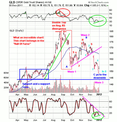
Click to Enlarge
Here’s what I see:
Double Top
There are a lot of patterns in this chart, so let’s first off take it from the top…as in double top with negative RS divergence (green circle).
From the July lows (everything above the green line), this issue took off like a rocket! Hot, highly emotional, on a Red Bull sugar high money loves this type of stuff. They love chasing buses, which when all is said and done, can be hazardous to your financial health.
There came a time when the issue was putting in what we call an “early warning alert change in trend pattern” that you all call a double top. My trading mantra with these is:
“Nice uptrend, above the 50 day, puts in a double top and breaks to the downside.”
Notice that once it broke to the downside, it stopped back at a prior support level of $150 to $155.
First Thrust Down
That initial break down is what we call the “first thrust down” (red box). After an issue stages a first thrust down, more often than not (because this is an art more than a science), the issue will tend to get some sort of a snapback rally. Everything above the pink line is the snapback rally. Upon a break of the snapback rally (pink line), it’s called “bombs away!”
Remember our mantra with these is: “First thrust down, snapback rally, and then bombs away.”
In addition to the first thrust down, it can also be considered wave 1 to the downside for those familiar with Elliott Wave theory.
Three Waves Up
Now let’s take a closer look at that snapback rally. Within that snapback rally, there is a lot of structure. First off, see those little red 1-2-3 numbers? That is a classic Elliott Wave three waves up pattern. Therefore, the big picture wave count at the completion of the three waves up makes this a wave 2.
So we have the first thrust down being wave one, the snapback rally being wave 2, and yes, wave 3 took place on the break of the pink line to the downside for “bombs away.”
Click to Enlarge
Head and Shoulders
Also within that snapback rally you can clearly see a head-and-shoulders top also marked in red. Folks, this is how the market talks to us, all via chart pattern recognition and the components of patterns.
Five Waves Down of Wave Three
Lastly, in that chart, you can see some sky blue numbering. That “bombs away” is comprised of five waves down. Here we have classic Elliott Wave and true to form for a wave 3.
Typically, according to Elliott Wave theory, after three waves down comes the fourth wave (if big picture this issue topped, we have a bear count), and the fourth wave can be sideways or a traditional three waves up just like wave 2 was.
The bull count big picture is that if this was just a three waves down traditional correction, then it’s upward and onward from here starting soon.
On a side note, what happens to our big-picture indexes at the end of this move off the October lows upon a break to the downside? You’re looking at it!
Notice Where We Are Now?
Five waves down and near a prior support zone. So at this point, what do you do if you own it?
Well, first off, the bulk of the damage is surely done here. Afterall, over the last two months, it has gone from $175 to the $150 zone and is sporting a positive RS divergence (little green line in the RSI indicator at the top of the chart and the green circle). Remember, it’s always darkest just before the dawn.
What is positive RS divergence? Simple, it’s when an issue hits a low and the RSI hits a low right along with it, then the issue bounces along with the RSI, too. After the bounce, the issue rolls over and breaks into a lower low than the recent prior low but the RSI does not. That is a positive RSI divergence.
The flip side to that (a negative RSI divergence) can also be found in the chart at the double top. See it? The issue hits a peak, pulls back, retests its highs, yet the RSI does not confirm the highs. This is all found in the red circle.
MoneyShow.com readers, consider this whole article a lesson in short selling and advanced technical analysis. The beauty is that you didn’t have to cough up $3000 for some university infomercial that you attend that is going to show you all of this with the hard-sell sales pitch at the end.
It ultimately is your call as to what you do, but at least we’ve given you what to watch for with regards to taking short sells. Of course, the flip side is what to watch for if you’re long.
Going forward, if you start to see patterns like those mentioned above, you have all the tools in your arsenal to allow you to take action and trade them for profit.
By David Grandey of AllAboutTrends.net


