
Basic sector rotation themes can be used to uncover the strongest stocks and sectors for long trades, as well as the weakest stocks and sectors for short plays, writes Corey Rosenbloom, showing three current examples.
Let’s take a moment to clarify how investors and traders can use top-level sector rotation themes to their advantage.
Traders and investors often use the model—or at least compare sector relative performance—to pinpoint trading or investing opportunities from the strongest stocks in the strongest sectors during bull/rally phases in the market.
See video: Sector Rotation in Today’s Markets
If you’re looking for a high-probably trade, simply buy the strongest stocks in the strongest sectors and sell short the weakest stocks in the weakest sectors. Yes, it really is that easy.
Here are some examples.
The financial and technology sectors—as viewed using the Select Sector SPDR - Financial (XLF) and Select Sector SPDR - Technology (XLK)—are the top performers so far in 2012 (year to date through March 29).
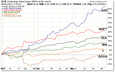
Let’s take it one step further and view the largest five stocks in these two leading ETFs, first with technology:
Click to Enlarge
The chart above shows the price performance of five leading technology stocks so far in 2012.
While XLK, the broader technology ETF, is up 20% year to date, some stocks rose more than that, while other technology stocks did not rise as much.
Generally speaking, the best trading and investment opportunities develop from the stronger stocks in a strong sector, which can be defined using fundamental analysis or even technical analysis (charting trends and relative performance).
You want to put your money in the best stocks within sectors that are outperforming the broader market, and at a minimum, avoid buying the weakest stocks in the weakest sectors.
This type of logic is along the lines of the phrase “Buy high, sell higher.”
Anyway, it should be no surprise that the top performer in the group is Apple (AAPL), but it may be surprising to learn that Google (GOOG) is the underperformer so far, notching only a 1.5% gain so far in 2012.
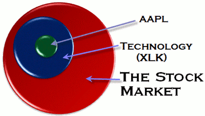
The image below helps us visualize a stock’s location not just within its sector, but within the broader market as well:
Click to Enlarge
If we start with the broader market, we can then break the market down into nine (or ten) major sectors.
At times in the business/economic cycle, certain sectors will outperform others—and the broader stock market as well.
Individual stocks group together to make up the sectors, which are tracked easily using the Select Sector SPDR ETFs.
There’s a variety of ways to view both sector and stock performance, and it can be helpful to take the time to do so. Visualizing each stock as part of a broader picture (its sector) which is then part of the stock market as a whole.
NEXT: Financials Lead While Utilities Lag
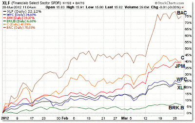
|pagebreak|Below is a performance chart for the other sector leader in 2012: the financial sector.
We see a similar picture in financials as we see in technology. Bank of America (BAC) has outperformed the other leading companies in the sector, while Berkshire Hathaway (BRK.B) was an underperformer so far.
While the broader sector ETF is up 22%, some stocks rose well above that amount year to date.
Click to Enlarge
Notice also that Bank of America started the year in the strongest position and remains there as of the end of March.
Berkshire Hathaway started the weakest stock in this top 5 list and is currently positioned there as well.
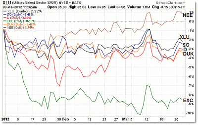
And finally, let’s take a quick look at the utilities sector and the Select Sector SPDR â€" Utilities (XLU), which has been this year’s underperformer into March:
Click to Enlarge
Again, the broader XLU sector ETF is down 2.2% year to date, and most of the “big five” stocks in the ETF are also down for the year.
Keep in mind that the utilities sector is a defensive/protective sector group and is expected to underperform during periods of stock market bullishness/rallies.
The underperformer in the group so far is Exelon (EXC), while the (relative) outperformer is NextEra Energy (NEE).
The main lesson to me is that we shouldn’t try to pick the best stock in a bad sector. The only leading stock that is positive for the year is NEE, which is up less than 1%.
Contrast this with the worst “top 5″ performer in technology, Google, which is up 1.5%, and the worst “top 5″ financial performer, Berkshire Hathaway, which is up almost 7%.
We’re reminded again that “The Trend is Your Friend,” particularly with sector trends and performance relative to the broader market.
Swing traders, in particular, can benefit from taking the extra step to analyze sector and leading stock performance.
By Corey Rosenbloom, CMT, trader and blogger, AfraidToTrade.com


