
Using current S&P 500 chart action as a reference, LA Little of Minyanville.com shows why monitoring price and volume behavior at key technical levels can give clearer trading signals than any indicator.
All unfettered exchanges are perpetually seeking equilibrium, that illusory state where all risk and reward is priced in. Since the future cannot be known with certainty, the equilibrium process is endless. Although over time, this mechanism works quite well, in the short term, it can seem quite chaotic.
One way to climb above the chaos is through abstraction, and in a concrete way, technical analysis is a methodology that abstracts, for it identifies varying price levels deemed important.
Classical technical analysis was initially built around patterns like the head and shoulders, cup and handle, and so forth. Eventually, with the advent of computers and number crunching, classical technical analysis morphed into data analysis with relative strength indicators, Bollinger bands, and varying types of oscillators.
In neoclassical thought, the desire is to step back and simplify—to identify those levels that are associated with supply and demand as evidenced on the charts. It’s not about patterns, but levels and the continual tests of those levels.
The tests are the way the market reveals information about what it is up to. It is when these tests take place that we can gather insight as to the probability of what comes next.
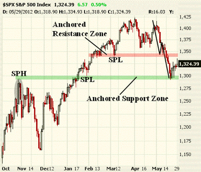
The market is replete with examples, and recently, there was an important test on the S&P 500. It was what I refer to as a “retest and regenerate sequence.” Here’s a chart showing both how we got here and what happened:
Click to Enlarge
As a recap, the S&P 500 broke down a couple weeks back, fulfilling an ABCD down that just happened to project to roughly 1292, which, as you would have it, was the swing point high (or SPH) from late-October 2011. What a great place for the first leg down to terminate.
The projection had finished, and a test of a prior swing point high was made. Although not seen on this chart, that test saw volume lighter than what it tested, so the odds of a bounce the other way were quite high. I talked about this last week and suggested Whirlpool (WHR) as a way to trade the expected bounce.
See also: A Play on Rising Confidence
Now, there is an anchored support zone as well as an anchored resistance zone which spans about 50 S&P points. These are the levels where tests will occur, and how the tests play out can give traders a leg up on what is most likely to come next.
NEXT: Shorter-Term Chart Shows Anchored Resistance Zones
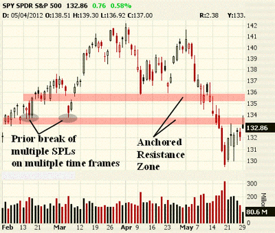
|pagebreak|Now, here is shorter-term chart of the Spyder Trust (SPY) showing the first test of resistance that is presently underway. Note the two anchored resistance zones that have to be contended with.
Anchored resistance is a way of saying “the supply is significant at these price levels.” It is discovered by examining the bars on the chart with respect to volume and the price spread of the bars. I employ an algorithmic approach in finding the anchored support and resistance zones. Without trying to explain this in more detail for now, assume that they signify price levels of importance.
Click to Enlarge
Now, remember that the break of the $134 SPY area was a break of multiple swing point lows (or SPLs) on multiple time frames, which led to a quick push to the lows.
What usually takes place after such a breakdown is a retest and regenerate sequence. This simply means that price attempts to revisit the area where it broke down and retest it. If the retest is such that the supply is greater than the demand, then we can expect the test to reject the attempt for prices to move higher and regeneratelower. If the volume expands as the test occurs relative to what is being tested, then we can expect prices to work even higher, and the regeneratefails. The great part about this is that you can measure it as it happens.
So far, volume on this test is lighter than both the bars that were broken and the bars doing the breaking when prices collapsed lower two weeks ago. That is telling us that, at least for now, the test is unable to get up and over this first resistance zone, and the probability that prices will trade lower next has increased.
This tells me to distribute what I bought a week ago into this move higher and begin to take the other side of the trade by shorting the strength.
Measuring price and volume action at critical price zones is what neoclassical technical analysis is all about. It’s a way to measure supply and demand. In some ways, it is a throwback to the bygone era of tape reading. Maybe less really is more.
By LA Little, contributor, Minyanville.com


