
The configuration of these markets is a warning shot across the bow to begin locking in profits and, at the very minimum, get downside protection for your portfolio, write Anthony Cherniawski and Janice Dorn in Minyanville.com.
Our October 4 article (Stock Market Panic in October?) outlined the dangers of a panic sell-off with particular emphasis in the month of October.
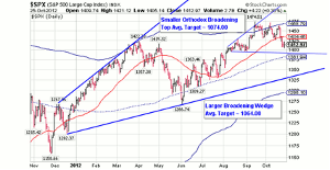
Since then, that the S&P 500 Index (SPX) has fallen beneath its 50-day moving average with seemingly little effect on investor confidence. The S&P 500 Index has not seen a higher close since September 14, the day after the Fed announcement of QE3. A review of the daily chart of the S&P 500 shows that it is now positioned less than 2% from the price level of 1395 that was highlighted in the previous article.
Daily Chart of the S&P 500
Source:
Bloomberg
Click to Enlarge
There are stock market patterns that give warning to the probability of a reversal in trend and a possible panic or crash. A classic pattern mentioned in Technical Analysis of Stock Trends by Robert D. Edwards and John Magee is the broadening formation. They comment:
.the broadening formation may be said to suggest a market lacking intelligent sponsorship and out of control-a situation usually in which the 'public' is excitedly committed and which is being whipped around by wild rumors.. Nevertheless, the very fact that chart pictures of this type make their appearance as a rule only at the end or in the final phases of a long bull market lends credence to our characteristics of them.
We shall bypass the discussion of the different broadening (megaphone) formations to discuss yet another chart pattern called the bearish ending diagonal. An ending diagonal also signals the end of a trend, with swift and sure results.
An ending diagonal may be differentiated from a rising wedge by the fact that each subsequent rise after the first bears the same mathematical construct. For example, each subsequent bottom-to-top from the first low (starting in 2009) is 62% of the prior rally. A broken lower trendline signals an end of the trend, and the decline that follows completely retraces the ending diagonal from its origin. It appears that the lower trendline may be breached imminently.
NEXT PAGE: Market Configurations Send Warnings
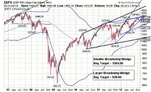
|pagebreak|It may come as a surprise to some that the end of its retracement agrees exactly with the target offered by the orthodox broadening top shown in the daily S&P 500 chart. However, that is not the end of this analysis. Should the larger broadening wedge formation shown in the weekly S&P 500 chart also be triggered, the new target for this decline may be 920.00!
Weekly Chart of the S&P 500
Source:
Bloomberg
Click to Enlarge
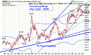
Now observe the 30-Year US Treasury Bonds Index. It has the identical pattern as the S&P 500 Index. The ending diagonal portrayed in this chart appears to be broken and projects a swift decline to its origin at 117.31. In the meantime, the broadening wedge has a good probability of being activated with a further decline projected to 100.
Please note the 31-year trendline just beneath the lows in 2010 and 2011. It is easy to see why the Fed has been the largest buyer of US Treasuries. Mr. Bernanke is attempting to put some distance between the price of the long bond and the trendline. Unfortunately, he may have created a monster, instead. It appears that we may see the long bond decline in tandem with stocks in a likely panic decline to breach the three-decade-long uptrend.
Weekly Chart of the 30-Year Treasury Bond
Source:
Bloomberg
Click to Enlarge
We believe that one of the reasons why the Fed continues to be the largest buyer of the long bond is the proximity of its recent activity to its 31-year-old uptrend. Not only does the US government have to navigate the fiscal cliff, it also may have to deal with rising interest rates.
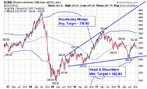
Weekly Chart of the CRB Index
Source:
Bloomberg
Click to Enlarge
The CRB Index does not appear exempt from a probable panic, even after the terrible decline in 2008. A not-so-surprising find is that the lower trendline of the broadening top may also double as a head & shoulders neckline with a probable target near 162.00. Both formations are cut from the same cloth and have similar implications.
Precious metals offer similar warnings. It is little wonder that Mr. Bernanke promised that he would throw everything he had at the market to keep it afloat? Right now, this is a market with few if any, safe havens. The configuration of these markets is a warning shot across the bow to begin locking in profits and, at the very minimum, get downside protection for your portfolio.
By Anthony Cherniawski and Janice Dorn, Contributors, Minyanville.com


