
For the benefit of new technicians learning about charting, James Brumley of BigTrends.com discusses two patterns that all traders should be able to identify, the hammer and the dragonfly doji. James also cites two examples to illustrate his point.
Although no trader has a perfect crystal ball, there are certain chart shapes and cues that are reliable indications of what's apt to happen next. One of the more reliable—and more common—patterns any trader should recognize is the so-called hammer pattern...and its cousin, the dragonfly doji.
A hammer formation on a chart is just what it sounds like, a particular bar is characterized as one with a long tail, or handle, with a mallet or hammerhead shape at the top of the bar. Generally speaking, when such a pattern forms after a pullback, a bullish reversal is likely. Indeed, the very shape of this bar implies the market has moved from a net-selling environment to a net-buying environment.
A Couple of Examples Will Illustrate the Idea
On the chart of Goldman Sachs (GS) below, you can see that after a relatively significant downtrend, a long-tailed bar with an open and close very near the high for the day began a substantial uptrend. The low for the day essentially indicated the point where the number of buyers was finally greater than the number of sellers.
GS Daily Chart
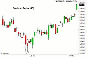
Click to Enlarge
In the same vein as a hammer formation, a dragonfly doji indicates the pivot point between selling pressure and buying pressure...with an open and close at or near the high for the day, with a low making a long tail. When these form after a defined a dip, odds are good a rebound is brewing as it was in our example below of Packaging Corporation of America (PKG). For the PKG daily chart and to read the entire article, click here…
By James Brumley of BigTrends.com


