
History shows that following volatility spikes like the one we’ve seen recently, a new rally ensues almost predictably. Will this surprising pattern play out again?
The CBOE Volatility Index (VIX), which measures the implied volatility of S&P 500 Index options, had a big rise on Wednesday due to the market pulling back. Day over day, the VIX closed 18.45% higher to end at 18.30.
While on a real basis we’re still within the lower range we’ve been in throughout 2011 (more on this later), on a one-day percentage basis, these kinds of moves are fairly unusual.
I took a look back at VIX data since the beginning of 2004 using new methodology VIX data from the CBOE Web site. We’re looking for previous one-day VIX spikes over 15%. There have been 57 of these since 2004, an average of 7.7 per year. So far in 2011, there have been five of these (but two of the occurrences were back-to-back and we combined them below).
Breaking it down into the one-year period from June 1, 2010 to June 1, 2011 there have been six VIX spikes of 15% or more (ignoring the one on Wednesday). We’re using five instances for the data analysis below, however, because there were VIX pops on consecutive days on March 15 and 16 this year, which we combined for performance analysis.
In this small, but timely sample, some interesting numbers jump out:
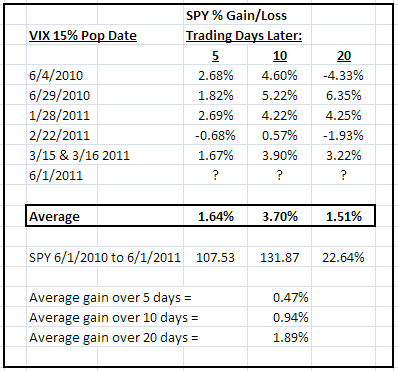
You can see above that the S&P 500 Index ETF (SPY) has moved higher, on average, following such a move in all three time frames looked at: Five trading days later (a week), ten trading days (or two weeks), and 20 trading days (or one month).
The key that immediately jumps out to me is the outperformance in the ten-day time frame. In none of the five samples was the market lower two weeks after the VIX spike. And the average gain in this time frame was a very healthy 3.7%.
NEXT: Will This Scenario Play Out Again?
|pagebreak|Now, we take into account what the market has done in this June 2010-to-June 2011 time frame to see these numbers in perspective. We broke down the average performance of SPY over these five-, ten-, and 20-day time frames based on its cumulative gain in the time frame measured. Note again the relative strength after such a VIX spike “signal” over five and ten trading days, but a net underperformance over 20 trading days.
The bottom line over the past year is that the market tends to rally for the two weeks following such a VIX pop.
But where does the VIX stand on the chart after the big percentage move higher? Well, you can see on the chart below that although we had a big percentage pop, on a real basis, the VIX is still (for the time being) well within its recent 15-19 range.
Additionally, we haven’t spiked to the top Bollinger or acceleration bands yet, so there’s every reason to believe at this time that any further VIX upside will be capped in the 19-20 area.
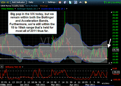
Click to Enlarge
In summary, if one looks at past occurrences over the past year, the market looks likely to rally in the two week time frame heading into mid June. Doesn’t look like this market’s mid-week down move and VIX spike is anything to be seriously worried about at this point.
By Moby Waller of BigTrends.com


