
During the financial crisis in 2008, the Federal Reserve lowered the fed funds rate to almost zero in order to stimulate the economy and stabilize the volatile equity market, explains market timing expert Joon Choi, contributing editor to Signalert's Systems & Forecasts.
Three rounds of accommodative monetary policies soon followed (aka: Quantitative Easing). The Fed purchased Treasury notes and mortgage backed securities to artificially lower long-term interest rates. These expansive measures led to a sharp appreciation in many asset classes such as equities, bonds, housings and collectables.
The U. S. economy is heavily dependent on consumption, which makes up 70% of the Gross Domestic Product (GDP). So, it’s very important to keep track of the consumers’ financial wealth/health. In this article, I will discuss the relationship between the U.S. household wealth and GDP.
Data preparation
I obtained “Household and Nonprofit Organizations; Net Worth, Level” and “Gross Domestic Product” from St. Louis Fed’s website. Both data are reported quarterly but the GDP estimate is reported a month after the quarter-end followed by two revisions in subsequent months; whereas, Net Worth data has approximately two months lag.
As a result, the latest data in this study is second quarter of this year; however, absence of the most recent quarterly reading is not profound for the scope of the research.
The Study
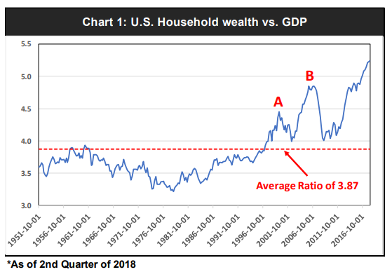
Recently, I have come across several of articles pointing to elevated U.S. Household wealth vs. GDP. In short, the average ratio between the two data has been 3.87 since 1951 (Chart 1); however, the latest reading is at 5.24 which seems very stretched from the average.
The ratio was also stretched in 2000 (Point A) and 2007 (Point b) before major stock sell-offs. Therefore, the authors concluded that a bear market was imminent.
Although this analysis raises the fear that a bear market may be overdue, I wanted to refine the study at this point because it has a major flaw. The analysis compares current financial conditions to an average of 67 years; in short, the study is over-simplified.
Instead of comparing the wealth/GDP ratio to a very long-term average, I plotted a 10-year simple moving average of the ratio and charted the difference between the two. This approach adjusts to the changing conditions as you are comparing current readings to that of the average of trailing 10 years (Chart 2).
The three most recent major peaks in the differentials coincided with major stock market peaks, although it was a few quarters earlier in 2006.
The differential indicator does not predict when the stock selloff will occur but rather informs when the household wealth is stretched vs. GDP. In other words, when GDP growth does not support the household wealth increase, sharp pull-back in equities may not be too far ahead.
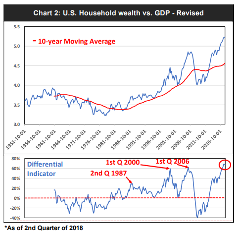
It’s interesting to note that the current wealth/GDP ratio is far higher than it was back in 2007 (5.2 vs. 4.8 respectively); the ratio made a new record high in 2015. Whereas, the gap between the ratio and its 10-year moving average made a new high in 2017 and it now sits slightly higher than the 2006 peak.
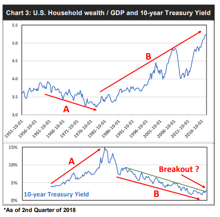
As I was writing this article, I became intrigued with the long-term pattern of the wealth/GDP ratio. Why was the ratio down trending from 1961 to 1981 and up trending ever since? I believe the answer lies in the long-term direction of interest rates.
s the 10-year Treasury yield rose sharply from the 1960s to early 1980s, the wealth/GDP ratio fell. (See trend A in chart 3 below.) In contrast, as long-term yield began its downtrend, household wealth increase outpaced the economic growth. (See trend B in chart 3, below.)
The relationship between the U.S. household wealth and GDP seems to suggest that the recent economic expansion from 2009 does not justify the overall wealth of U.S. households. The main driver of this imbalance derives from years of artificially low interest rates induced by central banks around the world.
However, as the long-term interest rates are on an upswing and it concerns me that the 10-year Treasury yield broke the downtrend that originated 30 years ago. (See chart 3 above.) Will we see much higher rates for the foreseeable future?
If so, will the wealth/GDP trend down from here? My analysis into the wealth/GDP ratio seems to suggest that a significant correction may be looming around the corner. Lastly, some of the major indices are in the process of forming monthly negative divergence versus its MACDs which may be a prelude for further equity selloff.


