

The latest gold price action is strikingly similar to the pattern that unfolded at precisely this time last year, and if the pattern holds true again, traders have a good roadmap and price targets for trading gold in July.
There seems to be a clean pattern now repeating itself on the gold charts that developed exactly one year ago, which I’m finding interesting.
Let’s take a look at the pattern then, compare it to now, and over the next few weeks, we’ll see if the future pathway of the pattern plays out as it did back in July 2010.
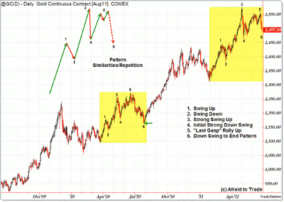
First, here’s the broader picture, which shows the repeating pattern of price swings:
Click to Enlarge
First, the little numbers in the chart are not Elliott Waves. They’re just calling attention to the little swings that form the bigger, six-point pattern I’ve described in the chart above.
First, we have a rally phase with a mini-pullback that forms the “1-2-3″ portion of the price structure.
Then—and here’s the interesting part—we have an initial “thrust,” or sharp price slide, that makes up the fourth point. This culminates with a new momentum low (as seen in the charts below).
We then are treated to what I like to call a “last gasp,” or more popularly, a “dead cat” corrective (the swings compress) rally into the prior high, which then gives way to the final part (#6) of the pattern, the downside follow through after negative divergences into the point #5 high.
It’s not a huge or terminal pattern. In fact, after it completed, gold rallied sharply after bottoming in July 2010.
I’m monitoring the potential that we are in the middle of the #6 downswing phase that occurred last July, resulting in a slight decline in gold prices.
The pattern—and the timing—are eerily similar as we head into July 2011. It’s not magic, nor is it guaranteed, but it’s certainly something to watch as July unfolds.
NEXT: A Closer Look at How This Pattern Last Played Out
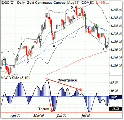
|pagebreak|Let’s step inside (with indicators) the pattern as seen from April through July 2010:
Click to Enlarge
Jumping right to the point, we see the up-rally that ended with the May 2010 high and gave-way to the #4 “thrust”
(sharp price swing that also created a new momentum low).
After that, we had the “dead cat,” or “last gasp,” rally to a slight new high, which ended on a negative momentum divergence (#5) ahead of the final resolution phase, taking price back to the 200-day simple moving average (SMA) at the end of July.
So how does this compare to 2011? Good question…
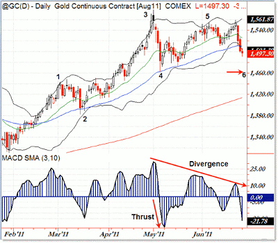
Click to Enlarge
Though the initial rally phase was longer (it started in February), the final pattern peak was also in May 2011, which gave way to a sharp downside “thrust” (new momentum low off a sharp selloff swing).
A similar corrective/overlapping rally (a “last gasp”) took us just shy of the prior swing high, yet there were still negative divergences undercutting the price structure.
The current points (1 through 5) are very similar to that of 2010, which resulted in a slight pullback in July.
The question now appears to be:
Given the structural (price) similarities from 2010 to 2011, will the final, point 6 decline take us back to the low of the thrust price ($1,460), or perhaps down to the rising 200-day SMA (which will rise to the $1,430 - $1,440 level soon)?
That’s something to watch as we enter and move through July.
If the pattern holds, then you’re looking at the pathway forward through July. Expect the decline phase to take us to the $1,450 region to bottom in July.
If, however, gold accelerates and rallies higher (breaking this structural similarity), then that would be a bullish sign that the “gravitational” or “historical” pull of the pattern is broken, which would be a bullish sign.
No one knows the future, but planning little “pathways” like this can help us with our positioning (if what we expect actually occurs) and risk management (if it does not).
By Corey Rosenbloom, CMT, trader and blogger, AfraidToTrade.com


