

Wild price action that ensued following IBM’s earnings report surprised many traders, and a look at the charts on several time frames reveals four valuable lessons to retain for future earnings trades.
Wow! If you missed the post-market action following IBM’s earnings announcement, you missed a huge move that took so many traders by surprise.
While this post will focus mainly on key lessons from the charts, it’s worth noting that trading around earnings increases risk, especially if a stock’s earnings differ greatly from what’s expected. Or, in IBM’s case, when earnings are different by mere pennies from expectations ($3.19 reported versus $3.22 expected).
Let’s focus our attention on two main lessons: That of higher-time-frame analysis and the massive multi-swing negative divergence that undercut the recent rally.
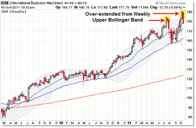
Let’s start with the overextended IBM (IBM) weekly chart:
Click to Enlarge
Let me just focus on two things on the chart above:
- A rising primary/long-term trend
- The two recent closes (spikes) through the upper Bollinger band
When doing analysis or finding candidates to swing trade, it’s often best to start with the higher- time-frame charts and work down from there.
Let’s focus on the two spikes above the upper weekly Bollinger band. This simply indicates the stock is overextended and generally more likely to fall in the immediate (next) move than rise.
As we look at the lower-time-frame charts, keep in mind that price was overextended above its upper Bollinger band into $190.
See related: John Bollinger on Bollinger Bands
This simply suggested it was not the time to get long IBM shares; and for very aggressive traders, it might be an opportunity to short sale (or buy put options) if the lower-time-frame charts showed bearish patterns/signals.
NEXT: A Look at the Daily Chart for IBM
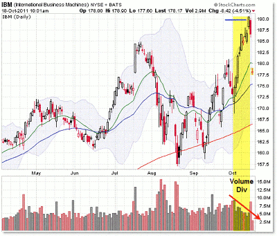
|pagebreak|With that, let’s drop to the popular daily chart:
Click to Enlarge
The daily chart steps us inside both instances where price overextended above the weekly Bollinger band.
The main thing to note on the daily chart is the power rally into $190, which was undercut by a persistent negative volume divergence. On each day of higher prices in October, volume was a little bit lower. Volume divergences tend to precede reversals.
So we have the weekly chart showing a poke outside the upper Bollinger band and the daily chart also showing an overextended rally that is being undercut (non-confirmed) by declining volume.
Again, this is not a situation that would compel a long (buy) trade, but instead would have aggressive traders taking the time frames even lower to see if a potential short-sale opportunity triggered.
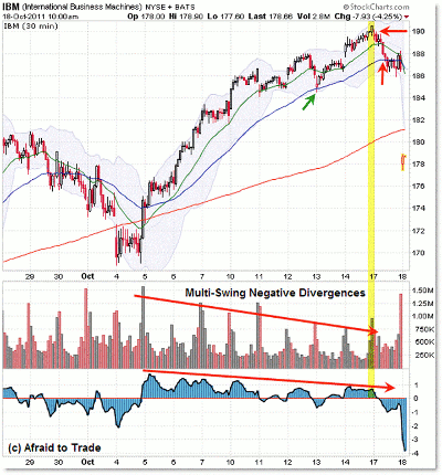
Let’s see two intraday time frame charts, starting with the 30-minute structure:
Click to Enlarge
I mentioned the negative volume divergence on the daily chart, but the 30-minute chart makes the divergence abundantly clear. That’s one of the benefits of multi-time-frame analysis; the lower time frames clarify the picture or reveal more information than the higher frames.
See related: More Time Frames, More Confidence
I’m now adding the 3/10 momentum oscillator to the chart to get a sense of what momentum reveals about the price swing in motion. Momentum declines steadily (along with volume) as price continues its rally higher.
The 30-minute chart reveals clearer negative volume and momentum divergences into an overextended situation on the higher time frames. Once again, not a compelling spot to plan a buy trade.
NEXT: It's a "Make or Break" Situation on the 15-Minute Chart
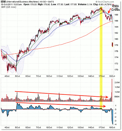
|pagebreak|Let’s see if the 15-minute chart shows us a potential short-sale opportunity:
Click to Enlarge
The 15-minute chart is basically the same as the 30-minute intraday chart, with one big exception: Price broke and closed under the 20/50 exponential moving average (EMA) structure early on October 17, and then these EMAs crossed bearishly later in the session.
Price then rallied into the EMA crossover (what I call the “Cradle Trade”) into $188 just ahead of the close…and ahead of the earnings report.
This sets up a “make or break” situation where price either continues its breakdown lower—in conjunction with a typical sell swing, as suggested by the higher time frames—or does the unexpected, lower-probability outcome with a firm breakthrough higher above $190, which would target $200.
The outcome this time was the expected, or probable thesis:
Price had greater odds of falling/declining due to the higher-time-frame overextended rallies above the upper Bollinger bands, which were undercut by negative volume and momentum divergences on the intraday/lower frames.
From that thesis, price gave a set-up or short-sale trigger on October 17 via breakdowns of rising trend lines and rising EMAs, along with an EMA crossover (all of which were potential trade entry triggers).
The stop would go above $188 (tight) or preferably $190, depending on your risk tolerance.
To summarize, the main/quick lessons to learn from this situation are the following:
- Weekly spike through the upper Bollinger band (overextended)
- Daily power rally on declining volume each day
- Intraday multi-swing negative momentum and volume divergences (clarified)
- 15-minute EMA crossovers and trade triggers
Take time to learn the lessons from situations like these, as these lessons will repeat in the future on other stocks and markets; just the end result won’t likely be such a sudden overnight resolution thanks to an earnings announcement to get the downward ball rolling.
By Corey Rosenbloom, CMT, trader and blogger, AfraidToTrade.com


