

As markets waited for the outcome of US presidential elections and the coming Greece austerity vote, internals hit all kinds of resistance and support levels. Clarity to come, or further confusion? We'll find out soon enough, according to Michael Gayed, CFA, Contributor, Minyanville.
“I assess the power of a will by how much resistance, pain, torture it endures and knows how to turn to its advantage.”
--Friedrich Nietzsche
Below is an assessment of the performance of some of the most important sectors and asset classes relative to each other, with an interpretation of what underlying market dynamics may be signaling about the future direction of risk-taking by investors. The below charts are all price ratios, which show the underlying trend of the numerator relative to the denominator. A rising price ratio means the numerator is outperforming (up more/down less) the denominator.
LEADERS: NO CONVICTION
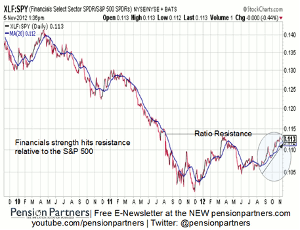
Financials (XLF) – Resistance
Click
to Enlarge
Comments: Financials have been a star performer all year, but recent outperformance is now hitting up against ratio resistance. I have highlighted concerns over the deflation pulse and behavior of the bond market, which has not steepened meaningfully in terms of the yield curve. A reversal may occur, particularly should flattening in Treasuries accelerate.
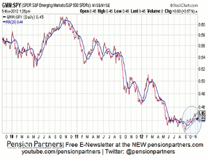
Emerging Markets (GMM) – Leadership Intact
Click
to Enlarge
Comments: I have been aggressively highlighting the strength in emerging markets despite the October decline as one area of the stock market poised to outperform independent of US deterioration. I suspect this trend remains early, though further strength may be attributable more to a declining S&P 500 (SPX) rather than advancing emerging market index.
NEXT PAGE: Proceed with Caution
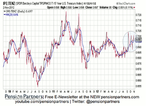
|pagebreak|Treasury Inflation Protected Securities (IPE) – Volatile
Click
to Enlarge
Comments: The IPE/TENZ price ratio is one way of seeing if inflation expectations are rising or falling within the bond market. When the ratio is trending higher, it means bets are occurring on rising prices ahead. Volatility has caused the ratio to be all over the place. It remains to be seen where an actual trend forms.
LAGGARDS: CONFUSION
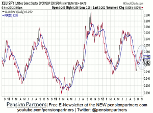
Utilities (XLU) – Overreaction?
Click
to Enlarge
Comments: Utilities severely weakened Monday, breaking the 20 day moving average sharply. Concerns over the looming fiscal cliff and taxes on dividend stocks might explain the weakness as bets on Obama winning increase. More time is needed to confirm if this is just a blip, or the start of a weakening trend.
Consumer Staples (XLP) – Punishing Defensiveness
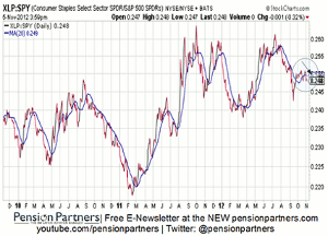
Click
to Enlarge
Comments: Consumer staples appear to be rolling over as concerns grow over the fiscal cliff and taxing of dividends under an Obama administration, similar to utilities. More time is needed to see if this is noise, or the start of a trend.
Energy (XLE) – Broken Energy
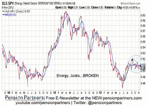
Click
to Enlarge
Comments: Energy appears to be in the early stages of a real breakdown, unable to break past prior ratio highs. More time is needed to confirm, but those wanting to bet against the market might want to consider the role of energy as a laggard in the coming weeks.
Conclusion
Markets are, across the board, hitting resistance internally as uncertainty over the elections in the US and Greece dominate decision making. The corrective period remains with some mixed messages. More time is needed to get a clearer sense, but caution remains warranted.
By Michael Gayed, CFA, Contributor, Minyanville


