

Moby Waller of BigTrends.com advises investors and traders to keep an eye on new trends emerging in 2014 to spot the unexpected winners and losers that can create big profitable trends.
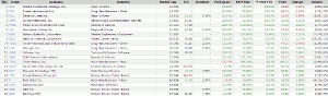
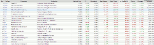
With two weeks of 2014 trading behind us, we took a quick look at some of the big moving stocks year-to-date, focusing on larger-cap stocks with good daily volume. Our screen was for big, liquid, optionable, and shortable stocks (over $10 billion market cap, over two million average daily volume)—we then sorted by the best- and worst-performing stocks of 2014 (in the case of the best, a further screen of above 20-, 50- ,and 200-day simple moving averages was used—in the worst, below 20-day, 50-day and 200-day moving averages).
The top year-to-date (YTD) movers in 2014 table is below. Some interesting names on here in sectors such as airlines, pharma/biotech, autos, banking/finance. Also a few technology names, in particular a few “older” tech names—one of the best movers is what we will focus on: Juniper Networks (JNPR). JNPR is up 14% YTD and near the top of the list, but doesn't have the yearly (52-week) gains that are in line with most of the others near the top of the list—this indicates a recent rebound in the shares and intrigues for a further examination.
Click to Enlarge
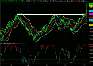
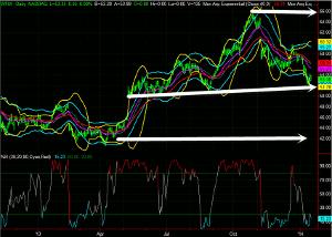
On the JNPR daily chart below, you can see that the 2014 gain is from a big move in recent days. This is a news-related move, as a hedge fund took a share in the company and is publicly looking to boost the stock price through various proposals and measures. However, we're not going to go overly in depth on the fundamentals of either stock analyzed in this article—also not going to speculate on how much (if any) the company's management will implement the proposed shareholder measures—largely we will “let the chart tell the tale” so to speak.
In this case, the activist group took a 6% stake in the company—but in a stock that has $13 billion + market cap and a float of nearly 500 million shares, this isn't an overwhelming stake. But the market has reacted positively to it—sustaining these gains short-term will be very important to “showing legs” in this breakout and the future direction of JNPR shares. Note the breakout over the 23 area on the chart below—the 24/23 area should now act support on pullbacks, in fact we would say there is a pretty clear line in the sand in this area that needs to hold pullbacks and should be a good low risk entry point for long positions.
JNPR Daily Chart
Click to Enlarge
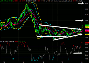
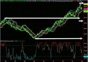
Zooming out on JNPR to a weekly chart below, here you can see a big decline in the stock in 2011, which was followed by a narrowing range from mid-2011 to the present. This was just broken to the upside, another sign of strength. The overall decline from high to low was from 45 to 15—a simple 50% Fibonacci Retracement of this gives an upside level of 30. This is a logical upside target on JNPR should the rally continue. The JNPR activist investor group has proposed a $35 to $40 upside valuation target on JNPR on their proposed restructuring and shareholder value moves—a move to $45 would retrace all of the losses since the 2011 high.
JNPR Weekly Chart
Click to Enlarge
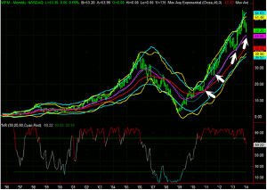
Zooming out even further on the JNPR monthly chart below, this encompasses all the movement since the stock went public. You can see giant run-up it had during the Internet bubble days, reaching as high as 240. Post-crashing from that parabolic run, it has been range bound for over 10 years now. The range is pretty wide, overall largely between about $5 and $40—more recently $15 to $45. You can note that monthly percent R (using the BigTrends method on this technical indicator) has breached into bullish territory for the first time in several years—previous strong readings of this long-term percent R (longer than we prefer to normally use) have moved back lower, but only after a few months of overall strength in general in the past.
JNPR Monthly Chart
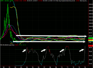
(Charts from Tradestation)
Click to Enlarge
Bottom line on JNPR at this point is that the breakout looks legitimate and significant on multiple time frames and 30 is a key upside target. Holding the 24/23 area on pullbacks is important.
NEXT PAGE: The Laggard
|pagebreak|Now on to the stock laggard of 2014 thus far—the worst YTD large-cap names are on the following table. Energy-related names pop up on this list many times. There is also a bit of retail here—the 4th name down is Whole Foods Market (WFM), which stands out (in addition to being a well-known name and a widely traded stock) for its 2014 loss but overall 52-week gain, indicating a recent downside reversal.
Biggest Stock Losers, 2014 YTD
Click to Enlarge
Looking at the WFM daily chart below, you can see it peaked in October and has since been moving lower. It had a big gap down in November following earnings and analyst downgrades—note that the stock does tend to gap big in both directions on earnings reports (something for options and volatility traders to keep in mind for the future). The more recent decline in 2014 is being attributed to various factors, including weather, retail, margins, charts, etc—not one overriding news event.
On this daily chart, there was an overall rally from 42 to 66 before the pullback—a 50% Fibonacci retracement of this is 54. That is a likely support area and pause point for the downtrend. We've overshot that a bit to the downside (with WFM currently below 53), but that can happen at times with these retracement levels. When you combine that 50% retracement of the gains with the uptrend line of key lows that points just below current levels, we would say this chart indicates a good possibility that WFM stabilizes and halts the downtrend at or around the 52 to 53 level in the shorter-term.
WFM Daily Chart
Click to Enlarge
Zooming out of WFM to a weekly chart below, you can see that this stock certainly has big tight trends in both directions in recent years. A clear downtrend was in place from 2006 to 2009, with a strong uptrend rally from 2009 to 2013. Note that the 2005/2006 high was the 40 level—look to this downside target as a support level if the downtrend continues (which isn't clear from the daily chart)—40 was also a good support area in 2012 and 2013. On the uptrend from 2008/2009 to 2013, the stock rallied from around $2.5/$5 to $65—a breakdown of this trend hasn't yet quite occurred, but a 50% retracement of this rally gives a downside target of around $34 ($30 to $35 area).
WFM Weekly Chart
Click to Enlarge
Zooming out even further to the WFM monthly chart below, again note that this stock has tended to trend heavily (in both directions) over the longer-term. Been a great stock for trend following and momentum system traders and investors to participate in. In this case, the multi-year uptrend is still in place…for now. Percent R has just pulled back from strongly bullish territory but hasn't broken mid-levels yet. Additionally, the shares have potential support below from the 20-month exponential moving average (purple line). This uptrending line is just below the $50 level currently—note that pullbacks in recent years have all held at or just above this moving average. At this point, you have to look at that that as a key support level—likely for a stabilization of the recent downtrend.
WFM Monthly Chart
Click to Enlarge
Bottom line on WFM from these charts is a bit mixed, but overall it looks like the 50/52/54 area should hold as support—a consolidation there is likely, and possibly a resumption of the uptrend. If that area is violated, downside of targets of $40/$35/$30 come into play.
Moby Waller, Co-Portfolio Manager, ETF Tradr Program & Rapid Options Income, BigTrends.com


