

Greg Harmon, of Dragonfly Capital, takes a technical look at the chart of the ratio of the Gold ETF to the US Treasury ETF to determine what indicators are telling him the course of action to take is next, based on—what he has coined as—this "Mexican Hat Pattern."
I never heard a formal name for this pattern but I see it a lot. The price falls in a long downtrend, finds support and bounces. The bounce is short lived, like a dead cat bounce and the price falls back to the low. From there the price starts to rise again and moves higher in a long uptrend. Like it is riding down the left side of the brim, up over the top and down, then back up the right side of the brim of a Mexican Hat.
It has that W shape that harmonic patterns have but the middle is too low to qualify. Maybe it is just a double bottom when you look at it after the full pattern has played out, but the two bottoms are not always equal. And doesn’t Mexican Hat pattern sound more interesting anyway?
Click
to Enlarge
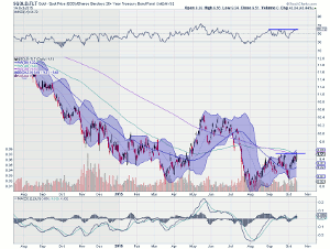
The chart of the ratio of the Gold ETF (GLD) to the US Treasury ETF (TLT) has that same look. It has already completed the ride down the left brim and up over the top. Now it looks to be starting up the right brim. A push over 9.60 in the ratio should confirm the trip higher.
The momentum indicators are supporting the move up. The RSI is pushing up through resistance in the bullish zone and heading to a new 4-month high. The MACD is crossed up and rising. Even the Bollinger Bands® have turned higher.
After confirmation the trade would be to buy Gold and sell bonds to profit on the ride higher in the ratio.
By Greg Harmon of Dragonfly Capital


