

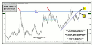
Chris Kimble of Kimble Charting Solutions takes a technical look at the yield on the 30-year bond from an inverted angle to indicate that if support is taken out at this key level, then bonds could fall in price and give back some gains they have achieved of late.
The chart below looks at the yield on the 30-year bond, from an inverted angle. Why invert the bond chart? This way it looks like bond price.
Click
to Enlarge
The 30-year yield (inverted) has peaked along line (A) a couple of times over the past eight years. Last week a large reversal pattern (bearish wick) took place a dual resistance price point (1), as it was attempting to break above resistance line (A). To read the entire article click here…
By Chris Kimble, Founder, Kimble Charting Solutions


